Title: Warder Sprite Thread
Post by: Archael on November 20, 2008, 08:58:38 pm
Post by: Archael on November 20, 2008, 08:58:38 pm
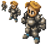
Sprites that are a STEP in the right direction for armor - heavyness level:


However this sprite will need no cape... no leather pieces.. it must all be
SOLID FUCKIN HEAVY ARMOR DIEEE RRRAARRRWER!!!
However this sprite will need no cape... no leather pieces.. it must all be
SOLID FUCKIN HEAVY ARMOR DIEEE RRRAARRRWER!!!
Title:
Post by: DarthPaul on November 20, 2008, 10:12:01 pm
Post by: DarthPaul on November 20, 2008, 10:12:01 pm
Nice halo and guildwars pics and i shall make an attempt.
Title:
Post by: AuraDragon on November 20, 2008, 10:39:51 pm
Post by: AuraDragon on November 20, 2008, 10:39:51 pm
Uh,*huff huff* heavy... uh... can't go to the washroom with this *huff huff* h-heavy... urgh... *huff* armo-... *slump*
Sounds fun, glad to see my sprite up there too.
Sounds fun, glad to see my sprite up there too.
Title:
Post by: GZGoten on November 20, 2008, 10:47:41 pm
Post by: GZGoten on November 20, 2008, 10:47:41 pm
Basically you're asking for a Fire Emblem 6,7,8,9 or 10 general without the helmet no?
Title:
Post by: DarthPaul on November 20, 2008, 10:51:52 pm
Post by: DarthPaul on November 20, 2008, 10:51:52 pm
Thats a great idea for the spriteGZGoten, desu.
Title:
Post by: Archael on November 20, 2008, 10:54:23 pm
Post by: Archael on November 20, 2008, 10:54:23 pm
Quote from: "GZGoten"Basically you're asking for a Fire Emblem 6,7,8,9 or 10 general without the helmet no?
I looked up some FE General sprite pics. Very close to what we are looking for. Yes.
Yes! A very good concept for this. Major props.
Linking:


Title:
Post by: AuraDragon on November 20, 2008, 10:56:59 pm
Post by: AuraDragon on November 20, 2008, 10:56:59 pm
You don't need to copy the ENTIRE Sprite Sheet... Sheet....
Title:
Post by: DarthPaul on November 20, 2008, 10:57:41 pm
Post by: DarthPaul on November 20, 2008, 10:57:41 pm
You found the palette for wendy but not the other night from sacred stones, and no sword animations at that for shame, desu. Also Fuuin no Tsurugi FTW, desu.
Title:
Post by: Archael on November 20, 2008, 10:58:26 pm
Post by: Archael on November 20, 2008, 10:58:26 pm
go ahead and paste em
Title:
Post by: DarthPaul on November 20, 2008, 11:06:41 pm
Post by: DarthPaul on November 20, 2008, 11:06:41 pm
Uh  I will when I find them, desu.
Title:
Post by: AuraDragon on November 21, 2008, 12:38:39 am
Post by: AuraDragon on November 21, 2008, 12:38:39 am
Ultimate Hulkage 2008!
Top THAT Lydyn...
EDIT: Hair, Mustache, and Booties may change later, in fact, I may just change them tomorrow...!
Title:
Post by: Archael on November 21, 2008, 09:56:47 am
Post by: Archael on November 21, 2008, 09:56:47 am
very nice job so far
anyway to make the shoulder pauldrons significantly larger and squarer more defined?
I am guessing the armguard is the left arm?
Also, can the arms / shoulders be larger in proportion to the chest piece?
maybe tone the chest down and bring shoulders up
If the shoulders get significantly larger around the head (you can even try to pull off those towering shoulder plates from FE General,
or something like them) the head will not look as "naked" without headgear
either way, awesome prelim
Title:
Post by: boomkick on November 21, 2008, 10:47:28 am
Post by: boomkick on November 21, 2008, 10:47:28 am
Maybe give them somewhat of a Loose Turtle Neck of Armor (if you know what im talking about). It won't cover their head but will coover up to the mouth.
Maybe spikes on the shoulder pads on females and spikes on the back for males.
Maybe spikes on the shoulder pads on females and spikes on the back for males.
Title:
Post by: gojoe on November 21, 2008, 12:20:02 pm
Post by: gojoe on November 21, 2008, 12:20:02 pm
kinda looks like a beer belly
Title:
Post by: Archael on November 21, 2008, 12:21:43 pm
Post by: Archael on November 21, 2008, 12:21:43 pm
yeah
the rounded shrine knight belly plate has to go
the rounded shrine knight belly plate has to go
Title:
Post by: gojoe on November 21, 2008, 12:26:19 pm
Post by: gojoe on November 21, 2008, 12:26:19 pm
hmmmmm give ma a day or two untill then use ramza's chestplate Ch2/3
Title:
Post by: gojoe on November 21, 2008, 12:42:52 pm
Post by: gojoe on November 21, 2008, 12:42:52 pm

this was quick and no helmet yet but is this kinda what yer loking for?
Title:
Post by: Cheetah on November 21, 2008, 01:03:50 pm
Post by: Cheetah on November 21, 2008, 01:03:50 pm
It's helmet-less Mega Man! It is pretty cool looking, but that might be a little too much.
Title:
Post by: BeoulveBlack on November 21, 2008, 01:23:10 pm
Post by: BeoulveBlack on November 21, 2008, 01:23:10 pm
looking at those FE sprite sheets makes me start to think i can replace them with a custom character...
Title:
Post by: DarthPaul on November 21, 2008, 02:37:48 pm
Post by: DarthPaul on November 21, 2008, 02:37:48 pm
Hmmmm FE spriting would be cool as hell and remember Hawkeye having a diff sprite than other berzerkers that would be cool to do for more characters, desu.
Title:
Post by: Archael on November 21, 2008, 02:48:46 pm
Post by: Archael on November 21, 2008, 02:48:46 pm
If I can somehow merge the FE General into AuraDragon's sprite with a faceguard instead of the full helm
and an armguard
that would be the perfect sprite
and an armguard
that would be the perfect sprite
Title:
Post by: AuraDragon on November 21, 2008, 02:55:03 pm
Post by: AuraDragon on November 21, 2008, 02:55:03 pm
Lolz, Gojoe has everything under wraps.
Title:
Post by: Archael on November 22, 2008, 12:29:36 pm
Post by: Archael on November 22, 2008, 12:29:36 pm
AuraDragon you plan to keep working on this sprite?
Title:
Post by: LastingDawn on November 22, 2008, 12:50:29 pm
Post by: LastingDawn on November 22, 2008, 12:50:29 pm
We've found our portrait fellows! Borrowed from Guildus of Tactics Ogre yore!

A very unique look which will help augment their separate characters.
A very unique look which will help augment their separate characters.
Title:
Post by: Cheetah on November 22, 2008, 01:25:30 pm
Post by: Cheetah on November 22, 2008, 01:25:30 pm
Ah there it is, that is the preview sprite that I was trying to find for you yesterday Voldemort. It is a good looking sprite overall and the portrait is awesome.
Title:
Post by: Archael on November 22, 2008, 01:28:17 pm
Post by: Archael on November 22, 2008, 01:28:17 pm
the sprite itself is not bad (and I say this strictly in terms of what we are looking for in this thread)
but the portrait is perfect
but the portrait is perfect
Title:
Post by: gojoe on November 22, 2008, 02:30:16 pm
Post by: gojoe on November 22, 2008, 02:30:16 pm

too much?
Title:
Post by: Archael on November 22, 2008, 03:48:46 pm
Post by: Archael on November 22, 2008, 03:48:46 pm
^ his shoulders have some weird melding up into the head-thing goin on, and the boots and gloves look like they are inflated
gaiz stop thinking within the confines of the shrine knight sprite
we're not looking for a shrine knight, or a bulked up version of one
this is something totally different
gaiz stop thinking within the confines of the shrine knight sprite
we're not looking for a shrine knight, or a bulked up version of one
this is something totally different
Title:
Post by: gojoe on November 22, 2008, 04:11:28 pm
Post by: gojoe on November 22, 2008, 04:11:28 pm
....... so you're lokng more for like what AD had with all armor plus one really big armguard/shield thing?
Title:
Post by: Archael on November 22, 2008, 04:14:54 pm
Post by: Archael on November 22, 2008, 04:14:54 pm
yup
that's what the topic says
exaggerated shoulders / arm guard shield are a + (since they will always be holding that part up)
but the rest of the armor has to look good as well
that's what the topic says
exaggerated shoulders / arm guard shield are a + (since they will always be holding that part up)
but the rest of the armor has to look good as well
Title:
Post by: AuraDragon on November 22, 2008, 07:13:20 pm
Post by: AuraDragon on November 22, 2008, 07:13:20 pm
Haven't been able to work on anything today, and to note: You should use a Diagonal view for extra depth. 
Title:
Post by: Zozma on November 23, 2008, 01:01:04 am
Post by: Zozma on November 23, 2008, 01:01:04 am
goodness.. better give that guy teleport... i dont think hell have more than 0 move in that much armor...
Title:
Post by: Xeno3 on November 23, 2008, 08:11:40 pm
Post by: Xeno3 on November 23, 2008, 08:11:40 pm
lmao I have to agree with Zozma the armor is an over kill
Title:
Post by: Effephoenix on November 25, 2008, 08:11:28 pm
Post by: Effephoenix on November 25, 2008, 08:11:28 pm
How about this? If you like the design, I'll keep going.

Yes, the sheild is ass. I rushed through that. If you like the design, though, I'll make one that looks much better.
Yes, the sheild is ass. I rushed through that. If you like the design, though, I'll make one that looks much better.
Title:
Post by: Archael on November 25, 2008, 08:27:20 pm
Post by: Archael on November 25, 2008, 08:27:20 pm
I didn't think anyone would actually try more shots at this one, I was planning to do it myself come December break.
But I gotta say that's not bad. A couple of things:
1) The sprite should have no helm
2) The shoulders should be a little more more defined and sloping upwards not downwards
3) The shield is actually pretty good... but perhaps make it more like a glove at the end with all the massive armor on the rest
4) The armor is skeletal almost.. it is a very unique look, and you certainly come close to what we want
I am looking at AD's sprite at the moment, perhaps add some things to that, or just trash it all and make one from scratch in December
I have to say it's gonna be a pain in the ass, because this is THE single most demanding and specific sprite request I have ever seen
I like the design, feel free to make a better one, because it definitely has potential even if it doesn't end up as a Warder
Title:
Post by: Effephoenix on November 25, 2008, 08:57:37 pm
Post by: Effephoenix on November 25, 2008, 08:57:37 pm
Touch it up you say? I agree.
Made it a bit bulkier. (READ: Alot)
EDIT: Sheild supremely updated. Will make defense pose and add it next chance I get.

Made it a bit bulkier. (READ: Alot)
EDIT: Sheild supremely updated. Will make defense pose and add it next chance I get.
Title:
Post by: Zephyr on November 25, 2008, 09:31:13 pm
Post by: Zephyr on November 25, 2008, 09:31:13 pm
That looks hawt.
Let's appreciate that sprite.
WOOOOOOO!!! somebody throw appreciation cookies =O
Let's appreciate that sprite.
WOOOOOOO!!! somebody throw appreciation cookies =O
Title:
Post by: Archael on November 25, 2008, 09:39:10 pm
Post by: Archael on November 25, 2008, 09:39:10 pm
wait, hold on
you had a piic up there before of a big armored gauntlet instead of a shield
you edited it out?
you had a piic up there before of a big armored gauntlet instead of a shield
you edited it out?
Title:
Post by: Effephoenix on November 25, 2008, 09:41:44 pm
Post by: Effephoenix on November 25, 2008, 09:41:44 pm
Yeah, It was real small, and it didn't fit with the rest of the sprite. I didn't like it. But I could put it back on if you really want me to.
Title:
Post by: Zephyr on November 25, 2008, 09:43:11 pm
Post by: Zephyr on November 25, 2008, 09:43:11 pm
That new shield looks like a hand cannon rofl. Looks like a godly new special character
Title:
Post by: Archael on November 25, 2008, 10:11:11 pm
Post by: Archael on November 25, 2008, 10:11:11 pm
the armor needs more separation / distinction of body parts
looks a little flat
looks a little flat
Title:
Post by: Effephoenix on November 25, 2008, 10:16:21 pm
Post by: Effephoenix on November 25, 2008, 10:16:21 pm
More contrast it is, then.

Title:
Post by: Archael on November 25, 2008, 10:45:00 pm
Post by: Archael on November 25, 2008, 10:45:00 pm
he's looking a lot better, I must admit
you mind putting back his Armguard (the one that is part of the armor) but with the same general size as that shield you got on right now? Even if the rear potruding part looks like an exaggerated armor spike,, plate thing.., that's the point of this armor (think, maybe, a stronger female monk armguard)
and his armor colors could use some work.. right now it looks sort of like bronze armor, would a color like the shield's (darker grey or iron) look better?
also his legplates need some work, you see how they are basically many layers of plate mail right now? perhaps they would look better as just single plates
I like the greaves themselves alot, and the grips of the gloves themselves are good
the shoulder pieces have the right look to them, but they feel a little too close to the head, and from the side view this is noticeable, they look kinda bunched up together with the head, but perhaps this is an effect of the chest piece being a little smaller
this is improving quickly
mind posting a bigger view?
LD should take a look at this, I think it has potential
Title:
Post by: LastingDawn on November 25, 2008, 10:57:54 pm
Post by: LastingDawn on November 25, 2008, 10:57:54 pm
Whoa. Talk about unique, that blows everything out of the park! But, is it 16 colors in all?
Title:
Post by: Effephoenix on November 26, 2008, 12:24:16 am
Post by: Effephoenix on November 26, 2008, 12:24:16 am
Sheild added, armor colored, five color schemes offered for other factions.

Title:
Post by: dwib on November 26, 2008, 12:58:57 am
Post by: dwib on November 26, 2008, 12:58:57 am
dude they are the shit. everything i'd expect the warder to be
Title:
Post by: Effephoenix on November 26, 2008, 01:07:48 am
Post by: Effephoenix on November 26, 2008, 01:07:48 am
Portrait. I didn't change much, but some.

Title:
Post by: Archael on November 26, 2008, 09:11:01 am
Post by: Archael on November 26, 2008, 09:11:01 am
the armguard has a strange box-like shape when seen from the side, and it is very different from what was on him before... it looks more like reversed blades than a shield
also the armor could do with different colored parts
also the armor could do with different colored parts
Title:
Post by: DarthPaul on November 26, 2008, 10:43:08 am
Post by: DarthPaul on November 26, 2008, 10:43:08 am
At least Arch knows what he wants and is being specific.
Title:
Post by: Archael on November 26, 2008, 02:11:26 pm
Post by: Archael on November 26, 2008, 02:11:26 pm
making this sprite look GOOD in FFT is a HUGE challenge
thats why I said this is the hardest request I have ever seen
I wasn't kidding
thats why I said this is the hardest request I have ever seen
I wasn't kidding
Title:
Post by: gojoe on November 26, 2008, 04:37:48 pm
Post by: gojoe on November 26, 2008, 04:37:48 pm
seriously though, he's not kidding
Title:
Post by: DarthPaul on November 26, 2008, 05:05:16 pm
Post by: DarthPaul on November 26, 2008, 05:05:16 pm
Indeed.
Title:
Post by: Effephoenix on November 26, 2008, 08:10:59 pm
Post by: Effephoenix on November 26, 2008, 08:10:59 pm
I've been working on it, added a bit of a red trim, working on poses. Obviously, when its all done, its going to be in constant animation, so some of the sprites won't look as well-done as others; but thats mostly because they don't need to be.

Title:
Post by: Effephoenix on November 27, 2008, 07:55:10 pm
Post by: Effephoenix on November 27, 2008, 07:55:10 pm

Beta version. Very subject to change.
NOTE: Top got a bit chopped off on the third frame, so it doesn't look right, and the first frame's completely sideways sheild is going to change.
Title:
Post by: Archael on November 27, 2008, 09:31:49 pm
Post by: Archael on November 27, 2008, 09:31:49 pm
it's looking a lot better with the secondary armor colors, major props, this has improved greatly
my only suggestions would be arm guard fix and if a 3rd (read, another secondary) armor color is do-able
perhaps the inner-leg plates and inner-arms can be of a different tone of steel
more colors (perhaps some earthly ones like his armor color was previously) would help him fit better once inside an actual FFT map
good luck with any changes you decide to make
Title:
Post by: 6divide9 on November 28, 2008, 12:40:25 am
Post by: 6divide9 on November 28, 2008, 12:40:25 am
That sprite is shaping up very nicely though.. the criticism is really just refinement ideas. Great job.
Title:
Post by: AuraDragon on November 28, 2008, 12:49:21 am
Post by: AuraDragon on November 28, 2008, 12:49:21 am
Quote from: "Effephoenix"
Hey, that is how I setup my sprites for display.
Quote from: "AuraDragon"

Title:
Post by: Archael on November 28, 2008, 02:14:04 pm
Post by: Archael on November 28, 2008, 02:14:04 pm
going to add that perhaps delita's head is not the best fit for him
might be worth looking at it with another face / hair
might be worth looking at it with another face / hair
Title:
Post by: Archael on November 28, 2008, 02:15:23 pm
Post by: Archael on November 28, 2008, 02:15:23 pm
Quote from: "Effephoenix"Portrait. I didn't change much, but some.
you should keep the classic fft mouth
he's already unique enough with the rest of his features
tho I think he might look better as you have him there but without the smirk, and just keep the chin hair (and not the mustache that he had before.. it was a little awkward)
Title:
Post by: AuraDragon on November 28, 2008, 02:58:01 pm
Post by: AuraDragon on November 28, 2008, 02:58:01 pm
No body smirks in battle, which is what I hate about some portraits that are on FFH forum/sprite database... NOBODY smirks in a war, cause someone is gonna die and there is a chance they will, and no body smirks when they may die.
Title:
Post by: Zozma on November 28, 2008, 03:19:22 pm
Post by: Zozma on November 28, 2008, 03:19:22 pm
thats not true aura. people who arent afraid of their enemy OR death might do it.
Title:
Post by: Archael on November 28, 2008, 03:20:24 pm
Post by: Archael on November 28, 2008, 03:20:24 pm
I don't have much reasoning behind it except that the classic FFT mouths give off the FFT feel
and that is something you wanna keep
and that is something you wanna keep
Title:
Post by: DarthPaul on November 28, 2008, 03:48:39 pm
Post by: DarthPaul on November 28, 2008, 03:48:39 pm
@ Aura my cousin got the nickname smiling Eddie cause he did smirk in battle but that's cause he knew if he was gonna die it would be for the people of the united states and wouldn't be worthless.
Title:
Post by: Zozma on November 28, 2008, 04:21:00 pm
Post by: Zozma on November 28, 2008, 04:21:00 pm
at any rate, it is good keep the same look that every other fft character has for the most part.
Title:
Post by: DarthPaul on November 28, 2008, 04:27:42 pm
Post by: DarthPaul on November 28, 2008, 04:27:42 pm
Yes of course.
Title:
Post by: Archael on November 28, 2008, 04:30:17 pm
Post by: Archael on November 28, 2008, 04:30:17 pm
Quote from: "Zozma"at any rate, it is good keep the same look that every other fft character has for the most part.
IE: EXACTLY WHAT ARCH JUST SAID
Title:
Post by: Zozma on November 28, 2008, 04:42:18 pm
Post by: Zozma on November 28, 2008, 04:42:18 pm
yeah yeah, well i was about to say that for certain characters a slight smirk looks apropriate but i just cut it short. i wouldnt, for example, remove the smirk from my "lust" sprite because she is not afraid that she might die and she gets a thrill from drawing blood. but then again thats just her character in my game.
Title:
Post by: Archael on November 28, 2008, 04:46:07 pm
Post by: Archael on November 28, 2008, 04:46:07 pm
I just had a visual-
a fft portrait with one of those HUGE anime-like surprised open mouth expressions
lol
a fft portrait with one of those HUGE anime-like surprised open mouth expressions
lol
Title:
Post by: Zozma on November 28, 2008, 06:57:26 pm
Post by: Zozma on November 28, 2008, 06:57:26 pm
lol imagine ramza with that portrait
Title:
Post by: Archael on December 01, 2008, 05:50:49 pm
Post by: Archael on December 01, 2008, 05:50:49 pm
Quote from: "Zozma"lol imagine ramza with that portrait
what are your thoughts on the sprite itself?
I am assuming effephoenix ain't done with it
Title:
Post by: Zozma on December 01, 2008, 05:57:51 pm
Post by: Zozma on December 01, 2008, 05:57:51 pm
it looks good, (i prefer not to have the big shield arm, but for what its for it makes sense) the only thing on the shield that bugs me is the front diagnol frame. i think it should curve in a little more, at the top, i cant quite make out the shield shape in that direction.
other than that it looks pretty sweet.
other than that it looks pretty sweet.
Title:
Post by: Archael on December 01, 2008, 05:59:59 pm
Post by: Archael on December 01, 2008, 05:59:59 pm
ya the shield is kinda weird
I wonder when he'll be back
this sprite has tons of potential
not to mention his other one... the esperblade
that ones sick
I wonder when he'll be back
this sprite has tons of potential
not to mention his other one... the esperblade
that ones sick
Title:
Post by: DarthPaul on December 01, 2008, 11:13:15 pm
Post by: DarthPaul on December 01, 2008, 11:13:15 pm
I'm working on a sketch of the sprite criteria but i don't think i have the shield big enough.
Note: this is being left handed as my fingers are still braced and i'm bored.
Note: this is being left handed as my fingers are still braced and i'm bored.
Title:
Post by: Archael on December 01, 2008, 11:23:16 pm
Post by: Archael on December 01, 2008, 11:23:16 pm
Title:
Post by: DarthPaul on December 01, 2008, 11:25:14 pm
Post by: DarthPaul on December 01, 2008, 11:25:14 pm
Is that the shield your looking for Arch?
Shouldn't be too hard to draw.
Shouldn't be too hard to draw.
Title:
Post by: Archael on December 01, 2008, 11:25:48 pm
Post by: Archael on December 01, 2008, 11:25:48 pm
Quote from: "darthpaul"Is that the shield your looking for Arch?
Shouldn't be too hard to draw.
yup
Title:
Post by: DarthPaul on December 01, 2008, 11:30:39 pm
Post by: DarthPaul on December 01, 2008, 11:30:39 pm
Cool should it be kept regular size or should i enlarge it?
Title:
Post by: Archael on December 06, 2008, 09:02:14 pm
Post by: Archael on December 06, 2008, 09:02:14 pm
LD turn this topic into Warder topic
yay
yay
Title:
Post by: FFTCamerons66 on December 21, 2008, 11:28:57 am
Post by: FFTCamerons66 on December 21, 2008, 11:28:57 am
see i like aura dragons archer sprite its nasty. like give him a crossbow and a sword hed be the shit mannn
Title: Re: Warder Job Thread (Large Update on First Post)
Post by: Curu on December 28, 2008, 05:53:13 pm
Post by: Curu on December 28, 2008, 05:53:13 pm
Quote from: "Voldemort7"Spriting Work on Warder[/b]
THIS WILL NOT DO AT ALL.
Title:
Post by: LastingDawn on December 28, 2008, 05:59:31 pm
Post by: LastingDawn on December 28, 2008, 05:59:31 pm
Hmm? You think it can be improved upon? Well the original spriter seems to be lost to us... and no one has come to take up the mantle.
Title: Re: Warder Job Thread (Large Update on First Post)
Post by: Archael on December 28, 2008, 05:59:39 pm
Post by: Archael on December 28, 2008, 05:59:39 pm
Quote from: "Curu"Quote from: "Voldemort7"Spriting Work on Warder[/b]
THIS WILL NOT DO AT ALL.
make sure you read entire thread
this idea is not easy to translate into a sprite
not even for you
Title:
Post by: Curu on December 28, 2008, 09:39:58 pm
Post by: Curu on December 28, 2008, 09:39:58 pm


Preliminary. Some stuff bugs me but it will be fixed later.
Title:
Post by: Archael on December 28, 2008, 10:03:50 pm
Post by: Archael on December 28, 2008, 10:03:50 pm
looks good
but something is bugging me about the shoulder pads
their design seems narrowed up, and tallish
perhaps widen their structure a bit
gj so far... much improvement over the original idea!
but something is bugging me about the shoulder pads
their design seems narrowed up, and tallish
perhaps widen their structure a bit
gj so far... much improvement over the original idea!
Title:
Post by: Curu on December 28, 2008, 10:15:28 pm
Post by: Curu on December 28, 2008, 10:15:28 pm
The concept is a design to prevent sweeping strikes for the face and neck. Which a thinner pauldron is ideal for, but you're tha' boss so I'll see what I can do in a bit.
Title:
Post by: DarthPaul on December 28, 2008, 10:38:37 pm
Post by: DarthPaul on December 28, 2008, 10:38:37 pm
Interesting sweep in the hair.
Title:
Post by: Archael on December 28, 2008, 10:49:06 pm
Post by: Archael on December 28, 2008, 10:49:06 pm
Quote from: "Curu"The concept is a design to prevent sweeping strikes for the face and neck. Which a thinner pauldron is ideal for, but you're tha' boss so I'll see what I can do in a bit.
Sounds good Curu
got any idea on the Armguard?
Title:
Post by: Curu on December 28, 2008, 10:52:53 pm
Post by: Curu on December 28, 2008, 10:52:53 pm
By the look of it you want the guard on only one arm, which is crazy. Because FFT flips its sprites, so it'll look all wonky when it suddenly appears on the opposite arm.
Or maybe I'm the crazy one.
Or maybe I'm the crazy one.
Title:
Post by: LastingDawn on December 28, 2008, 10:56:20 pm
Post by: LastingDawn on December 28, 2008, 10:56:20 pm
Indeed, but hey, they do it with the Archer's armguard, why not another?
Title:
Post by: Curu on December 28, 2008, 10:57:43 pm
Post by: Curu on December 28, 2008, 10:57:43 pm
Fair enough, fair enough.
My only counter argument is the archer's guard is rather tiny while, MR. SHIELD WALL's here is pretty damn big.
My only counter argument is the archer's guard is rather tiny while, MR. SHIELD WALL's here is pretty damn big.
Title:
Post by: DarthPaul on December 28, 2008, 10:58:29 pm
Post by: DarthPaul on December 28, 2008, 10:58:29 pm
You could sprite in to stay on the same arm it would be more difficult but I plan this sprite change for all of the characters.
Title:
Post by: Archael on December 29, 2008, 10:40:11 am
Post by: Archael on December 29, 2008, 10:40:11 am
Quote from: "Curu"Fair enough, fair enough.
My only counter argument is the archer's guard is rather tiny while, MR. SHIELD WALL's here is pretty damn big.
it need not be that huge, just very noticeable
especially in defend animation, which is what he's going to be spending the majority of his time in
Title:
Post by: Curu on December 31, 2008, 04:50:55 pm
Post by: Curu on December 31, 2008, 04:50:55 pm
Progress is slow due to health problems cropping up once more and really taking it out of me. Though I have not stopped regardless.
Title:
Post by: Archael on December 31, 2008, 04:56:57 pm
Post by: Archael on December 31, 2008, 04:56:57 pm
don't worry about it
health#1
spriting #2
sex #3
food #4
sleep #5
you are ok
health#1
spriting #2
sex #3
food #4
sleep #5
you are ok
Title:
Post by: Zalge on December 31, 2008, 05:02:09 pm
Post by: Zalge on December 31, 2008, 05:02:09 pm
haha, I like how you put sex RIGHT below spriting, but right above food =D
Title:
Post by: DarthPaul on December 31, 2008, 06:33:05 pm
Post by: DarthPaul on December 31, 2008, 06:33:05 pm
That's where it belongs man.
Title:
Post by: gojoe on January 02, 2009, 11:01:01 am
Post by: gojoe on January 02, 2009, 11:01:01 am
how bout a chest shield look from the Fire emblem game? then you could make it detach for the defend animation
Title:
Post by: boomkick on January 02, 2009, 12:16:03 pm
Post by: boomkick on January 02, 2009, 12:16:03 pm
But then you need to put something under it, but other then that it sounds cool.
Title:
Post by: Archael on January 03, 2009, 05:03:54 pm
Post by: Archael on January 03, 2009, 05:03:54 pm
no detachs!
arm shield!!!!!!!!!!!!!!!!
arm shield!!!!!!!!!!!!!!!!
Title:
Post by: Dormin Jake on January 03, 2009, 06:54:40 pm
Post by: Dormin Jake on January 03, 2009, 06:54:40 pm
Curu's version is amazing. Is there really a pressing need to have a huuuuuuuuuuuuuuuuuuuuuuuuuuuuuuuuuuuuuuuuuuuge arm shield? That guy already looks like an impenetrable tank. Maybe the female could have an arm shield?
Title:
Post by: Archael on January 03, 2009, 06:55:52 pm
Post by: Archael on January 03, 2009, 06:55:52 pm
Curu version is indeed good
but the armshield is crucial to this sprite
it'll be in Defending animation all the time, man
:\
but the armshield is crucial to this sprite
it'll be in Defending animation all the time, man
:\
Title:
Post by: Effephoenix on January 08, 2009, 03:54:04 pm
Post by: Effephoenix on January 08, 2009, 03:54:04 pm
ololololol
I RETURN FROM A BOUT OF HOLIDAY-ITIS. I'll get back to work on Spriting in no time.
I RETURN FROM A BOUT OF HOLIDAY-ITIS. I'll get back to work on Spriting in no time.
Title:
Post by: Archael on January 08, 2009, 05:05:46 pm
Post by: Archael on January 08, 2009, 05:05:46 pm
holy shit dude u been gone for a looong time
Title:
Post by: dwib on January 08, 2009, 07:30:35 pm
Post by: dwib on January 08, 2009, 07:30:35 pm
Quote from: "Voldemort7"don't worry about it
health#1
spriting #2
sex #3
food #4
sleep #5
iz good iz good
Title:
Post by: Curu on January 09, 2009, 12:36:34 am
Post by: Curu on January 09, 2009, 12:36:34 am
Seeing as I just spent the larger part of the day fixing my computer which decided corrupting its own registry is AWESOME, aborting ASS TONS of data in the process, and the Effephoenix fellow is back I will resign from this position unless otherwise desired by whom its for since he most likely has much more progress than me.
Title:
Post by: CidIII on January 09, 2009, 12:38:37 am
Post by: CidIII on January 09, 2009, 12:38:37 am
Curu! NOOO! 
Title:
Post by: LastingDawn on January 09, 2009, 03:56:34 pm
Post by: LastingDawn on January 09, 2009, 03:56:34 pm
Quote from: "Curu"Seeing as I just spent the larger part of the day fixing my computer which decided corrupting its own registry is AWESOME, aborting ASS TONS of data in the process, and the Effephoenix fellow is back I will resign from this position unless otherwise desired by whom its for since he most likely has much more progress than me.
A shame, but these things happen. Thank you for all your help, regardless.
Title:
Post by: Archael on January 09, 2009, 04:34:59 pm
Post by: Archael on January 09, 2009, 04:34:59 pm
Quote from: "Curu"Seeing as I just spent the larger part of the day fixing my computer which decided corrupting its own registry is AWESOME, aborting ASS TONS of data in the process, and the Effephoenix fellow is back I will resign from this position unless otherwise desired by whom its for since he most likely has much more progress than me.
I otherwise desire.
Title:
Post by: DarthPaul on January 09, 2009, 05:00:40 pm
Post by: DarthPaul on January 09, 2009, 05:00:40 pm
Quote from: "Curu"Seeing as I just spent the larger part of the day fixing my computer which decided corrupting its own registry is AWESOME, aborting ASS TONS of data in the process, and the Effephoenix fellow is back I will resign from this position unless otherwise desired by whom its for since he most likely has much more progress than me.
Sucks.
Title: I'm back!
Post by: Effephoenix on January 09, 2009, 05:30:53 pm
Post by: Effephoenix on January 09, 2009, 05:30:53 pm
I haven't sprited in like, a month and a half. I've been sick and busy all this time, so jumping right back into my old design just felt wrong.
So I did what any logical person would do in this situation; make a new one! And so I did.

Comparison between old and new. Old on bottom.
So I did what any logical person would do in this situation; make a new one! And so I did.
Comparison between old and new. Old on bottom.
Title:
Post by: gasm on January 10, 2009, 01:43:24 pm
Post by: gasm on January 10, 2009, 01:43:24 pm
Am I the only one that thinks Effephoenix's sprite looks awesome, but for some reason, not FFTesque?
Title:
Post by: Zozma on January 10, 2009, 01:52:18 pm
Post by: Zozma on January 10, 2009, 01:52:18 pm
the top one of those two looks wicked, ill be thoroughly impressed if he manages to make all the arm animations for it well.
only thing, i just don't really like the hair.
the part that goes to the side needs a little more definition...
maybe like this?
Quote from: "Effephoenix"
only thing, i just don't really like the hair.
the part that goes to the side needs a little more definition...
maybe like this?
Title:
Post by: Archael on January 10, 2009, 05:40:15 pm
Post by: Archael on January 10, 2009, 05:40:15 pm
I dislike the hair as well
also, I see what you mean about not FFTesque
perhaps the arm guard will round out the sprite a little, making him more FFT ish
also, I see what you mean about not FFTesque
perhaps the arm guard will round out the sprite a little, making him more FFT ish
Title:
Post by: Effephoenix on January 14, 2009, 05:14:50 pm
Post by: Effephoenix on January 14, 2009, 05:14:50 pm

HMMM.
Title:
Post by: Archael on January 14, 2009, 06:06:50 pm
Post by: Archael on January 14, 2009, 06:06:50 pm
you win everything forever
Title:
Post by: LastingDawn on January 14, 2009, 06:37:18 pm
Post by: LastingDawn on January 14, 2009, 06:37:18 pm
Very nice! That is jjust what I had envisioned! An excellent piece of work!
Title:
Post by: DarthPaul on January 14, 2009, 06:43:23 pm
Post by: DarthPaul on January 14, 2009, 06:43:23 pm
I am quite speechless.
Title:
Post by: CidIII on January 14, 2009, 06:50:38 pm
Post by: CidIII on January 14, 2009, 06:50:38 pm
Yeah, it is pretty good; however, the hair is still a little weird.
Title:
Post by: gojoe on January 14, 2009, 08:54:10 pm
Post by: gojoe on January 14, 2009, 08:54:10 pm
Quote from: "CidIII"Yeah, it is pretty good; however, the hair is still a little weird.
open top helm then?
Title:
Post by: Archael on January 14, 2009, 09:16:57 pm
Post by: Archael on January 14, 2009, 09:16:57 pm
hey yearh he ehreh top helm if LD want
Title:
Post by: LastingDawn on January 14, 2009, 09:22:27 pm
Post by: LastingDawn on January 14, 2009, 09:22:27 pm
Hm... I am Really against a helmet, for this fellow though.
Title:
Post by: gojoe on January 14, 2009, 09:31:55 pm
Post by: gojoe on January 14, 2009, 09:31:55 pm
iron headband?, maybe he just needs a new do? malak style?
Title:
Post by: LastingDawn on January 14, 2009, 09:37:30 pm
Post by: LastingDawn on January 14, 2009, 09:37:30 pm
A new hairdo could do the trick, an Iron Headband also seems equally interesting.
Title:
Post by: Archael on January 14, 2009, 10:37:17 pm
Post by: Archael on January 14, 2009, 10:37:17 pm
Yeh
new hairdo
new hairdo
Title:
Post by: Curu on January 15, 2009, 01:49:37 am
Post by: Curu on January 15, 2009, 01:49:37 am
You've got two different angles going on here.
Both the shield and the sprite are two point and that's all well and good, UNTIL YOU GET INTO ANGLES.
Your shield looks like it's resting on the side of his forearm, to be more specific it looks like it's resting along the Brachioradialis, a muscles that runs along the inside of your forearm, as such the shield looks like it is facing up at the sky instead of covering our intrepid heroes fleshy meat organs. Also looks like it's trying to merge into his face and has devoured his upper arm.
Par'don my incredibly hasty mouse scribble that I aborted onto MS-Paint in 5 seconds.
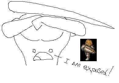
Explaining how to make it look better would take WAY TOO LONG and is better done by example, WHICH I AM NOT GOING TO BOTHER WITH at this very moment because it's 1:48 AM.
LASTLY, New hair, Metal circlet (Not sure why you're saying headband.) or Open face mask would do the trick just as well. Maybe I'll scribble examples for all this crap.
Both the shield and the sprite are two point and that's all well and good, UNTIL YOU GET INTO ANGLES.
Your shield looks like it's resting on the side of his forearm, to be more specific it looks like it's resting along the Brachioradialis, a muscles that runs along the inside of your forearm, as such the shield looks like it is facing up at the sky instead of covering our intrepid heroes fleshy meat organs. Also looks like it's trying to merge into his face and has devoured his upper arm.
Par'don my incredibly hasty mouse scribble that I aborted onto MS-Paint in 5 seconds.
Explaining how to make it look better would take WAY TOO LONG and is better done by example, WHICH I AM NOT GOING TO BOTHER WITH at this very moment because it's 1:48 AM.
LASTLY, New hair, Metal circlet (Not sure why you're saying headband.) or Open face mask would do the trick just as well. Maybe I'll scribble examples for all this crap.
Title:
Post by: DarthPaul on January 15, 2009, 01:00:30 pm
Post by: DarthPaul on January 15, 2009, 01:00:30 pm
Some words are forgotten on a moment notice, but circlet is a good way to put it. Nice pic too.
Title:
Post by: Effephoenix on January 15, 2009, 04:18:34 pm
Post by: Effephoenix on January 15, 2009, 04:18:34 pm
Gah! I've been exposed.
Fine, I'll get off my lazy ass and work the angle.
Hair... uh, I'll just make it hanging around his face like he hasn't gotten it cut in awhile, but still keeps it short.
Fine, I'll get off my lazy ass and work the angle.
Hair... uh, I'll just make it hanging around his face like he hasn't gotten it cut in awhile, but still keeps it short.
Title:
Post by: Archael on January 15, 2009, 04:28:08 pm
Post by: Archael on January 15, 2009, 04:28:08 pm
Weird, the angle looks OK to me...
Why don't you to work together on it HUH
Why don't you to work together on it HUH
Title:
Post by: Curu on January 20, 2009, 09:28:02 pm
Post by: Curu on January 20, 2009, 09:28:02 pm
Because Voldemort asked nicely.
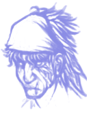
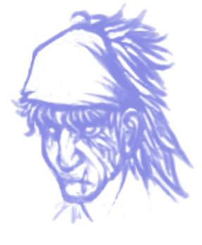
One of the quick messy sketches I did up for how I thought the Warder's portrait might look nicer.
One of the quick messy sketches I did up for how I thought the Warder's portrait might look nicer.
Title:
Post by: Cheetah on January 20, 2009, 09:37:50 pm
Post by: Cheetah on January 20, 2009, 09:37:50 pm
He is most assuredly beat to hell. I will definitely look forward to how this turns out.
Title:
Post by: Archael on January 20, 2009, 09:48:52 pm
Post by: Archael on January 20, 2009, 09:48:52 pm
deffo
Title:
Post by: dwib on January 20, 2009, 10:34:39 pm
Post by: dwib on January 20, 2009, 10:34:39 pm
i thought the angle looked fine, curu is very technical lol. this is going to be the most BA class...
Title:
Post by: LastingDawn on January 20, 2009, 10:36:29 pm
Post by: LastingDawn on January 20, 2009, 10:36:29 pm
Hmm... it will be a pretty interesting class, especially with Razele's new defense hack.
Title:
Post by: Effephoenix on January 25, 2009, 07:12:18 am
Post by: Effephoenix on January 25, 2009, 07:12:18 am
I couldn't think of a new hairdo. So I went searching for one! I thought, whose hair is badass?
Then it hit me, whose else hair other than the manliest of them all, Solid Snake.
In a word;
MULLEEEEEEEET

Also; fixed shield angle.
Then it hit me, whose else hair other than the manliest of them all, Solid Snake.
In a word;
MULLEEEEEEEET
Also; fixed shield angle.
Title:
Post by: Archael on January 25, 2009, 10:01:57 am
Post by: Archael on January 25, 2009, 10:01:57 am
now he looks younger
is that a hairband?
is that a hairband?
Title:
Post by: Effephoenix on January 25, 2009, 10:04:16 am
Post by: Effephoenix on January 25, 2009, 10:04:16 am
Everyone was raving 'METAL HEADBAND RAWR' so I abided.
Title:
Post by: dwib on January 25, 2009, 02:32:42 pm
Post by: dwib on January 25, 2009, 02:32:42 pm
the mullet looks bomb. good work!
Title:
Post by: CidIII on January 27, 2009, 08:24:10 pm
Post by: CidIII on January 27, 2009, 08:24:10 pm
Did you make your avatar armor yourself? If so, nice job.
Also, it's looking better and better, keep up the good work
Also, it's looking better and better, keep up the good work
Title:
Post by: LastingDawn on February 01, 2009, 03:55:47 pm
Post by: LastingDawn on February 01, 2009, 03:55:47 pm
The hair is nice, but indeed, it makes him look a bit young (the procrastination never ends, I know...), maybe if it were... slightly grayed?
Title:
Post by: Effephoenix on February 04, 2009, 08:02:53 pm
Post by: Effephoenix on February 04, 2009, 08:02:53 pm
Okay, I'm obviously a bit confused here. Is the Warder going to be a playable class, or enemy-specific? Because if its going to be playable, well, it'd be kind of weird to have a unit go from old/young periodically.
Title:
Post by: Archael on February 04, 2009, 09:51:11 pm
Post by: Archael on February 04, 2009, 09:51:11 pm
playable
Title:
Post by: LastingDawn on February 04, 2009, 11:18:06 pm
Post by: LastingDawn on February 04, 2009, 11:18:06 pm
Playable yes, but remember you only have Rad and Ramza in your party at any given time, which will always keep their unique sprites.
Title:
Post by: warrioroflight on February 19, 2009, 11:19:48 pm
Post by: warrioroflight on February 19, 2009, 11:19:48 pm
The arm shield reminds me of Yasutora Sado from Bleach... Maybe use that for the weapon?
Title:
Post by: LastingDawn on February 19, 2009, 11:21:27 pm
Post by: LastingDawn on February 19, 2009, 11:21:27 pm
Well, the Arm Shield is just there for style, in the same essence of the armguard on the male Archer, it does serve the purpose though of always being up in his continual defense stance though.
Title:
Post by: LastingDawn on March 08, 2009, 08:40:45 am
Post by: LastingDawn on March 08, 2009, 08:40:45 am
Update on first post, a finally chosen skillset, but now I need a Secret Skill, any thoughts?
Title:
Post by: boomkick on March 08, 2009, 12:16:30 pm
Post by: boomkick on March 08, 2009, 12:16:30 pm
Mighty Guard- At the cost of mana, he shields himself and his allies from certain death. 1 AOE Auto-Self-Targeting Adds: Protect, Shell, Regen (50% each).
Title:
Post by: Archael on May 13, 2009, 04:14:59 pm
Post by: Archael on May 13, 2009, 04:14:59 pm
gonna start working on finishing this sprite and getting a concept everyone likes, basing it on Curu's idea

Title:
Post by: Asmo X on May 14, 2009, 12:33:38 am
Post by: Asmo X on May 14, 2009, 12:33:38 am
cool. but the armour is too complicated
Title:
Post by: Archael on July 08, 2009, 08:16:33 pm
Post by: Archael on July 08, 2009, 08:16:33 pm
Quote from: "Asmo X"cool. but the armour is too complicated
yeah
it could be simpler and better
Title:
Post by: MiKeMiTchi on August 06, 2009, 04:31:23 am
Post by: MiKeMiTchi on August 06, 2009, 04:31:23 am
This sprite is better for the Warder:
Just add some details.
Quote
Just add some details.
Title:
Post by: LastingDawn on August 06, 2009, 11:57:57 am
Post by: LastingDawn on August 06, 2009, 11:57:57 am
The only problem with it is that it's missing the Large shield, which is meant to characterize the Warder.
Title:
Post by: MiKeMiTchi on August 06, 2009, 12:34:53 pm
Post by: MiKeMiTchi on August 06, 2009, 12:34:53 pm
The color count is 33 currently. Is that possible?
Title:
Post by: LastingDawn on August 06, 2009, 12:42:30 pm
Post by: LastingDawn on August 06, 2009, 12:42:30 pm
Heh... no, not one bit. Sometimes Curu had went a little overboard with colors and the like, or it could be the tool you're using is giving you incorrect colors.
Title:
Post by: MiKeMiTchi on August 06, 2009, 12:59:54 pm
Post by: MiKeMiTchi on August 06, 2009, 12:59:54 pm
I see.. I think that's only a minor problem for sprites like that..
when you save it to 16 colors, Graphicsgale will automatically adjust the colors. *I think*
when you save it to 16 colors, Graphicsgale will automatically adjust the colors. *I think*
Title: Re: Warder Job Thread (Finalized skillset)
Post by: Kagebunji on August 02, 2010, 12:06:22 pm
Post by: Kagebunji on August 02, 2010, 12:06:22 pm
Actually, they don't have sprite, aye? Maybe I can do something then? Btw, is hood acceptable?
Title: Re: Warder Job Thread (Finalized skillset)
Post by: LastingDawn on August 02, 2010, 12:22:24 pm
Post by: LastingDawn on August 02, 2010, 12:22:24 pm
For the female (as a semi-reference to Meliadoul) a hood is fine, I'm not very fond of it for the idea of males though.
Title: Re: Warder Job Thread (Finalized skillset)
Post by: Kagebunji on August 02, 2010, 12:36:12 pm
Post by: Kagebunji on August 02, 2010, 12:36:12 pm
I already work on a helm for male, it will be something like Cross Helm, and I have a suitable hair for Female, no worries. Damn, I wanna work on sprites again
Title: Re: Warder Job Thread (Finalized skillset)
Post by: Kagebunji on August 02, 2010, 02:08:24 pm
Post by: Kagebunji on August 02, 2010, 02:08:24 pm
I rejected the idea of Cross Helm, and I gave him simple hair. It is armored, and pretty easy to do. I personally would like to change something, I have no idea what though. Crits and ideas plz.
Title: Re: Warder Job Thread (Finalized skillset)
Post by: LastingDawn on August 02, 2010, 04:12:35 pm
Post by: LastingDawn on August 02, 2010, 04:12:35 pm
Definitely an armored look, but something looks off on that left foot... It doesn't seem complete to me for some reason or another.
Title: Re: Warder Job Thread (Finalized skillset)
Post by: Kagebunji on August 02, 2010, 04:13:50 pm
Post by: Kagebunji on August 02, 2010, 04:13:50 pm
Hm? His left or our? I can fix it anytime, this is pretty easy and nice sprite.
Title: Re: Warder Job Thread (Finalized skillset)
Post by: LastingDawn on August 02, 2010, 04:17:04 pm
Post by: LastingDawn on August 02, 2010, 04:17:04 pm
Our left, the foot looks a little incomplete. Also is it possible to give him Izlude like eyes? I expect Warder's to seem pretty determined.
Title: Re: Warder Job Thread (Finalized skillset)
Post by: Kagebunji on August 02, 2010, 04:25:44 pm
Post by: Kagebunji on August 02, 2010, 04:25:44 pm
Izlude's eyes don't differ much, but sure, I will copy them directly. And I know what part you mean(on his leg), armor got in my way and that is why it looks like this, heh.
Title: Re: Warder Job Thread (Finalized skillset)
Post by: Kagebunji on August 03, 2010, 01:34:00 pm
Post by: Kagebunji on August 03, 2010, 01:34:00 pm
Fixed his leg, copied Izlude's face, and did two more poses.
Title: Re: Warder Job Thread (Finalized skillset)
Post by: LastingDawn on August 03, 2010, 02:44:33 pm
Post by: LastingDawn on August 03, 2010, 02:44:33 pm
Hmm, is it just me or in the left facing one is his face sticking out too far? I really like the front facing one, but my only real critique currently is that he looks too young. Is it possible to make him look a bit older? Perhaps some facial hair?
Title: Re: Warder Job Thread (Finalized skillset)
Post by: Kagebunji on August 03, 2010, 03:29:50 pm
Post by: Kagebunji on August 03, 2010, 03:29:50 pm
Hehe, I quess using 10 yo boy head MADE him look young. I had some trouble with choosing head and hair, so I took the boy and altered him. I can choose other head and hair, just gimme some time. Oh, and are you okay with a beard? Long one, like Simon's. It would give him more serious look plus he would look older and like a veteran soldier.
Title: Re: Warder Job Thread (Finalized skillset)
Post by: LastingDawn on August 03, 2010, 03:32:55 pm
Post by: LastingDawn on August 03, 2010, 03:32:55 pm
A beard is perfectly fine. A Veteran Soldier is the preferred way for him to lool.
Title: Re: Warder Job Thread (Finalized skillset)
Post by: Archael on August 03, 2010, 03:57:13 pm
Post by: Archael on August 03, 2010, 03:57:13 pm
shield
the whole point of this job and sprite is the shield
the whole point of this job and sprite is the shield
Title: Re: Warder Job Thread (Finalized skillset)
Post by: Kagebunji on August 03, 2010, 04:02:15 pm
Post by: Kagebunji on August 03, 2010, 04:02:15 pm
Shield would be a pain in the ass on walking frames and damage-related one. There would be high possibility it would exceed the size one arm is permitted to have. Besides it would clash with weapons in-game(an if he were to use shield...oh g0d that would be hillarious). So forget about that shield, adding shields, swords etc makes sprite look bad.
Title: Re: Warder Job Thread (Finalized skillset)
Post by: Archael on August 03, 2010, 04:03:45 pm
Post by: Archael on August 03, 2010, 04:03:45 pm
you don't seem to understand... this job was my idea originally along with arbalist
Warders are always in defending stance
the arm shield is the point of this job, to always be defending and reduce all dmg by 25%
no shield = no warder = an entirely different concept
Warders are always in defending stance
the arm shield is the point of this job, to always be defending and reduce all dmg by 25%
no shield = no warder = an entirely different concept
Title: Re: Warder Job Thread (Finalized skillset)
Post by: Kagebunji on August 03, 2010, 04:06:24 pm
Post by: Kagebunji on August 03, 2010, 04:06:24 pm
So it practicaly needs five basic frames, dead, critical, and that is all? Lol
Title: Re: Warder Job Thread (Finalized skillset)
Post by: Archael on August 03, 2010, 04:07:10 pm
Post by: Archael on August 03, 2010, 04:07:10 pm
no it needs walking frames too, because they walk while moving
they just won't walk while standing, cuz they are in permanent defend status
they just won't walk while standing, cuz they are in permanent defend status
Title: Re: Warder Job Thread (Finalized skillset)
Post by: Kagebunji on August 03, 2010, 04:40:11 pm
Post by: Kagebunji on August 03, 2010, 04:40:11 pm
Bleh, I will continue with this sprite, if LD won't like it, it can always be some custom job. Adding a shield to a sprite is not sounding good to me for some reason, sorry.
Title: Re: Warder Job Thread (Finalized skillset)
Post by: scatttman on August 03, 2010, 06:11:15 pm
Post by: scatttman on August 03, 2010, 06:11:15 pm
so i used curu original sprite but for my taste it has little amount of colors so i merged with the shrine knight armor and added the shield i like how it looks i worked on the neck too
 16 colors
16 colors
Title: Re: Warder Job Thread (Finalized skillset)
Post by: Kagebunji on August 03, 2010, 06:23:24 pm
Post by: Kagebunji on August 03, 2010, 06:23:24 pm
Yeah it looks cool, Curu did great job with her Warder. Blue is a bit dark, but it is not much of a issue. Good luck with rest of the sprite!
Title: Re: Warder Job Thread (Finalized skillset)
Post by: Archael on August 03, 2010, 09:41:11 pm
Post by: Archael on August 03, 2010, 09:41:11 pm
perfect
Title: Re: Warder Job Thread (Finalized skillset)
Post by: LastingDawn on August 03, 2010, 10:12:57 pm
Post by: LastingDawn on August 03, 2010, 10:12:57 pm
Quote from: "scatttman"so i used curu original sprite but for my taste it has little amount of colors so i merged with the shrine knight armor and added the shield i like how it looks i worked on the neck too
If the original concept can be carried forth than so be it. There's much room for custom jobs and custom characters, so that's no trouble.
Title: Re: Warder Job Thread (Finalized skillset)
Post by: scatttman on August 03, 2010, 11:34:43 pm
Post by: scatttman on August 03, 2010, 11:34:43 pm
i can work on this sprite but i need to know what sprite curu used as base btw yes blue is too dark but i was thinking to make it red anyways
i tryed to make it look like this guy

i tryed to make it look like this guy
Title: Re: Warder Job Thread (Finalized skillset)
Post by: LastingDawn on August 03, 2010, 11:49:35 pm
Post by: LastingDawn on August 03, 2010, 11:49:35 pm
A very nice picture, all of Curu's work was custom, if memory serves right. So you will likely not find any references.
Title: Re: Warder Job Thread (Finalized skillset)
Post by: mav on August 05, 2010, 01:24:59 am
Post by: mav on August 05, 2010, 01:24:59 am
Sprite looks good, just give him the angry eyes and remove that dark blue line on his shield. Honestly though, I'd prefer if he looked less like a shrine knight. Is there a way to make his face look fatter?
Title: Re: Warder Job Thread (Finalized skillset)
Post by: scatttman on August 06, 2010, 02:26:23 am
Post by: scatttman on August 06, 2010, 02:26:23 am
ok i think you were right he looks a little too much like shrine knight i worked on that but the color amount change now it has 15 colors and tryed to de side view but doesnt turn out too well


Title: Re: Warder Job Thread (Finalized skillset)
Post by: LastingDawn on August 07, 2010, 04:00:54 pm
Post by: LastingDawn on August 07, 2010, 04:00:54 pm
Eh, little things like that can come in time. You should work with the poses you feel more comfortable with. I really like the new one you have though. That half-mantle thing looks pretty good.
Title: Re: Warder Job Thread (Finalized skillset)
Post by: scatttman on August 08, 2010, 11:38:11 pm
Post by: scatttman on August 08, 2010, 11:38:11 pm
update what do u think ?

Title: Re: Warder Job Thread (Finalized skillset)
Post by: LastingDawn on August 08, 2010, 11:54:32 pm
Post by: LastingDawn on August 08, 2010, 11:54:32 pm
Hmm... not bad! As I said I love that design and it seems to be coming along great! As we said, any thought of giving him facial hair?
Title: Re: Warder Job Thread (Finalized skillset)
Post by: Cheetah on August 09, 2010, 08:12:58 pm
Post by: Cheetah on August 09, 2010, 08:12:58 pm
Very nice design. It is always easier to add facial hair than to remove it though, so just due it later on in the process either way I say. Considering how many designs for this job have been done, very few of them have even looked decent and this one is awesome. How are you going to do the arms though?
Title: Re: Warder Sprite Thread
Post by: scatttman on August 09, 2010, 10:38:52 pm
Post by: scatttman on August 09, 2010, 10:38:52 pm
im doing custom arms but i use a shrine knight base but still its a little hard the arms and mostly the chest.
ps: i liked the head that curu did but im not that good so i use the 20yearsMAN head if someone but can be replaced later.
ps: i liked the head that curu did but im not that good so i use the 20yearsMAN head if someone but can be replaced later.
Title: Re: Warder Sprite Thread
Post by: LastingDawn on August 09, 2010, 10:41:29 pm
Post by: LastingDawn on August 09, 2010, 10:41:29 pm
Ah, don't worry about that for the moment, Cheetah's right. Once we get the base finished and all of that, the rest will fall into place.
Title: Re: Warder Sprite Thread
Post by: Cheetah on August 09, 2010, 11:07:38 pm
Post by: Cheetah on August 09, 2010, 11:07:38 pm
His loincloth may be a bit too dark. I thought that the outline was too bright at first, but found your shading to be spot on there. But no that I look at it again and still find it a bit clashing I think that it is the loincloth that is too dark instead.
Title: Re: Warder Sprite Thread
Post by: Archael on August 19, 2010, 03:08:43 pm
Post by: Archael on August 19, 2010, 03:08:43 pm
is there a finished sprite of this?
with the shield?
polish aside, that sprite is perfect for the job
Title: Re: Warder Sprite Thread
Post by: Kagebunji on August 19, 2010, 03:36:00 pm
Post by: Kagebunji on August 19, 2010, 03:36:00 pm
Scatt fell silent all of a sudden, I hope he didn't abandon this.