Title: Seushiro's Sprites... Redoing some sprites
Post by: Seushiro on August 19, 2009, 12:12:50 am
Post by: Seushiro on August 19, 2009, 12:12:50 am
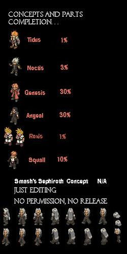
Here is the summary of my Crap:
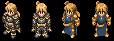
Female Zalbag:

Agrias Knights:

Vash the Stampede:

Treize:


Org XIII:

Vahn:

Ramza:
Sephiroth: Smash Concept
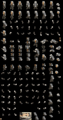
Marche Concept
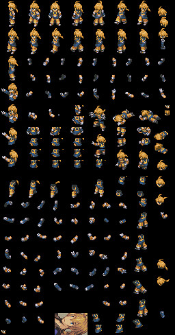
Ryu:
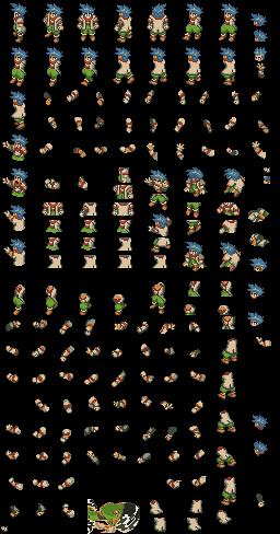
Old Avatar:

Seushiro:
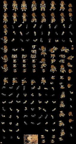
Reno:

Fei Fong Wong:

Izlude:


Iron Man:

Strider:

Cavalier:
Chunli:

Charlie/Bison/Cammy:

Charlie:


Ken:

2 Very first sprites as a beginner on 8/22/2009
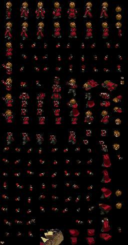


Female Zalbag:
Agrias Knights:
Vash the Stampede:
Treize:
Org XIII:
Vahn:
Ramza:
Sephiroth: Smash Concept
Marche Concept
Ryu:
Old Avatar:
Seushiro:
Reno:
Fei Fong Wong:
Izlude:
Iron Man:
Strider:
Cavalier:
Chunli:
Charlie/Bison/Cammy:
Charlie:
Ken:
2 Very first sprites as a beginner on 8/22/2009
Title:
Post by: Clementine on August 19, 2009, 12:19:17 am
Post by: Clementine on August 19, 2009, 12:19:17 am
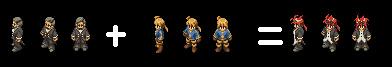
You need to make the resolution on these a lot bigger. I don't know what you did, but they shouldn't be this tiny. I can hardly see them, and my screen is huge.
Also, post them in PNG.
Also, post them in PNG.
Title:
Post by: MiKeMiTchi on August 19, 2009, 12:30:38 am
Post by: MiKeMiTchi on August 19, 2009, 12:30:38 am
Welcome to the site. 
Those were great edits. Haha.
Just make it bigger as Clementine said.
Those were great edits. Haha.
Just make it bigger as Clementine said.
Title:
Post by: RolyTunedIn on August 19, 2009, 12:47:09 am
Post by: RolyTunedIn on August 19, 2009, 12:47:09 am
i dont know about you guys but it looks normal to me... but anyways i like the genesis sprite, it still needs work on it though and squall needs alot of work done...
Title:
Post by: Zozma on August 19, 2009, 02:06:30 am
Post by: Zozma on August 19, 2009, 02:06:30 am
but the portraits, do you plan to make fft style ones?
Title:
Post by: Seushiro on August 19, 2009, 02:17:38 am
Post by: Seushiro on August 19, 2009, 02:17:38 am
I dnt know how to make portraits. . .
In both of them all i got was. . .. FAIL
In both of them all i got was. . .. FAIL
Title:
Post by: Kagebunji on August 19, 2009, 02:22:19 am
Post by: Kagebunji on August 19, 2009, 02:22:19 am
Good concept of Genesis, work on him a bit and he will look just great, about Squall... I can't see anything 
Title:
Post by: Clementine on August 19, 2009, 02:30:57 am
Post by: Clementine on August 19, 2009, 02:30:57 am
The Genesis one is good. Squall, not so much. He looks flat, and like a cartoon. |:
Title:
Post by: Luiakyn on August 19, 2009, 09:20:29 am
Post by: Luiakyn on August 19, 2009, 09:20:29 am
^^ exactly. I'd trade out that yellow on his jacket for another shade of gray. Aside from that, they look awesome >: D
Title:
Post by: Xifanie on August 19, 2009, 10:20:46 am
Post by: Xifanie on August 19, 2009, 10:20:46 am
On squall:
- Don't use black as an outline color for hair; ever.
- The Black shading looks reversed?
- The white is way too light.
- Needs darker hair.
On Genesis:
- The "light circle on his hair" needs to be a little darker; And personally I don't think it's necessary, it would probably look better without it.
The reason you guys probably can't see them well is probably just because of the darker colors used.
But yeah good work; especially on the Genesis sprite.
Title:
Post by: Asmo X on August 19, 2009, 11:34:08 am
Post by: Asmo X on August 19, 2009, 11:34:08 am
The Genesis sprite isn't bad for a first-timer. You seen to have trouble lining things up diagonally and you make the classic mistake of over saturating some areas.
The Squall should just be redone from scratch. Never use black as an outline. Its for deep shading. If you are making a new sprite, copy and paste from existing sprites to get something close to what you want and then make very small changes. Also try not to come up with your own palettes right away. Its way harder than it looks. If you want a series of blues for example, copy them from another sprite.
The Squall should just be redone from scratch. Never use black as an outline. Its for deep shading. If you are making a new sprite, copy and paste from existing sprites to get something close to what you want and then make very small changes. Also try not to come up with your own palettes right away. Its way harder than it looks. If you want a series of blues for example, copy them from another sprite.
Title:
Post by: Seushiro on August 19, 2009, 08:01:24 pm
Post by: Seushiro on August 19, 2009, 08:01:24 pm
Thanks for the feedback. . . and yup each statement is true. . . looking at it right now doing the fixes from ur advise would really make it good. . . thanks for the tips.
Title:
Post by: DarthPaul on August 19, 2009, 08:12:45 pm
Post by: DarthPaul on August 19, 2009, 08:12:45 pm
I'm not sure how to say this exactly. So here goes. Squalls hair is too tidy.
Title:
Post by: Archael on August 20, 2009, 02:12:37 pm
Post by: Archael on August 20, 2009, 02:12:37 pm
dude, the genesis sprite is great for a first timer... I don't think I could do better my first time around
good job, andI hope to see these improve, especially that Genesis one.. I like it alot
good job, andI hope to see these improve, especially that Genesis one.. I like it alot
Title:
Post by: Kagebunji on August 20, 2009, 02:24:50 pm
Post by: Kagebunji on August 20, 2009, 02:24:50 pm
Genesis sprite is good indeed, just try to make his face when he take damage less "WTF is goin on?!", or you just want him to look like that?
Title:
Post by: Seushiro on August 21, 2009, 10:01:18 pm
Post by: Seushiro on August 21, 2009, 10:01:18 pm
Have to do Genesis from the top too. . . He has the soldier belt, buckled boots, and an open coat with collar. I think I was thinking of Sephiroth's coat during the time. . .
here is wat I have done with my boredom. . .

here is wat I have done with my boredom. . .
Title:
Post by: Zalge on August 21, 2009, 10:06:12 pm
Post by: Zalge on August 21, 2009, 10:06:12 pm
o.o Reno?! Awesome!
Nice going, you gunna finish it? I'll try to make a portrait for it xD
Nice going, you gunna finish it? I'll try to make a portrait for it xD
Title:
Post by: SilvasRuin on August 21, 2009, 10:06:40 pm
Post by: SilvasRuin on August 21, 2009, 10:06:40 pm
Looks like you could go from there and make a pretty good Reno.
Edit: Dang, Zalge beat me to it.
Edit: Dang, Zalge beat me to it.
Title:
Post by: Seushiro on August 21, 2009, 10:08:28 pm
Post by: Seushiro on August 21, 2009, 10:08:28 pm
No Reno possible. . . unless somebody has a complete sprite of that butler. . . wew
Title:
Post by: Zozma on August 21, 2009, 10:22:27 pm
Post by: Zozma on August 21, 2009, 10:22:27 pm
the custom cloud sprite has pants similar (elmdor's pants are almost the butler pants as well) just to give an idea for parts
Title:
Post by: Seushiro on August 21, 2009, 10:32:50 pm
Post by: Seushiro on August 21, 2009, 10:32:50 pm
i'll look into that. . . and the hands will be the only problem. . . grr!!!
i want to edit the walking arms to make one hand in the pocket and the other with a baton bumping the shoulder while walking. . .
well since I'm stooped with Genesis might as well start searching the parts. . . i'll try to get my Baltier sprite to see the white sleeves and hands...
*edit
tested the walk with Ramza ch 1 and so far so good. .. no Baton T__T
Title:
Post by: RolyTunedIn on August 22, 2009, 01:58:55 am
Post by: RolyTunedIn on August 22, 2009, 01:58:55 am
reno is looking good but there's something that bothers me about it... the one where he is facing directly towards us, his goggle seem smaller than the rest, and thethe one where he is facing away is missing his ponytail. you might have already caught that but i thought i should point it out.
Title:
Post by: Kagebunji on August 22, 2009, 07:25:08 am
Post by: Kagebunji on August 22, 2009, 07:25:08 am
Reno is looking very impressive, but Roly was right, fix that cause it look strange. Btw, you want me to believe you are newbie in spriting? No way 
Title:
Post by: MiKeMiTchi on August 22, 2009, 07:41:04 am
Post by: MiKeMiTchi on August 22, 2009, 07:41:04 am
Work on the shadings and anti-aliasing on the hair.
Title:
Post by: Asmo X on August 22, 2009, 09:01:46 am
Post by: Asmo X on August 22, 2009, 09:01:46 am
Make the hairstyle a little less ambitious. It otherwise looks good.
Title:
Post by: Cheetah on August 22, 2009, 11:45:58 am
Post by: Cheetah on August 22, 2009, 11:45:58 am
Very nice concept, keep it up.RolyTunedin and everyone's criticism was spot on.
The inside of his palms are way to dark when he has the raised. You can always check to see if an existing character has similar arms, chap 1 Ramza might be a good bet.
The inside of his palms are way to dark when he has the raised. You can always check to see if an existing character has similar arms, chap 1 Ramza might be a good bet.
Title:
Post by: Seushiro on August 22, 2009, 10:43:28 pm
Post by: Seushiro on August 22, 2009, 10:43:28 pm
Few more parts to go. . . then I'll fix it based upon your comments. . . anybody knows where to get boot graphics similar for a Fayt Leingod? Ramza ch 4 palette looks great for a Fayt sprite just need his freakin' boots. . .
Title:
Post by: Seushiro on August 24, 2009, 09:38:31 pm
Post by: Seushiro on August 24, 2009, 09:38:31 pm
COncepts for now. . .
I'm having slow progress in making sprites now. . . I'm trying to learn how to make portraits from the the tutorials
I'm having slow progress in making sprites now. . . I'm trying to learn how to make portraits from the the tutorials
Title:
Post by: Cheetah on August 24, 2009, 09:45:34 pm
Post by: Cheetah on August 24, 2009, 09:45:34 pm
These are very nice ideas, but the proportions seem a bit off for some reason. I'm not quite sure what it is. I will post more specific comments later. I'm excited for Reno though.
Title:
Post by: Zalge on August 24, 2009, 09:45:37 pm
Post by: Zalge on August 24, 2009, 09:45:37 pm
I'll try to make a Reno portrait for ya.
Title:
Post by: RolyTunedIn on August 24, 2009, 11:35:05 pm
Post by: RolyTunedIn on August 24, 2009, 11:35:05 pm
i was taking a look at your concepts, and in my opinion the best looking sprite you got is squall although his fur on the jacket was white, wasnt it? well anyways i think they are all very nice ideas but, tidus and roxas seems to bother me alot... they seem flat and i know roxas hair is supposed to be messy but it's a mess... as for angeal you can use clouds body for a base and genesis neck looks kind of hunched... other than that its pretty good... it was kind of funny, i was planning on working on angeal and genesis one of these days, i even drew out portraits for them.
Title:
Post by: Cheetah on August 24, 2009, 11:40:52 pm
Post by: Cheetah on August 24, 2009, 11:40:52 pm
Tidus: His arms look to long, his feet too big, and his hair needs more texture or something.
Noctis: Looks too much like a little kid.
Genesis: Shoulder pads look a bit too big.
Angeal: Hair needs some definite work.
Roxis: Definitely the worst of the bunch.
Squal: I can't quite put my finger on it. Other than white around the collar.
Sephiroth: Smash was all about giving tools for people to work with. Finish Sephiroth and everyone will thank you.
Overall these are very ambitious and cool. Keep up the good work.
Title:
Post by: RolyTunedIn on August 24, 2009, 11:49:26 pm
Post by: RolyTunedIn on August 24, 2009, 11:49:26 pm
looking at it again squall's legs look too short... as for the sephiroth sprite, his front view looks funny and his pants don't look right in some of it. i see your putting alot of effort into these, but work on one at a time and you'll finish a sprite faster.
Title:
Post by: Asmo X on August 25, 2009, 12:02:30 am
Post by: Asmo X on August 25, 2009, 12:02:30 am
You're trying to do too much with the hair. It just isn't going to look good no matter how bad you want it to. Think simple. You violate this rule most egregiously on the Tidus sprite. Look at it my man. What on earth is going on with that costume? Understand that there are some things that just aren't going to work scaled down to the size of a FFT sprite.
Cheetah: For Squall, the chest is shaded flatly. Short, dumpy legs and super long arms.
Cheetah: For Squall, the chest is shaded flatly. Short, dumpy legs and super long arms.
Title:
Post by: Seushiro on August 25, 2009, 12:08:52 am
Post by: Seushiro on August 25, 2009, 12:08:52 am
yeah I'll focus on Sephiroth and Genesis cuz' I need sephy's arms as base. . .
I'll forget about squall. . . belt cant be placed since it does make the legs look smaller. . .
I dnt want to use the cloud base for Angeal since i want a crisis core style with darker colors. . . cloud FFT is too flat and needs more definition, he also seems to be in baggy pants and boots. . .
thanks for the info on the neck. . . must find a way to color it while showing the collar of the coat. . .
Hope Zalge does make a Portrait. . .
Title:
Post by: jimmyjw88 on August 25, 2009, 12:34:21 am
Post by: jimmyjw88 on August 25, 2009, 12:34:21 am
For Angeal base, you could try using Zack as a base and recolour it abit as Zack is abit blue while Angeal is black.
Looked over all your concepts and they are interesting ^^
Great job. I planned to make Genesis one day but I'm not really good at it ^^
Anyway, Genesis is looking good. About the Squall, I think its abit too out. I like the Tidus concept though ^^
But of course, still need alot of works to do. Sephiroth, its Smash work, and as always, AMAZING WORK ^^
The remaining two, I don't know who they are but like what Cheetah said.
Well, keep it up. Looking forward on this ^^
Title:
Post by: MiKeMiTchi on August 25, 2009, 02:15:31 am
Post by: MiKeMiTchi on August 25, 2009, 02:15:31 am
QuoteYou're trying to do too much with the hair. It just isn't going to look good no matter how bad you want it to. Think simple. You violate this rule most egregiously on the Tidus sprite. Look at it my man. What on earth is going on with that costume? Understand that there are some things that just aren't going to work scaled down to the size of a FFT sprite.
Yes. I suggest doing what Asmo said.
Make the hair simple. Use anti-aliasing..
KISS. Keep it simple, spriter!!
Title:
Post by: Zalge on August 25, 2009, 08:34:54 pm
Post by: Zalge on August 25, 2009, 08:34:54 pm
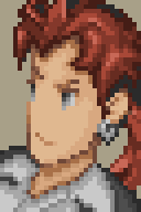
My first attempt at a Reno portrait. Clearly is based of Zozma's portrait. Its not as good as I would have hoped, but I was having huge trouble with the hair.
EDIT: I just realized I forgot the goggles and tatoo I'll add it in a moment.
Title:
Post by: ChronosAragami on August 25, 2009, 08:36:27 pm
Post by: ChronosAragami on August 25, 2009, 08:36:27 pm
Hey guy I liked the sprites, very good, would you could make a sora too?
Title:
Post by: mav on August 25, 2009, 08:40:44 pm
Post by: mav on August 25, 2009, 08:40:44 pm
Good portrait Zalge, though try making the hair a little less curvy and a wee bit more pointy. And should he have an earring?
Title:
Post by: Zalge on August 25, 2009, 08:47:30 pm
Post by: Zalge on August 25, 2009, 08:47:30 pm
It was based off Zozma, so the only thing I did to the hair was change the color and add the pony tail xD I'll try to edit the hair, but no promises.
and yes, he does have an earring: http://media.photobucket.com/image/reno ... tongue.jpg (http://media.photobucket.com/image/reno%20ff7/gelupeh/renotongue.jpg)
Second attempt: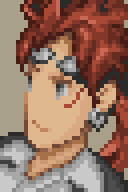
The goggles were a huge pain, compared to the hair, it was a breeze.
The goggles still don't look right. I'll fix it later.
and yes, he does have an earring: http://media.photobucket.com/image/reno ... tongue.jpg (http://media.photobucket.com/image/reno%20ff7/gelupeh/renotongue.jpg)
Second attempt:
The goggles were a huge pain, compared to the hair, it was a breeze.
The goggles still don't look right. I'll fix it later.
Title:
Post by: Sen on August 25, 2009, 10:01:33 pm
Post by: Sen on August 25, 2009, 10:01:33 pm
Squall's belt is thick that makes his legs too short

making the belt look like from this sprite opens space for his legs
making the belt look like from this sprite opens space for his legs
Title:
Post by: Seushiro on August 25, 2009, 10:09:17 pm
Post by: Seushiro on August 25, 2009, 10:09:17 pm
Nice work Zalge looks similar to the concept art.

and Sen i might actually use that squall instead and start from there if u dnt mind. perhaps losing the buckles on the belt and the legs is ok.
and Sen i might actually use that squall instead and start from there if u dnt mind. perhaps losing the buckles on the belt and the legs is ok.
Title:
Post by: Zalge on August 25, 2009, 10:11:40 pm
Post by: Zalge on August 25, 2009, 10:11:40 pm
Thanks for the compliment, Seu. I was actually using an advent children picture for reference, not the concept art xD.
Title:
Post by: Sen on August 25, 2009, 10:14:56 pm
Post by: Sen on August 25, 2009, 10:14:56 pm
You can do whatever you wan with that, it's not even mine
it be yours if you finished the spritesheet
it be yours if you finished the spritesheet
Title:
Post by: GeneralStrife on August 25, 2009, 10:25:11 pm
Post by: GeneralStrife on August 25, 2009, 10:25:11 pm
Real nice.
Title:
Post by: MiKeMiTchi on August 25, 2009, 10:38:54 pm
Post by: MiKeMiTchi on August 25, 2009, 10:38:54 pm
Nice attempt Zalge!
Just need to fix the goooooggles.
Just need to fix the goooooggles.
Title:
Post by: DarthPaul on August 25, 2009, 10:48:22 pm
Post by: DarthPaul on August 25, 2009, 10:48:22 pm
Anyone know why Reno has a red tattoo on the sides of his face?
Title:
Post by: Zalge on August 25, 2009, 10:49:40 pm
Post by: Zalge on August 25, 2009, 10:49:40 pm
Quote from: "darthpaul"Anyone know why Reno has red tattoo on the sides of his face?cause he's sexy. He donated to FFH.
Title:
Post by: Zozma on August 26, 2009, 12:04:34 am
Post by: Zozma on August 26, 2009, 12:04:34 am
i still think the ff7 characters made to resemble their original arts like the one of reno posted a few above, as opposed to AC, look better.. but thats just me
Title:
Post by: RolyTunedIn on August 26, 2009, 12:32:01 am
Post by: RolyTunedIn on August 26, 2009, 12:32:01 am
the reno portrait looks good, but i think that the bangs should be thinner and longer, in my opinion anyways... yea and the goggles do look kinda funny, i think it's tilting the wrong way.
Title:
Post by: DarthPaul on August 26, 2009, 12:47:05 am
Post by: DarthPaul on August 26, 2009, 12:47:05 am
Quote from: "Zozma"i still think the ff7 characters made to resemble their original arts like the one of reno posted a few above, as opposed to AC, look better.. but thats just me
I agree with you there. AC's style was cool but the original art looks more pleasing to the eye. That shows what a 10 year gap will do to something.
Though the Turks really didn't change because there is nothing to change. Their uniform is nice and plain. Reno wears his suit casual (as do I and anyone in the right state of mind) and the others do not. There is little to work with based on habits because they stick to a uniform. Which I like, it shows that they can stay organized even after the company they work for is destroyed. Also a sense of loyalty.
On another note I always though it funny that the chain of command in the Turks was:
Tseng -> Reno -> Rude -> Elena.
Who would think to have someone like Reno as a second in commend.
Title:
Post by: Zozma on August 26, 2009, 02:33:34 am
Post by: Zozma on August 26, 2009, 02:33:34 am
well if you think about it, the way they are modeled in AC looks slightly asian.
and my impression when first playing ff7 was that none of these characters besides yuffie were anywhere near asian.
(An Elena sprite would be nice) but the male tux sprite still needs to be completed
and my impression when first playing ff7 was that none of these characters besides yuffie were anywhere near asian.
(An Elena sprite would be nice) but the male tux sprite still needs to be completed
Title:
Post by: DarthPaul on August 26, 2009, 08:48:31 am
Post by: DarthPaul on August 26, 2009, 08:48:31 am
I think I see what you mean but I think that effect was caused by the animating style.
Title:
Post by: SilvasRuin on August 26, 2009, 11:30:33 am
Post by: SilvasRuin on August 26, 2009, 11:30:33 am
Reno is probably the best choice for second in command because he's the most competent and can take a command role, even if he has his quirks. Rude is more of a quiet follower than a leader most of the time, at least by my impression. The exception would be the poker/whatever guys in Junon saying it isn't a party without him.
I'm not sure his face and personality translate well into the FFT style portraits... While I can see the similarity to the concept art, it doesn't feel like Reno to me. Not sure just why that is though.
I'm not sure his face and personality translate well into the FFT style portraits... While I can see the similarity to the concept art, it doesn't feel like Reno to me. Not sure just why that is though.
Title:
Post by: mav on August 26, 2009, 01:21:13 pm
Post by: mav on August 26, 2009, 01:21:13 pm
Quote from: "RolyTunedIn"...but i think that the bangs should be thinner and longer, in my opinion anyways... yea and the goggles do look kinda funny, i think it's tilting the wrong way.I definitely agree on the bangs and I think the goggles look strange because they're also a wee bit too small.
Title:
Post by: Twinees on August 27, 2009, 04:07:55 am
Post by: Twinees on August 27, 2009, 04:07:55 am
 (http://img141.imageshack.us/i/tidusfifthteenth.png/)
Liked the look of the tidus sprite, so I thought id have a crack at it. Btw this is my first sprite... Not complete yet though. But I thought Zalge could have a go at the portrait because he did a great job with the Reno one.
Title:
Post by: Mental_Gear on August 27, 2009, 05:28:00 am
Post by: Mental_Gear on August 27, 2009, 05:28:00 am
The colour style seems a bit 'off'. More like an FFTA / A2 sprite than original FFT.
Title:
Post by: Twinees on August 27, 2009, 05:57:38 am
Post by: Twinees on August 27, 2009, 05:57:38 am
Do you mean by the hair and the shirt with the yellows? I guess I could change the hair to make it look more like Cloud's hair colours. And maybe use the red and blues from other fft characters.
Title:
Post by: Mental_Gear on August 27, 2009, 08:10:04 am
Post by: Mental_Gear on August 27, 2009, 08:10:04 am
Yeah, that's it, I just thought saying 'it's too light' would sound stupid.
Are you sure that's the size it'd look in-game? it seems small.
Asmo is probably going to throw a fit about the lack of shading though.
Are you sure that's the size it'd look in-game? it seems small.
Asmo is probably going to throw a fit about the lack of shading though.
Title:
Post by: Kagebunji on August 27, 2009, 09:13:48 am
Post by: Kagebunji on August 27, 2009, 09:13:48 am
Hair and his non-armored arm needs shading.
Title:
Post by: Mental_Gear on August 27, 2009, 09:28:03 am
Post by: Mental_Gear on August 27, 2009, 09:28:03 am
BTW congratulations on having a useful first post.
Title:
Post by: DarthPaul on August 27, 2009, 12:34:14 pm
Post by: DarthPaul on August 27, 2009, 12:34:14 pm
Quote from: "SilvasRuin"Reno is probably the best choice for second in command because he's the most competent and can take a command role, even if he has his quirks.
He is also the only Turk with full qualifications to pilot military vehicles. Particularly helicopters and tanks.
Title:
Post by: Mental_Gear on August 27, 2009, 01:26:24 pm
Post by: Mental_Gear on August 27, 2009, 01:26:24 pm
Which have yet to be implemented in FFT.
Title:
Post by: DarthPaul on August 27, 2009, 01:59:00 pm
Post by: DarthPaul on August 27, 2009, 01:59:00 pm
That's because FFT Takes place way in the future...Wait a minute while I ponder that retort...
Title:
Post by: Mental_Gear on August 27, 2009, 02:04:24 pm
Post by: Mental_Gear on August 27, 2009, 02:04:24 pm
Just saying. Kind of nullifies your point. And I think you meant 'past'.
Reno: "Tank giving you trouble? I'll shock the driver and take over the tank!"
Ramza: "A...what now?"
Reno: "Tank giving you trouble? I'll shock the driver and take over the tank!"
Ramza: "A...what now?"
Title:
Post by: DarthPaul on August 27, 2009, 02:08:33 pm
Post by: DarthPaul on August 27, 2009, 02:08:33 pm
I wasn't saying it in regards to FFT. Just in regards to him as a character.
He well rounded in his knowledge even if he doesn't seem to be. Based on looks and attitude.
EDIT: Though the time lines don't link up at all it is in the future as far as the Ivalice series is concerned. Just to clear things up, I don't feel like explaining the joke I tried to make.
He well rounded in his knowledge even if he doesn't seem to be. Based on looks and attitude.
EDIT: Though the time lines don't link up at all it is in the future as far as the Ivalice series is concerned. Just to clear things up, I don't feel like explaining the joke I tried to make.
Title:
Post by: Twinees on August 27, 2009, 10:45:02 pm
Post by: Twinees on August 27, 2009, 10:45:02 pm
Thanks for the ideas and changes that should be made. Instead of using cloud's hair colours, I decided to use Ramza's (mainly because one of cloud's hair colour is his skin colour. I also changed the skin colour to suit FFT style but I may change this to cloud's skin colour.
So here it is: New
 (http://img219.imageshack.us/i/tidusrevised.png/)
Old
(http://img141.imageshack.us/i/tidusfifthteenth.png/)
I hope the shading is better. Should i change the red and blues to suit FFT style?
Edit: Could someone help make a portrait for it? I'm completely hopeless with making them.
So here it is: New
(http://img219.imageshack.us/i/tidusrevised.png/)Old
(http://img141.imageshack.us/i/tidusfifthteenth.png/)I hope the shading is better. Should i change the red and blues to suit FFT style?
Edit: Could someone help make a portrait for it? I'm completely hopeless with making them.
Title:
Post by: Zalge on August 27, 2009, 10:51:26 pm
Post by: Zalge on August 27, 2009, 10:51:26 pm
Oi, the back view looks... oi. He looks WAY too wide in that frame. Tidus put on a few pounds, huh?
but really, all sarcasm aside. His backview does look a bit wide. Maybe trim some pixels on his shirt? Maybe its just because I'm sitting back.
An idea, next time you post a picture, keep a small copy to work on and just resize a copy larger so we can see the details better.
but really, all sarcasm aside. His backview does look a bit wide. Maybe trim some pixels on his shirt? Maybe its just because I'm sitting back.
An idea, next time you post a picture, keep a small copy to work on and just resize a copy larger so we can see the details better.
Title:
Post by: Twinees on August 27, 2009, 10:55:00 pm
Post by: Twinees on August 27, 2009, 10:55:00 pm
Yeah, his back view does seem a bit odd. And ill make the pictures bigger next time. And Zalge could you have a shot at making the Portrait? The Reno portrait you made looks great and I thought you would be able to do this one too.
Title:
Post by: MiKeMiTchi on August 27, 2009, 11:00:20 pm
Post by: MiKeMiTchi on August 27, 2009, 11:00:20 pm
I suggest you concentrate on making one sprite first.
If you don't care to do that, you'll be suprised it'll take long to finish something.
If you don't care to do that, you'll be suprised it'll take long to finish something.
Title:
Post by: Zalge on August 27, 2009, 11:00:38 pm
Post by: Zalge on August 27, 2009, 11:00:38 pm
This may be a challenge, like Reno, Tidus has very... unique hair. The rest shouldn't be the problem, I just have trouble with unique hair >.<
Title:
Post by: Twinees on August 27, 2009, 11:14:45 pm
Post by: Twinees on August 27, 2009, 11:14:45 pm
 (http://img217.imageshack.us/i/tidusrevised2.png/)
Ok, I moved the armoured arm down a fraction and made the other arm a bit thinner (also resized image).
One more thing, i have only used 15 colours (including black) so what would be the best colour to use for the 16th? Another skin colour? Another yellow for the shirt and shoes? a blue? or a red?
Edit: I'm going to fix the shading on the pants and chest.
Title:
Post by: Zalge on August 27, 2009, 11:20:41 pm
Post by: Zalge on August 27, 2009, 11:20:41 pm
Maybe another shade of white for the hood.
Alot of the shading looks kind of awkward...
Alot of the shading looks kind of awkward...
Title:
Post by: mav on August 27, 2009, 11:21:29 pm
Post by: mav on August 27, 2009, 11:21:29 pm
Looks unbelievably boxy...I think your shading has led to a colossal loss of depth, so fix it. And are you making his clothes and hair yourself? It's really tough and frankly you haven't quite hit the nail on the head. Use Ch. 2 Ramza's as a base for the hair, tweak it a bit and that'll be covered, though honestly I dunno where to get a good body base. Right now something's gone horribly awry...Maybe it's your outlining?
Title:
Post by: GeneralStrife on August 27, 2009, 11:23:24 pm
Post by: GeneralStrife on August 27, 2009, 11:23:24 pm
It's kind of boxy...just a little...looks good except the back frame....he looks like he has put on some weight.
Title:
Post by: Twinees on August 27, 2009, 11:31:04 pm
Post by: Twinees on August 27, 2009, 11:31:04 pm
By boxy you mean everything is separated by a black line? I might fix that up. I'll keep working on the back view.
Oh and i did use Ramza's hair for some views but the body wasn't made from any other character except the feet.
Edit: Maybe the male chemist jacket would be a good base for the shirt?
Oh and i did use Ramza's hair for some views but the body wasn't made from any other character except the feet.
Edit: Maybe the male chemist jacket would be a good base for the shirt?
Title:
Post by: RolyTunedIn on August 27, 2009, 11:32:32 pm
Post by: RolyTunedIn on August 27, 2009, 11:32:32 pm
the back view looks too wide, the first one looks too thin... they all look flat even though it is shaded
Title:
Post by: Seushiro on August 27, 2009, 11:58:38 pm
Post by: Seushiro on August 27, 2009, 11:58:38 pm
Tidus is quite ok. . . I'm actually playing Dissidia and wanting to do a Hero of Light sprite. . .
i think the shading is fine. looks fine in the PSP render. . . well chunky sprite but atleast he has the jumper chains and arm gear ^__^ nice thinking. . .
i think the shading is fine. looks fine in the PSP render. . . well chunky sprite but atleast he has the jumper chains and arm gear ^__^ nice thinking. . .
Title:
Post by: Twinees on August 28, 2009, 12:02:34 am
Post by: Twinees on August 28, 2009, 12:02:34 am
Good to hear from the person who made me want to do this ^^.
I'll post soon with some different versions of Tidus, as in the normal one, one with a chemist shirt etc.
I'll post soon with some different versions of Tidus, as in the normal one, one with a chemist shirt etc.
Title:
Post by: Seushiro on August 28, 2009, 01:04:47 am
Post by: Seushiro on August 28, 2009, 01:04:47 am
ooh. . just read it "edit. .. . Helpless with Portraits" -> ur not alone. . . dnt make me display a picture of a portrait FAIL!!!
Some concepts to spark more interests:
Shrine knights for ORG XIII members. . .
"We can open Kingdom Hearts with the Zodiac stones and become human"
for those who dnt know ORG XIII and need a bigger picture. ..

Some concepts to spark more interests:
Shrine knights for ORG XIII members. . .
"We can open Kingdom Hearts with the Zodiac stones and become human"
for those who dnt know ORG XIII and need a bigger picture. ..
Title:
Post by: ChronosAragami on August 28, 2009, 01:20:48 am
Post by: ChronosAragami on August 28, 2009, 01:20:48 am
I loved the idea! Kingdom Hearts forever!
Title:
Post by: Twinees on August 28, 2009, 01:40:51 am
Post by: Twinees on August 28, 2009, 01:40:51 am
 (http://img216.imageshack.us/i/tidusnormal.png/)
okay that is the original version
 (http://img216.imageshack.us/i/tidusrevamped.png/)
this is the new one.
What do you guys think? I used the chemist's top (which looks like it had a jacket) and cloud's legs. Not sure about the 'armoured arm' it looks like it is part of the jacket and not an armour piece. So I might change that depending on what you guys think.
Edit: Yes i'm surprised i managed to do 16 colours also.
Title:
Post by: Seushiro on August 28, 2009, 01:45:54 am
Post by: Seushiro on August 28, 2009, 01:45:54 am
somehow i like the small one's arms better since it is more detailed. . . i'd say keep the head and legs part of the second and merge it with the top of the first. . . *I TOOK BACK WHAT I SAID. .. THIS SPRITE IS POSSIBLE (OH YES 16 COLORS BOOYAH)* the middle of the second one makes him look like he has a jacket and outline and not the jumpers. . .
*edit the color for the red in the pants and gloves which is also the highlights of the hair should be changed to a lighter flesh so his face cud have a darker shade. . .
*edit the color for the red in the pants and gloves which is also the highlights of the hair should be changed to a lighter flesh so his face cud have a darker shade. . .
Title:
Post by: boomkick on August 28, 2009, 01:54:10 am
Post by: boomkick on August 28, 2009, 01:54:10 am
Quote from: "Seushiro"
Wheres Roxas?
Title:
Post by: SilvasRuin on August 28, 2009, 02:02:25 am
Post by: SilvasRuin on August 28, 2009, 02:02:25 am
The Xemnas sprite needs darker skin tones. It's too bad the berserker's scar won't translate well on to the sprite. He needs different hair though. I'm pretty sure you took that hair from Zack. It needs a lighter tone and a different style to match the person it is based on. Also... is that one before last supposed to be Sora? Sora never wore one of those cloaks. If you must make a Sora, use his KHII outfit, or make Wisdom and/or Final form. (If you make one or both of those and animate its gliding properly somehow, I will love you forever. Not quite sure if that is possible...)
Title:
Post by: Twinees on August 28, 2009, 02:07:13 am
Post by: Twinees on August 28, 2009, 02:07:13 am
 (http://img210.imageshack.us/i/tidusrevamped2.png/)
ok i changed the arm a bit and a little bit with his jacket thing.
Cheers.
His lower arm seems a bit to wide but ill see what you guys think.
Title:
Post by: Kagebunji on August 28, 2009, 02:27:57 am
Post by: Kagebunji on August 28, 2009, 02:27:57 am
His jacket looks odd now, look at the part of chest that is closer to us, it looks cetainly strange.
Title:
Post by: Twinees on August 28, 2009, 03:45:08 am
Post by: Twinees on August 28, 2009, 03:45:08 am
 (http://img215.imageshack.us/i/tidusrevised3.png/)
Which one should i continue with?
Thanks in advance.
Title:
Post by: Kagebunji on August 28, 2009, 04:33:41 am
Post by: Kagebunji on August 28, 2009, 04:33:41 am
First one don't have much details, and that's why he isn't good enough, second one has got great pants, but his head...third one is the best for me, just copy the pants of second one. Btw, 4th one look like bullshit(no offense in that).
Title:
Post by: Twinees on August 28, 2009, 05:18:50 am
Post by: Twinees on August 28, 2009, 05:18:50 am
Thanks for the ideas Kage, i'll get right on it and post back soon.
What about the boots? Do you like the boots on the third one or the second one?
Edit: I was going through some sprites and i saw the female thief's (which shows some leg at the bottom of the pants). So now i'm going to see what happens when i use that instead will post back soon.
What about the boots? Do you like the boots on the third one or the second one?
Edit: I was going through some sprites and i saw the female thief's (which shows some leg at the bottom of the pants). So now i'm going to see what happens when i use that instead will post back soon.
Title:
Post by: Kagebunji on August 28, 2009, 06:09:54 am
Post by: Kagebunji on August 28, 2009, 06:09:54 am
Definitly shoes of 2nd one, it resembles Tidus boots more.
Title:
Post by: Twinees on August 28, 2009, 06:39:50 am
Post by: Twinees on August 28, 2009, 06:39:50 am
 (http://img215.imageshack.us/i/tidusbest.png/)
I don't want to be too cocky but i think this is my best yet. I used the female thief's pants but changed them slightly.
I would really like to hear your opinions to make it better, but its pretty close to complete now I think.
I wonder if Zalge is still doing the portrait.
Edit: I think the pants may need to be one pixel longer on his left leg
Title:
Post by: MiKeMiTchi on August 28, 2009, 06:51:56 am
Post by: MiKeMiTchi on August 28, 2009, 06:51:56 am
twinees, the tidus sprite really looks fat, imo.
Also, the hair looks afro.
Also, the hair looks afro.
Title:
Post by: Twinees on August 28, 2009, 07:03:33 am
Post by: Twinees on August 28, 2009, 07:03:33 am
 (http://img156.imageshack.us/i/tidushair.png/)
I took your words into consideration but the only reason why he looks fat i think is because of his arm so i made it a bit thinner. Also which hair style do you prefer?
Title:
Post by: MiKeMiTchi on August 28, 2009, 08:04:58 am
Post by: MiKeMiTchi on August 28, 2009, 08:04:58 am
Use the Vaan sprite's hair.
Just lessen the saturation of the hair after that.
Also, it might be better if you use the Vaan sprite as the base image.
Just lessen the saturation of the hair after that.
Also, it might be better if you use the Vaan sprite as the base image.
Title:
Post by: RolyTunedIn on August 28, 2009, 09:09:25 am
Post by: RolyTunedIn on August 28, 2009, 09:09:25 am
they look pretty good, although axel dont have a ponytail, saix looks kind of funny(mainly the hair). your roxas looks really good compared to the old one, but their hoods dont need to stick out so much.
as for the tidus sprite, i think the hair looks okay. i like the boots, other than that it looks funny in a way.
Title:
Post by: mav on August 28, 2009, 11:19:50 am
Post by: mav on August 28, 2009, 11:19:50 am
Alright twinees, you're getting closer with the Tidus sprite, just don't rely on the dark outline. See the yellow on his shirt thing? That really shouldn't have the dark outline; use one of the browns from his hair. You might only have 16 colors, but that doesn't mean you can't double dip. Also his left arm looks strange: what angle is it at? In fact why are both arms sticking out?
Title:
Post by: Asmo X on August 28, 2009, 12:15:32 pm
Post by: Asmo X on August 28, 2009, 12:15:32 pm
Quote from: "twinees"
I don't want to be too cocky but i think this is my best yet. I used the female thief's pants but changed them slightly.
I would really like to hear your opinions to make it better, but its pretty close to complete now I think.
I wonder if Zalge is still doing the portrait.
Edit: I think the pants may need to be one pixel longer on his left leg
The palette is no good. Not enough spread. I've seen this before in other spriters. You have a fear of depth. You need darker shades otherwise this will continue to look cartoonish and flat. The arm closest to us also looks detached. Like it's a pipe of some sort and the hair is outlined. DO NOT OUTLINE THINGS.
Title:
Post by: jimmyjw88 on August 30, 2009, 10:40:49 pm
Post by: jimmyjw88 on August 30, 2009, 10:40:49 pm
Looking good so far. There's progress. Keep on taking advices. Its going to turn out well ^^
However, you could try this, from japanese. Its quite good looking. Maybe a little bit of tweaks from all the advices and I think its good to go. Plus, it saves you time and trouble ^^
Well, its only suggestion ^^
Cheers =)

However, you could try this, from japanese. Its quite good looking. Maybe a little bit of tweaks from all the advices and I think its good to go. Plus, it saves you time and trouble ^^
Well, its only suggestion ^^
Cheers =)
Title:
Post by: jimmyjw88 on August 30, 2009, 10:44:32 pm
Post by: jimmyjw88 on August 30, 2009, 10:44:32 pm
Also, this could probably be a good start for Squall ^^
However, I think that white colar should be white fur. Probably use Gafgarion's sprite for that.

However, I think that white colar should be white fur. Probably use Gafgarion's sprite for that.
Title:
Post by: RolyTunedIn on August 30, 2009, 10:52:08 pm
Post by: RolyTunedIn on August 30, 2009, 10:52:08 pm
Quote from: "jimmyjw88"However, I think that white colar should be white fur. Probably use Gafgarion's sprite for that.
no actually it looks good as it is. i've played around with gaffy's fur numerous timesso i'd know, it'll be too much...
Title:
Post by: jimmyjw88 on August 30, 2009, 11:05:51 pm
Post by: jimmyjw88 on August 30, 2009, 11:05:51 pm
Hmm....really?
I took a look at Gaffy's fur...erm...maybe shrink it a little, would it be nice?
I took a look at Gaffy's fur...erm...maybe shrink it a little, would it be nice?
Title:
Post by: RolyTunedIn on August 30, 2009, 11:43:55 pm
Post by: RolyTunedIn on August 30, 2009, 11:43:55 pm
yeah i'd prefer it smaller, but the reason i'd say keep that squall the way he is, is because it seem more the appropriate size due to his jacket being like a half jacket...
Title:
Post by: jimmyjw88 on August 30, 2009, 11:53:45 pm
Post by: jimmyjw88 on August 30, 2009, 11:53:45 pm
Yea. You're right. Well, this is a good start for squall ^^
Title:
Post by: SilvasRuin on August 31, 2009, 12:12:32 am
Post by: SilvasRuin on August 31, 2009, 12:12:32 am
That Japanese Tidus doesn't look like it fits in with FFT's style. Sure, borrow some aspects of it to help, but just ripping that won't look good at all.
Title:
Post by: jimmyjw88 on August 31, 2009, 12:17:46 am
Post by: jimmyjw88 on August 31, 2009, 12:17:46 am
Yea. I know ^^
But can use it for some reference to save some trouble ^^
But can use it for some reference to save some trouble ^^
Title:
Post by: Asmo X on August 31, 2009, 05:41:35 am
Post by: Asmo X on August 31, 2009, 05:41:35 am
It's not a bad start for Squall, but realise it's a little bit outliney.
Title:
Post by: jimmyjw88 on August 31, 2009, 06:05:45 am
Post by: jimmyjw88 on August 31, 2009, 06:05:45 am
Yea but can tweak it to make it better ^^
Title:
Post by: mav on August 31, 2009, 07:25:26 am
Post by: mav on August 31, 2009, 07:25:26 am
I'm hoping this guy used the outline just to make his sprites stick out, otherwise that's a damn shame, since his sprites are pretty damn good. I think you guys can easily adapt his sprites to look pretty proper in FFT--it'll be the [possibly] customized arms that are a problem...
Title:
Post by: Seushiro on September 01, 2009, 02:46:19 am
Post by: Seushiro on September 01, 2009, 02:46:19 am
Made a Ryu after seeing one of the Breath of Fire sprite samples. . . it has been years since i played thru that. . .
Just made this one to for fun but not pursuing it. . . Light and "L"

Sephy Work in Progress just fixin the Hands and long hair
* still Smash's Sephiroth main concept

Just made this one to for fun but not pursuing it. . . Light and "L"
Sephy Work in Progress just fixin the Hands and long hair
* still Smash's Sephiroth main concept
Title:
Post by: Krobelus on September 01, 2009, 05:16:55 am
Post by: Krobelus on September 01, 2009, 05:16:55 am
Very nice sprites there Seushiro. I've been following your progress for some time and I must say you do great work. I can't wait until Tidus is fully finished. I'd like to start a FFX-FFT type hack.
In any case good luck! Great work!
-Krobelus
In any case good luck! Great work!
-Krobelus
Title:
Post by: Mental_Gear on September 01, 2009, 02:27:48 pm
Post by: Mental_Gear on September 01, 2009, 02:27:48 pm
I really think the Tidus sprite shown above was intended for an FFT Advance game...
Also, would it be possible to have a one-winged version of Sephiroth? It would seem feasible by borrowing Altima's wing and recolouring it, but I don't know whether or not that would put a strain on size and palette limits...
Also, would it be possible to have a one-winged version of Sephiroth? It would seem feasible by borrowing Altima's wing and recolouring it, but I don't know whether or not that would put a strain on size and palette limits...
Title:
Post by: Seushiro on September 01, 2009, 02:32:22 pm
Post by: Seushiro on September 01, 2009, 02:32:22 pm
Well Sephiroth has a black wing and is possible cuz he wears black with different shades. . . can be possible to do that effect. . .
Will post Seph with wings if it can be done on 16 colors. . .
New WIP Vaan FFXII

Version 1:
Version 2: Brighter colors for those with video cards. . . and thinks its pale

Will post Seph with wings if it can be done on 16 colors. . .
New WIP Vaan FFXII
Version 1:
Version 2: Brighter colors for those with video cards. . . and thinks its pale
Title:
Post by: Knox on September 01, 2009, 03:43:23 pm
Post by: Knox on September 01, 2009, 03:43:23 pm
He doesn't HAVE to have the black wing, but anyways a regular version of him would be great first.
As much as i love how its coming i have a few crits:
Somethings off in his front view, i think its that his bangs arent as pointy as the others, and the hair in the back isnt so visible from the front though im not too sure it should be but something to fiddle with.
The back view doesn't match the side view's shape, same with the turned view.
Overall looking very good.
Title:
Post by: Cheetah on September 01, 2009, 03:55:58 pm
Post by: Cheetah on September 01, 2009, 03:55:58 pm
That Vaan sprite is looking like a decent concept to be sure. Though his head needs to be a pixel taller I believe.
Title:
Post by: SilvasRuin on September 01, 2009, 05:43:42 pm
Post by: SilvasRuin on September 01, 2009, 05:43:42 pm
Why did you choose to give Vaan paler colors? Or is it just his hair that is screwing with the rest of my perception?
Title:
Post by: Krobelus on September 01, 2009, 06:30:45 pm
Post by: Krobelus on September 01, 2009, 06:30:45 pm
Very nice Vaan and Ryu sprites, I can't see anything wrong with them. And Sephiroth is looking great! Perhaps one day we'll see the entire cast of Final Fantasy main characters converted to FFT.
Great job!
-Krobelus
Great job!
-Krobelus
Title:
Post by: SilvasRuin on September 01, 2009, 08:41:33 pm
Post by: SilvasRuin on September 01, 2009, 08:41:33 pm
FF Dissidia in FFT's setting and system? >_>
We'd need more than just the main characters to have true versatility in such a thing... I wonder if that could even work.
We'd need more than just the main characters to have true versatility in such a thing... I wonder if that could even work.
Title:
Post by: mav on September 01, 2009, 09:28:49 pm
Post by: mav on September 01, 2009, 09:28:49 pm
Oh man, those colors are way too bright. Did you make those colors yourself? Cause, I'd strongly suggest against it...
Title:
Post by: Seushiro on September 01, 2009, 09:38:36 pm
Post by: Seushiro on September 01, 2009, 09:38:36 pm
Nope I didnt make them they are straight from the DS sprites. . . why not try putting in game before saying its bright?. . .
*edit
oops i posted my last too edits with the saturation. . . there now version 1 has a more tactics like contrast. . .
*edit
oops i posted my last too edits with the saturation. . . there now version 1 has a more tactics like contrast. . .
Title:
Post by: Luiakyn on September 01, 2009, 09:59:14 pm
Post by: Luiakyn on September 01, 2009, 09:59:14 pm
:P Just want to tell you what I see.
Title:
Post by: MiKeMiTchi on September 01, 2009, 10:44:15 pm
Post by: MiKeMiTchi on September 01, 2009, 10:44:15 pm
There's a pre-made Vaan sprite somewhere.. hmm..
I think it would be better if you'd work on that.
I think it would be better if you'd work on that.
Title:
Post by: Cheetah on September 01, 2009, 11:17:27 pm
Post by: Cheetah on September 01, 2009, 11:17:27 pm
The colors still need work and others had good input. But this is really good and completed really quickly, I'm impressed. What happened to the Reno sprite though?
Title:
Post by: RolyTunedIn on September 01, 2009, 11:42:53 pm
Post by: RolyTunedIn on September 01, 2009, 11:42:53 pm
here's a premade vann sprite... and a portrait. (i did not make these)


Title:
Post by: jimmyjw88 on September 01, 2009, 11:51:19 pm
Post by: jimmyjw88 on September 01, 2009, 11:51:19 pm
The Vaan is looking decent ^^
Good job. For Sephiroth, I think his hair needs to flow back for walking animation. ^^
Good job. For Sephiroth, I think his hair needs to flow back for walking animation. ^^
Title:
Post by: RolyTunedIn on September 01, 2009, 11:56:04 pm
Post by: RolyTunedIn on September 01, 2009, 11:56:04 pm
i still think the sephiroth is far far from perfect... the front view looks too flat. yes i know that it's incomplete, but it do need lots of work... it's getting there though.
Title:
Post by: Cheetah on September 02, 2009, 12:04:27 am
Post by: Cheetah on September 02, 2009, 12:04:27 am
Oh wow Seushiro I totally didn't realize that you were posting finished sprites on the first post. Ryu looks pretty damn good, you are producing these things very quickly. I would definitely take a few pointers from that japanese version of Vaan, especially the head and jacket, but I'm liking what you did with the body and arms better I think. I would also suggest touching up Genesis and Squal, they are far from usable quality right now. But you are definitely getting better with each sprite.
That Vaan portrait is awesome, one of the few things the Japanese spriters do really well.
That Vaan portrait is awesome, one of the few things the Japanese spriters do really well.
Title:
Post by: Asmo X on September 02, 2009, 12:11:48 am
Post by: Asmo X on September 02, 2009, 12:11:48 am
No, the Vaan is looking bad. Do you people spend more than half a second looking at these sprites? Save it to your computer, open it in paint, zoom in and look at it. The amount of problems with it is staggering and I'm going to critique it as though it's final since WIP doesn't tell me anything about what elements are considered to be completed. First off, the palette is terrible. The skin palette contains at least 2 colours that are almost identical and one of them is being passed off as shading. This is causing the shoulders in particular to look horribly flat and is not working. The face is flat and doesnt match the rest of the sprites in either composition or angle. All the dark shades of the skin palette are pushed right to the edge of the face and the only colour left in between to indicate any kind of depth is that one shade of pink that is almost identical to the brightest one. The chest is all kinds of bad. Every object here is represented by one colour and it is placed really squarely and rigidly. Belt, jacket etc etc. These are not shaded properly, not even close, do not reflect the way fabric looks or sits and do not reflect the slight angle that all forward and backwards facing sprites are subject too. The armour palette looks like he is carrying a torch in a cave. It goes from very bright to very dark immediately. DO NOT MAKE YOUR OWN PALETTES. I cannot emphasize this point enough. If you want the armour to be a certain colour, open the sprite database and get it from another sprite. This goes for most objects you can put on a sprite too. If you want a jacket, open the sprite database and find one. The monk's, as someone suggested, would have been perfect. Then all you'd have to do is edit slightly.
Title:
Post by: Asmo X on September 02, 2009, 12:13:04 am
Post by: Asmo X on September 02, 2009, 12:13:04 am
that was all in regards to Seushiro's, not Roly's, which I have yet to look at properly
Title:
Post by: Seushiro on September 02, 2009, 01:05:01 am
Post by: Seushiro on September 02, 2009, 01:05:01 am
Thanks Asmo i rushed that cuz u critic sprites and I want to put all my ideas first before getting a second opinion that way it helps me fix the whole thing. . . how bout the Ryu sprite what needs fix there? it is on the first page. . .
*
I did test the Vaan Sprite in my PSP and yup he is "Angelic". .. too light colored. . .
will work on these and be back on my rest days with a second draft. . .
*
I did test the Vaan Sprite in my PSP and yup he is "Angelic". .. too light colored. . .
will work on these and be back on my rest days with a second draft. . .
Title:
Post by: Asmo X on September 02, 2009, 01:29:31 am
Post by: Asmo X on September 02, 2009, 01:29:31 am
Well it's better than the Vaan sprite for sure, but it has several problems: Whats going on around his chin/neck area? Its just a big orange blob. The jacket bulges massively at the shoulders and again your jacket just consists of several straight lines. And it's suffering from outlines too. Don't just trace around an object with a dark colour. I know shading is tricky. The darkest blue on the hair needs to be a bit darker because its too flat right now.
The crucial advice you need to know is 1) Don't make your own palettes. Get them from other sprites. 2) Don't make your own parts. Get them from other sprites and make small edits. SMALL, mind you. When I was learning I was making sprites that combined parts from up to 15 different sprites. Dont just start making a sprite and then try to freestyle all this crap into the sprite. Ask yourself exactly what items your sprite will need for it to look the way you want it to look and then open the sprite database and improvise.
Also, post images in PNG, not JPG.
Title:
Post by: Mental_Gear on September 02, 2009, 11:21:17 am
Post by: Mental_Gear on September 02, 2009, 11:21:17 am
Vaan seems a little...small.
Title:
Post by: Kagebunji on September 02, 2009, 12:10:00 pm
Post by: Kagebunji on September 02, 2009, 12:10:00 pm
I think he is too "flashy"
Title:
Post by: Smash on September 04, 2009, 09:53:20 pm
Post by: Smash on September 04, 2009, 09:53:20 pm
Someone took on my Sephiroth..?
This is amazing. And you seem to work quite fast at sheets, keep it up.
Had I time, I could crit or even help directly with the sprites, but I have no free time like I did way back in the summer.. Still, Seushiro, with people like you around, I could perhaps try and finish my half-done Bangaa so it could be used to expand FFT to more than just one race.
Title:
Post by: jimmyjw88 on September 04, 2009, 11:45:58 pm
Post by: jimmyjw88 on September 04, 2009, 11:45:58 pm
Smash, you're back? ^^
Title:
Post by: SilvasRuin on September 04, 2009, 11:47:22 pm
Post by: SilvasRuin on September 04, 2009, 11:47:22 pm
He's been posting every now and then for the past few days. He's not back, exactly, he's just around occassionally.
Title:
Post by: MiKeMiTchi on September 08, 2009, 03:52:05 am
Post by: MiKeMiTchi on September 08, 2009, 03:52:05 am
Sephiroth Beta looks good. 
Is it necessary to give him wings?
Is it necessary to give him wings?
Title:
Post by: jimmyjw88 on September 08, 2009, 04:37:50 am
Post by: jimmyjw88 on September 08, 2009, 04:37:50 am
Can try add it in. Perhaps Altima's Wing but shrink it down?
Title:
Post by: Asmo X on September 08, 2009, 04:39:01 am
Post by: Asmo X on September 08, 2009, 04:39:01 am
do. not. give. him. wings.
Title:
Post by: jimmyjw88 on September 08, 2009, 05:59:46 am
Post by: jimmyjw88 on September 08, 2009, 05:59:46 am
Yeah. Actually, without wing is better. Its just that since its mentioned, so just give the idea of scale down Altima's wing.
But Asmo is right. No wings.
But Asmo is right. No wings.
Title:
Post by: MiKeMiTchi on September 08, 2009, 07:38:29 am
Post by: MiKeMiTchi on September 08, 2009, 07:38:29 am
yea. asmo. is. absolutely. right.
I don't think, too that wings are necessary..
But that can be done swiftly..
I don't think, too that wings are necessary..
But that can be done swiftly..
Title:
Post by: DarthPaul on September 08, 2009, 12:27:34 pm
Post by: DarthPaul on September 08, 2009, 12:27:34 pm
I don't think he should have a wings either. For one he would only need a single wing, and that would just be too silly with the wing changing sides of his body in game. Two without a wing he would be ready for any role you want to put him in, whether it is a CC, FF7, or AC type of environment.
Looking good, and the Reno sprite looks good. Just find someone to do a portrait and I'd download it.
Looking good, and the Reno sprite looks good. Just find someone to do a portrait and I'd download it.
Title:
Post by: Bloodthirster0 on September 08, 2009, 02:56:59 pm
Post by: Bloodthirster0 on September 08, 2009, 02:56:59 pm
for sure,do not give him wings it would be so zavskiorkutmarshmellowdepois and it wouldnt look as good as it looks without them.
If you are not going to give him wings,he looks very complete for me
If you are not going to give him wings,he looks very complete for me
Title:
Post by: Seushiro on September 08, 2009, 03:31:40 pm
Post by: Seushiro on September 08, 2009, 03:31:40 pm
Ok I wnt give him wings. . . I was just pointing out there is four color slots to use if u guys want to see a mako infused eyes or wings. . .
anyway wanted to come up with a Dark Knight that has found a light through the darkness and gained elem abilities and came up with an elem knight to replace generic squires. . .


still working on the portraits. . .
Also wanted to redo my Ramza since he is the main Character and after being excomm- he should be buff from fights.
Sephiroth Version 1. . .
anyway wanted to come up with a Dark Knight that has found a light through the darkness and gained elem abilities and came up with an elem knight to replace generic squires. . .
still working on the portraits. . .
Also wanted to redo my Ramza since he is the main Character and after being excomm- he should be buff from fights.
Sephiroth Version 1. . .
Title:
Post by: Bloodthirster0 on September 08, 2009, 03:37:30 pm
Post by: Bloodthirster0 on September 08, 2009, 03:37:30 pm
Shrine Knight Chapter 1 Ramza,very nice one
Title:
Post by: Seushiro on September 08, 2009, 03:42:06 pm
Post by: Seushiro on September 08, 2009, 03:42:06 pm
yeah and he is using exact Chapter 1 palettes so it can be used and wont look that funny even in events. . . but still in the works. . .
Title:
Post by: LastingDawn on September 08, 2009, 03:51:37 pm
Post by: LastingDawn on September 08, 2009, 03:51:37 pm
Shrine Knight for Ramza..? I'm sorry, but unless you change the story to have that Make Sense, I can't buy it. The Shrine Knights a diametrically opposed from Ramza ever since the start of Chapter 2, unless there's symbolic reasoning behind him getting the Shrine Knight armor, it doesn't fit his character at all.
Title:
Post by: Seushiro on September 08, 2009, 03:58:39 pm
Post by: Seushiro on September 08, 2009, 03:58:39 pm
unless Balbanes made another son who looks like him again which is always possible and is on the look for Ramza after the battle of Ajora. . . but I just like the costume so I tried it. . . since there is no blue clothed Shrine Knight. . .
Title:
Post by: ArkDelgato on September 08, 2009, 05:31:43 pm
Post by: ArkDelgato on September 08, 2009, 05:31:43 pm
Isn't Rofel (http://www.spriters-resource.com/psx_ps2/fft/rofel.png) a shrine knight?
Or was he something different?
Or was he something different?
Title:
Post by: Zozma on September 08, 2009, 05:34:07 pm
Post by: Zozma on September 08, 2009, 05:34:07 pm
why yes, yes he is
Title:
Post by: Bloodthirster0 on September 08, 2009, 05:58:39 pm
Post by: Bloodthirster0 on September 08, 2009, 05:58:39 pm
Quote from: "Seushiro"since there is no blue/yellow clothed Shrine Knight without a hood. . .
fix'd
Title:
Post by: mav on September 08, 2009, 06:34:57 pm
Post by: mav on September 08, 2009, 06:34:57 pm
Heh. I agree with LD about Ramza, but the sprite itself is quite gorgeous. Great color choice, in my opinion. Sephiroth looks pretty good too, though his rear-facing pose doesn't look quite right. Is his head too low?
The Dark Knight's hair needs some work. The shading seems awkward...I'll blame the colors for now.
The Dark Knight's hair needs some work. The shading seems awkward...I'll blame the colors for now.
Title:
Post by: MiKeMiTchi on September 08, 2009, 07:03:16 pm
Post by: MiKeMiTchi on September 08, 2009, 07:03:16 pm
QuoteThe Dark Knight's hair needs some work. The shading seems awkward...I'll blame the colors for now.
Yes, you should work this. I think this is your problem somehow.
Title:
Post by: Krobelus on September 08, 2009, 09:02:41 pm
Post by: Krobelus on September 08, 2009, 09:02:41 pm
The elemental knights are pretty good, but they seem out of place somehow.. perhaps it is the colors mentioned earlier.
You could also add armor to the knights to make them more "knight-like". Hmmm imagine remaking all the job sprites to look more european "medieval"? I can totally picture a knight with shiny silver armor covered him head to toe. Oh oh oh, sprites who have their weapon on them. Like for the knight their sword on their back or side, archers with their arrows strapped on their back, and monks with there fists in their hands!
Just a suggestion =P
Good work though, especially with Sephiroth. I think the portrait could use a little more work, it looks a little funny.
-Krobelus
Title:
Post by: Vanya on September 08, 2009, 09:54:56 pm
Post by: Vanya on September 08, 2009, 09:54:56 pm
Is it just me or does the DK look infinitely better without the helmet?
Title:
Post by: Krobelus on September 08, 2009, 10:29:51 pm
Post by: Krobelus on September 08, 2009, 10:29:51 pm
I also wanted to point out, the Sephiroth sprite. It looks great, although I think him looking left, the top of his head is too flat. I'm not sure if it's supposed to be that way, but it looks kinda odd. Might wanna fix that.
-Krobelus
-Krobelus
Title:
Post by: jimmyjw88 on September 08, 2009, 11:23:38 pm
Post by: jimmyjw88 on September 08, 2009, 11:23:38 pm
Looking good.
I agree with you, Vanya. The Dark Knight looks a lot better without the helmet.
Probably is because the helmet looks a bit odd and funny.
I agree with you, Vanya. The Dark Knight looks a lot better without the helmet.
Probably is because the helmet looks a bit odd and funny.
Title:
Post by: Vanya on September 08, 2009, 11:28:06 pm
Post by: Vanya on September 08, 2009, 11:28:06 pm
I think they were trying too hard to make it look like the one from FF3DS.
Title:
Post by: RolyTunedIn on September 08, 2009, 11:50:40 pm
Post by: RolyTunedIn on September 08, 2009, 11:50:40 pm
here is a reno portrait i made based off of the helmetless gaffy...

Title:
Post by: Krobelus on September 09, 2009, 01:07:44 am
Post by: Krobelus on September 09, 2009, 01:07:44 am
Good job Roly. Looks like it's based off of FF7 Cid with the goggles to me. The bangs look a little pixely, but the bang strand on the right has a piece shooting off into the left which looks weird to me. Other than that good job!
-Krobelus
-Krobelus
Title:
Post by: MiKeMiTchi on September 09, 2009, 01:40:52 am
Post by: MiKeMiTchi on September 09, 2009, 01:40:52 am
We'll see what Asmo's got to say with it.
It has a lot of flaws, actually.
It has a lot of flaws, actually.
Title:
Post by: Seushiro on September 09, 2009, 01:56:39 am
Post by: Seushiro on September 09, 2009, 01:56:39 am
I think its a great job. . . pixelated but still can be considered the best reno Portrait in FFT for now. . . Let me try it in game maybe it wnt be that pixelated when reduced. . .
Title:
Post by: jimmyjw88 on September 09, 2009, 02:35:22 am
Post by: jimmyjw88 on September 09, 2009, 02:35:22 am
Yeah. Not bad but like Mike said, a lot of flaws, like shadings of the hair, darker shades under the neck, colar looks flat and etc.
Well, we'll wait for Asmo for crits.
Well, we'll wait for Asmo for crits.
Title:
Post by: Asmo X on September 09, 2009, 05:02:23 am
Post by: Asmo X on September 09, 2009, 05:02:23 am
Yeah it's not very good, as everyone has sensed. I don't normally crit portraits. It's incredibly rare to find a good one. Basically, the problem here is that you have simply placed your shading in layers, one after the other, and then taken the line right to the end of the object. This does not look good. Smash had a good tutorial on this a while ago. Essentially, you don't designate some area as the clavicle and then just draw a line to show it. What you draw is indentation or depth. If you look at Mikemitchi's avatar, you can see how the jawline gets phased out by grading the same line. It's heaviest at the front where the jaw is deepest and lighter towards the back where it begins to meet the plane of the neck. It's a similar story with the hair. You not only need to shade it properly but you need to think about how it sits and where the line is "deep" and where it starts to phase out. You aren't going do anything good by trying to show tiny little strands of hair a couple of pixels wide. No other portrait I can think of attempts to do that, and if they did they would probably not draw them coming off the brow and hanging down almost perfectly vertically. Jimmy is right; the collar looks very flat. There is no shading whatsoever to speak of, bearing in mind that outlining an object in darker colour does not constitute shading. The guys who did portraits for FFT were incredibly skillful and unlike spriting, not everyone is going to be able to do it. If you do want to make portraits you are going to practice your fucking face off. Ideally, if there was ever a portrait needed we could just assign Smash, Curu, Mikemitchi or Mav since no one is even close to any of them but that's a lot of demand to fill for 4 people.
Title:
Post by: MiKeMiTchi on September 09, 2009, 05:39:11 am
Post by: MiKeMiTchi on September 09, 2009, 05:39:11 am
Quote from: "Asmo"Yeah it's not very good, as everyone has sensed. I don't normally crit portraits. It's incredibly rare to find a good one. Basically, the problem here is that you have simply placed your shading in layers, one after the other, and then taken the line right to the end of the object. This does not look good. Smash had a good tutorial on this a while ago. Essentially, you don't designate some area as the clavicle and then just draw a line to show it. What you draw is indentation or depth. If you look at Mikemitchi's avatar, you can see how the jawline gets phased out by grading the same line. It's heaviest at the front where the jaw is deepest and lighter towards the back where it begins to meet the plane of the neck. It's a similar story with the hair. You not only need to shade it properly but you need to think about how it sits and where the line is "deep" and where it starts to phase out. You aren't going do anything good by trying to show tiny little strands of hair a couple of pixels wide. No other portrait I can think of attempts to do that, and if they did they would probably not draw them coming off the brow and hanging down almost perfectly vertically. Jimmy is right; the collar looks very flat. There is no shading whatsoever to speak of, bearing in mind that outlining an object in darker colour does not constitute shading. The guys who did portraits for FFT were incredibly skillful and unlike spriting, not everyone is going to be able to do it. If you do want to make portraits you are going to practice your fucking face off. Ideally, if there was ever a portrait needed we could just assign Smash, Curu, Mikemitchi or Mav since no one is even close to any of them but that's a lot of demand to fill for 4 people.
In-depth crit! Absolutely correct! (Don't take it as a bad thing, RolyTunedIn)
Take it as a compliment and learn from it.
It even has my name on it!
Well, if you'd ask me, I'm not that great at portraits, too.
What I secretly do is the same as sprites. COPY and PASTE from default/finished portraits.
I make use of layers, and rotations, and play with the colors/palettes.
After that, I study how they work (the shading, the anatomy).
Title:
Post by: Mental_Gear on September 09, 2009, 05:55:26 am
Post by: Mental_Gear on September 09, 2009, 05:55:26 am
Simple solution - make a winged Sephiroth and a non-winged one.
Actually, just do non-winged. When I get to grips with GG I'll try making the winged version myself.
Actually, just do non-winged. When I get to grips with GG I'll try making the winged version myself.
Title:
Post by: Asmo X on September 09, 2009, 06:03:09 am
Post by: Asmo X on September 09, 2009, 06:03:09 am
Quote from: "MiKeMiTchi"What I secretly do is the same as sprites. COPY and PASTE from default/finished portraits.
I make use of layers, and rotations, and play with the colors/palettes.
After that, I study how they work (the shading, the anatomy).
This still seems to be beyond people. Everyone wants to make their own portraits and its always a massive failure.
Title:
Post by: MiKeMiTchi on September 09, 2009, 06:12:36 am
Post by: MiKeMiTchi on September 09, 2009, 06:12:36 am
Is that so? Oh well..
Hmm.. That would be quite hard without practice..
Hmm.. That would be quite hard without practice..
Title:
Post by: RolyTunedIn on September 09, 2009, 07:12:48 am
Post by: RolyTunedIn on September 09, 2009, 07:12:48 am
oh no, no offense taken. as you guys probably read in other posts, im not much of a spriter, therefor not much better at making portraits. other than that i was going to ask if anyone can wanted to use it as a reference or edit it.
Title:
Post by: jimmyjw88 on September 09, 2009, 11:49:16 am
Post by: jimmyjw88 on September 09, 2009, 11:49:16 am
Quote from: "Asmo X"This still seems to be beyond people. Everyone wants to make their own portraits and its always a massive failure.
YES YES. Really...for those beginners like me, PLEASE DO NOT TRY TO CREATE YOUR OWN PORTRAITS. IT JUST WON'T LOOK RIGHT. I did mine and it totally suck.
Anyway, TAKE Asmo's crits. Asmo crits always help a lot in improvements. ALWAYS!!
Title:
Post by: mav on September 09, 2009, 05:32:16 pm
Post by: mav on September 09, 2009, 05:32:16 pm
Quote from: "MiKeMiTchi"What I secretly do is the same as sprites. COPY and PASTE from default/finished portraits.Same here. And I wouldn't consider myself all that good at portraits, but I hope I understand 'em well enough to make some knockoffs here and there. What Asmo said is absolutely correct, so I won't further elaborate. Really, it comes down to shading and angles--if you can understand how these two things apply on portraits they becomes so much easier. Unfortunately I don't really understand 'em well enough to do anything from scratch (I secretly try to shade "blank" portraits from time to time and fail every single time), so instead I borrow from many portraits and keep editing them until they look good enough. If you look at any portrait I do, you'll see how many attempts it takes me...
I make use of layers, and rotations, and play with the colors/palettes.
After that, I study how they work (the shading, the anatomy).
So consider what you just did attempt #1. Expect to do four more before you like it and like eight more before it's complete.
Oh and Curu and Smash are among the most gifted artists here...they worked on their respective stuff so fast and so well it simply blows my mind. And Kuraudo Sutoraifu too. He was fantastic, though under-appreciated, in my opinion. I'd love to know their secrets...
Title:
Post by: Zalge on September 09, 2009, 07:51:39 pm
Post by: Zalge on September 09, 2009, 07:51:39 pm
After reading the stuff about the Reno portrait... I think I'm gunna take a shot and try to spruce it a bit. unless you guys would rather I not so roly can learn some more by experience.
Also, my opinion on the Winged and nonwinged Sephiroth...
If you're gunna do a winged, try making it MON-type so you have space to work with the wing.
EDIT: I've already messed with a few things on the Reno portrait, I can post it any time if you guys want me to. The changes are few and some are very subtle.
Title:
Post by: jimmyjw88 on September 09, 2009, 08:04:09 pm
Post by: jimmyjw88 on September 09, 2009, 08:04:09 pm
Roly, you might wanna take a look a the next page post, http://www.ffhacktics.com/forum/viewtop ... c&start=40 (http://www.ffhacktics.com/forum/viewtopic.php?t=2764&postdays=0&postorder=asc&start=40) for some guidance. There's a portrait in progress and it start out from suck to become much much better with A LOT OF Smashs' tips and guidance. Though it's still far from perfect; Also, there's a tutorial on shading that you might wanna get your hands on.
Hope this would help ^^
EDIT: By the way, is this your first attempt Roly? If it is, then you're far better than me because my first attempt is totally shit. So, if you get some tips and guidance, plus practise, I think you may get the hands on this.
Hope this would help ^^
EDIT: By the way, is this your first attempt Roly? If it is, then you're far better than me because my first attempt is totally shit. So, if you get some tips and guidance, plus practise, I think you may get the hands on this.
Title:
Post by: MiKeMiTchi on September 09, 2009, 09:47:55 pm
Post by: MiKeMiTchi on September 09, 2009, 09:47:55 pm
^ Yup. the link you gave was an easy way around (alternative).
When I created my VERY first sprite, I started with line art.
Studying ART starts with LINES, right? hahaha.
When I created my VERY first sprite, I started with line art.
Studying ART starts with LINES, right? hahaha.
Title:
Post by: Luiakyn on September 09, 2009, 10:17:49 pm
Post by: Luiakyn on September 09, 2009, 10:17:49 pm
Quote from: "jimmyjw88"EDIT: By the way, is this your first attempt Roly? If it is, then you're far better than me because my first attempt is totally shit. So, if you get some tips and guidance, plus practise, I think you may get the hands on this.yeah, I'm still editing my protrait
The portrait is a good concept for starters. Now you need to refine it, greatly. I have about 6 other characters protraits lined up to see if it fits or not. As soon as I'm done, I think it fits. An hour later, I see where I went wrong, very easily. It's how most of us are.
Keep working at it.
Title:
Post by: Zalge on September 09, 2009, 10:21:19 pm
Post by: Zalge on September 09, 2009, 10:21:19 pm
Seeing as no one seems to care, I'll post my revised version of Roly's Reno portrait. The changes aren't that big except for one thats obvious, and I tried to make the bangs hanging down a little better shaded. There are still some things that could obviously be improved though.

Title:
Post by: MiKeMiTchi on September 09, 2009, 10:26:07 pm
Post by: MiKeMiTchi on September 09, 2009, 10:26:07 pm
QuoteThere are still some things that could obviously be improved though.
Yes.
The hair bangs itself.
The shading of that red in his face.
The neck, the anatomy.
The shading on the clothes.
The shading on the hair looks fine. XD
Title:
Post by: Zalge on September 09, 2009, 10:27:55 pm
Post by: Zalge on September 09, 2009, 10:27:55 pm
Well, it was just an attempt to improve it slightly, I did it in like... 5 minutes xD
Title:
Post by: jimmyjw88 on September 09, 2009, 10:29:05 pm
Post by: jimmyjw88 on September 09, 2009, 10:29:05 pm
Quote from: "Luiakyn"I'm still editing my protraitbeen 6 months+ since I made it O.o
By your portrait, you mean your avatar? It's looking great. Far better than mine ^^
Quote from: "Luiakyn"I have about 6 other characters protraits lined up to see if it fits or not. As soon as I'm done, I think it fits. An hour later, I see where I went wrong, very easily. It's how most of us are.
Yes. Placing other portraits lining up is the best. Use them as reference for shadings, lines and etc. Definite improvements with this.
Keep working at it ^^
Title:
Post by: Luiakyn on September 09, 2009, 10:44:08 pm
Post by: Luiakyn on September 09, 2009, 10:44:08 pm
Thanks But didn't you do the protrait for Llednar? That was amazing
Title:
Post by: jimmyjw88 on September 09, 2009, 10:47:15 pm
Post by: jimmyjw88 on September 09, 2009, 10:47:15 pm
Haha. Its far far from perfect and only with Smash numerous times of helps, it turns out to be that portrait.
Without Smash, I bet it will still looks like that first portrait I posted from scratch. Haha
Without Smash, I bet it will still looks like that first portrait I posted from scratch. Haha
Title:
Post by: mav on September 09, 2009, 10:48:18 pm
Post by: mav on September 09, 2009, 10:48:18 pm
Good work Zalge. I mean, it's not done, but it's going better. Does he wear sunglasses or goggles? Right now it looks like a mix. And if that's supposed to be some kinda mark on his face, good luck--I strongly advise against keeping it as dark as his face.
Title:
Post by: RolyTunedIn on September 09, 2009, 10:58:05 pm
Post by: RolyTunedIn on September 09, 2009, 10:58:05 pm
if you can zalge, finish up that portrait for me please... i would try to do it myself, but i'm too impatient and rush it. also i don't have much time to do so... i just wanted to help out here and there...
Title:
Post by: Asmo X on September 09, 2009, 11:07:50 pm
Post by: Asmo X on September 09, 2009, 11:07:50 pm
No, the current portrait doesn't need to be touched up. It needs to be scrapped and started anew. The entire approach to the shading is just way the fuck off. The newer version does not look significantly different in any crucial way.
Title:
Post by: Kagebunji on September 10, 2009, 09:37:47 am
Post by: Kagebunji on September 10, 2009, 09:37:47 am
Maybe just small touch-ups of this one?
Title:
Post by: Asmo X on September 10, 2009, 10:13:09 am
Post by: Asmo X on September 10, 2009, 10:13:09 am
Pillow shading. Why does the hair have to be made from scratch? Is there seriously no combination of portraits that will get something close to what you want? Everything below the neck also sucks. Its basically the same thing Roly did.
Title:
Post by: Kagebunji on September 10, 2009, 10:22:58 am
Post by: Kagebunji on September 10, 2009, 10:22:58 am
Uuuum, it's not mine btw.
Title:
Post by: Zalge on September 10, 2009, 04:08:14 pm
Post by: Zalge on September 10, 2009, 04:08:14 pm
Yeah, thats mine from a while ago...
Title:
Post by: jimmyjw88 on September 10, 2009, 10:20:21 pm
Post by: jimmyjw88 on September 10, 2009, 10:20:21 pm
For the collar, try looking at other existing portraits with collar, let say maybe Olan's.
I know Olan's collar is a bit bigger than Reno's but look at the transition of the shades and lines between his neck and collar.
As for the hair, perhaps Ramza Chapter 1? And Mustadio too?
EDIT: I know that I'm no master in portraits but just some suggestions ^^
I know Olan's collar is a bit bigger than Reno's but look at the transition of the shades and lines between his neck and collar.
As for the hair, perhaps Ramza Chapter 1? And Mustadio too?
EDIT: I know that I'm no master in portraits but just some suggestions ^^
Title:
Post by: jimmyjw88 on September 11, 2009, 12:23:16 am
Post by: jimmyjw88 on September 11, 2009, 12:23:16 am
Tidus as a base maybe?

Title:
Post by: Zozma on September 11, 2009, 07:18:39 am
Post by: Zozma on September 11, 2009, 07:18:39 am
before you go too far with using that zack hair as a template, just know that it wasn't done well....
Title:
Post by: jimmyjw88 on September 11, 2009, 08:16:26 am
Post by: jimmyjw88 on September 11, 2009, 08:16:26 am
Ah...I see. Sorry Zozma. Couldn't or rather hard finding hair style/shadings that suits Tidus.
As for the body, I know its out but its a rough base. Haha.
As for the body, I know its out but its a rough base. Haha.
Title:
Post by: Kagebunji on September 12, 2009, 08:12:53 am
Post by: Kagebunji on September 12, 2009, 08:12:53 am
If you still need Vaan portrait, then here you go:

IT'S NOT MINE, SOMEONE ELSE DID THIS PORTRAIT.
IT'S NOT MINE, SOMEONE ELSE DID THIS PORTRAIT.
Title:
Post by: RolyTunedIn on September 12, 2009, 09:18:49 am
Post by: RolyTunedIn on September 12, 2009, 09:18:49 am
Quote from: "Kagebunji"If you still need Vaan portrait, then here you go:
IT'S NOT MINE, SOMEONE ELSE DID THIS PORTRAIT.
i posted this a couple pages back...
Title:
Post by: Kagebunji on September 12, 2009, 09:25:23 am
Post by: Kagebunji on September 12, 2009, 09:25:23 am
Oh? I didn't seen your post.
Title:
Post by: jimmyjw88 on September 12, 2009, 10:59:36 am
Post by: jimmyjw88 on September 12, 2009, 10:59:36 am
Haha. Well, that is a decent looking Vaan portrait. unlike this:

Title:
Post by: Kagebunji on September 12, 2009, 11:10:36 am
Post by: Kagebunji on September 12, 2009, 11:10:36 am
Holy shit! Where did you find this?
Title:
Post by: Asmo X on September 12, 2009, 11:13:40 am
Post by: Asmo X on September 12, 2009, 11:13:40 am
hahah jimmy where the fuck did you get that?
Title:
Post by: RolyTunedIn on September 12, 2009, 11:15:24 am
Post by: RolyTunedIn on September 12, 2009, 11:15:24 am
didnt that come with the japanes vaan sprite? lol
Title:
Post by: jimmyjw88 on September 12, 2009, 11:54:50 am
Post by: jimmyjw88 on September 12, 2009, 11:54:50 am
Haha. Yeah Roly. This portrait is from the japanese Vaan sprite, Asmo. Totally shit, I say.
Title:
Post by: Bloodthirster0 on September 12, 2009, 02:57:57 pm
Post by: Bloodthirster0 on September 12, 2009, 02:57:57 pm
that japanese Vaan sprite really sucks,looks like he is going to the moon
Title:
Post by: RolyTunedIn on September 13, 2009, 11:56:43 am
Post by: RolyTunedIn on September 13, 2009, 11:56:43 am
i know asmo suggested that we start on a new reno portrait, but i decided to work on my old one for fun... it's not all that great though, but i was thinking, why not submit it with the sprite so it can be complete and when someone come up with something better, we can change it... well here is the one i was working on, still not so good at shading...

Title:
Post by: Zalge on September 13, 2009, 11:59:46 am
Post by: Zalge on September 13, 2009, 11:59:46 am
Well, the clothes don't look as flat... The hair still needs work... and the left (his right) goggle looks kinda awkward.
Title:
Post by: RolyTunedIn on September 13, 2009, 12:05:00 pm
Post by: RolyTunedIn on September 13, 2009, 12:05:00 pm
yeah i was thinkin the same thing..
Title:
Post by: jimmyjw88 on September 13, 2009, 12:09:03 pm
Post by: jimmyjw88 on September 13, 2009, 12:09:03 pm
The hair is better but still need some work. The collar is pillowshaded. Erm, you might wanna look at Bard, Elmdor, or Olan's collar for the shading ^^
EDIT: I'm no pro but just a thought ^^
Sorry. Not pillowshaded. Said wrongly.
EDIT: I'm no pro but just a thought ^^
Sorry. Not pillowshaded. Said wrongly.
Title:
Post by: mav on September 13, 2009, 12:15:53 pm
Post by: mav on September 13, 2009, 12:15:53 pm
I would suggest modifying Balthier's shirt, since the Bard and Olan have those ridiculously gigantic collars--but it's all about modification anyway, so choose whatever. If these individual locks of hair are a must, look at how they did it on Aliste, the Bard, and the Female Time Mage. These are all different styles, but you're gonna have to adapt them to what you want...which shouldn't be too tough.
Title:
Post by: jimmyjw88 on September 13, 2009, 12:25:05 pm
Post by: jimmyjw88 on September 13, 2009, 12:25:05 pm
Ohya, Balthier...Lol. Forgotten about that. Haha ^^
Title:
Post by: RolyTunedIn on September 13, 2009, 08:06:00 pm
Post by: RolyTunedIn on September 13, 2009, 08:06:00 pm
funny thing, i was looking at those portraits today and downloaded some of them...
Title:
Post by: Aquablack on September 13, 2009, 08:48:56 pm
Post by: Aquablack on September 13, 2009, 08:48:56 pm
Quote from: "jimmyjw88"Haha. Well, that is a decent looking Vaan portrait. unlike this:
This looks like they just took his FF A2 portrait and cut its colors down to 16.
Title:
Post by: jimmyjw88 on September 13, 2009, 11:16:56 pm
Post by: jimmyjw88 on September 13, 2009, 11:16:56 pm
Haha. Yeah. Something like the first Llednar portrait that I made.
Title:
Post by: RolyTunedIn on September 13, 2009, 11:48:02 pm
Post by: RolyTunedIn on September 13, 2009, 11:48:02 pm
here is a more updated one...

Title:
Post by: jimmyjw88 on September 14, 2009, 12:06:09 am
Post by: jimmyjw88 on September 14, 2009, 12:06:09 am
It looks better. Continue with this improvement and this portrait will be great ^^
Title:
Post by: Zalge on September 14, 2009, 12:22:09 am
Post by: Zalge on September 14, 2009, 12:22:09 am
Hey, now THAT is a big improvement!
Title:
Post by: RolyTunedIn on September 14, 2009, 12:27:35 am
Post by: RolyTunedIn on September 14, 2009, 12:27:35 am
here is the latest one i did... not much done, i moved him about three pixels to the left and tried to show the black from his suit (which is barely noticable). but i don't know what else to do to him...

Title:
Post by: Seushiro on September 14, 2009, 12:43:31 am
Post by: Seushiro on September 14, 2009, 12:43:31 am
under the neck needs to be blended but getting better. . . . yep want me to submit a ver 1 of Reno with that now? oh and that red tatoo needs a darker red to be distinguished from the bangs. . .
Myself as a Holy Knight still not done. .. neck needs fixes
Myself as a Holy Knight still not done. .. neck needs fixes
Title:
Post by: RolyTunedIn on September 14, 2009, 12:48:21 am
Post by: RolyTunedIn on September 14, 2009, 12:48:21 am
yeah you should submit it for now, until a better portrait comes along... lol

Title:
Post by: Seushiro on September 14, 2009, 12:58:44 am
Post by: Seushiro on September 14, 2009, 12:58:44 am
U need to reduce it to 16 colors. . . it became darker when I auto reduced it. . .
*edit can now try in game. . .
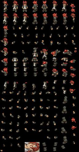
*edit can now try in game. . .
Title:
Post by: RolyTunedIn on September 14, 2009, 01:01:10 am
Post by: RolyTunedIn on September 14, 2009, 01:01:10 am
i thought portraits can have up to 24 colors... i could be wrong though...
Title:
Post by: jimmyjw88 on September 14, 2009, 01:01:37 am
Post by: jimmyjw88 on September 14, 2009, 01:01:37 am
Nono...All needs to be 16!!
Title:
Post by: Seushiro on September 14, 2009, 01:02:59 am
Post by: Seushiro on September 14, 2009, 01:02:59 am
well still looks good though. . . check the final ups. . . the file is there u can go and submit it. . . I dnt know how to submit to the site ahahah
Title:
Post by: RolyTunedIn on September 14, 2009, 01:03:03 am
Post by: RolyTunedIn on September 14, 2009, 01:03:03 am
aehm... yeah i'm really going to have a hard time doing that.... how much colors is it right now?
Title:
Post by: Seushiro on September 14, 2009, 01:06:00 am
Post by: Seushiro on September 14, 2009, 01:06:00 am
Just saw some posts in this thread. . . . I have to repeat. . . Vaan Portrait from Revnant Wings ported to FFT = EPIC Fail. . .
* oh I forgot I will submit the finished Sephiroth Ver. 1
* oh I forgot I will submit the finished Sephiroth Ver. 1
Title:
Post by: RolyTunedIn on September 14, 2009, 01:15:46 am
Post by: RolyTunedIn on September 14, 2009, 01:15:46 am
i think i got rid of at least three colors...

Title:
Post by: MiKeMiTchi on September 14, 2009, 01:40:24 am
Post by: MiKeMiTchi on September 14, 2009, 01:40:24 am
What happened to the goggles? I liked the old one.
And what's with his chin shadows? It's very dark.
IMO, remove the strands of hair in the middle.
And what's with his chin shadows? It's very dark.
IMO, remove the strands of hair in the middle.
Title:
Post by: mav on September 14, 2009, 07:10:18 am
Post by: mav on September 14, 2009, 07:10:18 am
You're getting there; the hair looks better...though the individual hairs, or whatever you wanna call 'em, still look a little awkward though, but they're headed in the right direction. Good job.
Title:
Post by: Asmo X on September 14, 2009, 07:43:16 am
Post by: Asmo X on September 14, 2009, 07:43:16 am
Stop that hair around his face from hanging perfectly vertical. It looks well stupid
Title:
Post by: mav on September 14, 2009, 07:47:35 am
Post by: mav on September 14, 2009, 07:47:35 am
Quote from: "Asmo X"Stop that hair around his face from hanging perfectly vertical. It looks well stupidI agree on this--remember, the hair needs to look semi-natural. Curvy, shaded, drops shadow, etc.
Title:
Post by: MiKeMiTchi on September 14, 2009, 07:54:42 am
Post by: MiKeMiTchi on September 14, 2009, 07:54:42 am
Well, can we see the reference pic for the reno portrait again?
Title:
Post by: RolyTunedIn on September 14, 2009, 10:38:49 am
Post by: RolyTunedIn on September 14, 2009, 10:38:49 am
kind of curious, does he look better with or without the bang coming down his face?


Title:
Post by: RolyTunedIn on September 14, 2009, 10:39:39 am
Post by: RolyTunedIn on September 14, 2009, 10:39:39 am
nevermind, i think he looks better without...
Title:
Post by: Asmo X on September 14, 2009, 10:39:46 am
Post by: Asmo X on September 14, 2009, 10:39:46 am
Without, dammit.
Title:
Post by: RolyTunedIn on September 14, 2009, 10:43:59 am
Post by: RolyTunedIn on September 14, 2009, 10:43:59 am
lol, yeah... but anyways, your copy paste advice was really helpful XD.
Title:
Post by: Zozma on September 14, 2009, 10:46:50 am
Post by: Zozma on September 14, 2009, 10:46:50 am
lol asmo is really right,
you're trying too hard to make that hair down the middle work,but its not.
im sure theres another way.
But i understand what you're trying to do.. the old reno right? the cool one? before they made him look like an asian clown?

you're trying too hard to make that hair down the middle work,but its not.
im sure theres another way.
But i understand what you're trying to do.. the old reno right? the cool one? before they made him look like an asian clown?
Title:
Post by: jimmyjw88 on September 14, 2009, 11:29:09 am
Post by: jimmyjw88 on September 14, 2009, 11:29:09 am
This looks much better. Good job. Continue ^^
Title:
Post by: RolyTunedIn on September 14, 2009, 01:19:45 pm
Post by: RolyTunedIn on September 14, 2009, 01:19:45 pm
i'm lost at what to do... any suggestions or crit.
Title:
Post by: Zozma on September 14, 2009, 01:29:54 pm
Post by: Zozma on September 14, 2009, 01:29:54 pm
stick with nothing there untill you can find a way to make that hair work here i guess?
with the hair going down the middle its not casting any sort of shadow either, its just there so thats part of it
with the hair going down the middle its not casting any sort of shadow either, its just there so thats part of it
Title:
Post by: RolyTunedIn on September 14, 2009, 01:38:33 pm
Post by: RolyTunedIn on September 14, 2009, 01:38:33 pm
seushiro, when are you going to work on your new genesis sprite?
Title:
Post by: DarthPaul on September 14, 2009, 01:54:41 pm
Post by: DarthPaul on September 14, 2009, 01:54:41 pm
Why not put it down the right side of his face? Obscure the right eye. If done right I think it would work.
Title:
Post by: Seushiro on September 14, 2009, 02:42:50 pm
Post by: Seushiro on September 14, 2009, 02:42:50 pm
here is what I think. . . The bangs in his right side is messy at the bottom and the bangs on his left side just needs to be curled a bit. . .
and the sprite does not have bangs in the middle so that portrait matches greatly. . . updated my sprite too. . . Old hair was horrible.


and the sprite does not have bangs in the middle so that portrait matches greatly. . . updated my sprite too. . . Old hair was horrible.
Title:
Post by: Asmo X on September 15, 2009, 12:41:32 am
Post by: Asmo X on September 15, 2009, 12:41:32 am
that new hair on the sprite sucks. Over saturated and too bright.
Title:
Post by: DarthPaul on September 15, 2009, 12:50:39 am
Post by: DarthPaul on September 15, 2009, 12:50:39 am
Agreed the hair looks kind of like someone was looking for flame tones. Also the neck of the shirt looks more like a sweater, it should be thinned out a few pixels. And the goggles, where to start. They look a tad too small they look to be set wrong and generally are not visually appealing. Good base, needs massive touching up.
Title:
Post by: MiKeMiTchi on September 15, 2009, 02:45:36 am
Post by: MiKeMiTchi on September 15, 2009, 02:45:36 am
QuoteOver saturated and too bright.
Just lessen the saturation, Seu.
Title:
Post by: Seushiro on September 15, 2009, 12:59:35 pm
Post by: Seushiro on September 15, 2009, 12:59:35 pm
Sorry Roly will start my Genesis from scrap. . . and want to do the genesis sprite from a FFT artwork before doing it like some patchers here do. . . so currenty drawing and having tons of scratch paper lying around. . .
here is what i'm working on ryt now. . . just fixing lots of stuff like for reno fixed the white polo collar and tried abit darker hair. . . guess i cnt do anything about the shades on his head. . .


here is what i'm working on ryt now. . . just fixing lots of stuff like for reno fixed the white polo collar and tried abit darker hair. . . guess i cnt do anything about the shades on his head. . .
Title:
Post by: jimmyjw88 on September 15, 2009, 01:07:58 pm
Post by: jimmyjw88 on September 15, 2009, 01:07:58 pm
Who is that? The sprite is nice and the portrait is looking good ^^
Title:
Post by: Seushiro on September 15, 2009, 01:10:23 pm
Post by: Seushiro on September 15, 2009, 01:10:23 pm
That is Fei Fong Wong from Xenogears without the big belt he had. . .

here he is in Xenogears which is a few pixels bigger than tactics


here he is in Xenogears which is a few pixels bigger than tactics
Title:
Post by: Zozma on September 15, 2009, 01:20:08 pm
Post by: Zozma on September 15, 2009, 01:20:08 pm
oho adding a second Xenogears character to the custom sprite section eh? cool
Title:
Post by: Seushiro on September 15, 2009, 01:23:34 pm
Post by: Seushiro on September 15, 2009, 01:23:34 pm
yeah I'm Guessing Miang needs someone to brainwash. . . and I want to replace my Monk Job with this
Title:
Post by: Vanya on September 15, 2009, 01:24:04 pm
Post by: Vanya on September 15, 2009, 01:24:04 pm
Very nice. ^_^
Title:
Post by: Zozma on September 15, 2009, 01:27:30 pm
Post by: Zozma on September 15, 2009, 01:27:30 pm
well if she doesn't get to do it to fei then i guess shell settle for delita
Title:
Post by: Seushiro on September 15, 2009, 06:44:34 pm
Post by: Seushiro on September 15, 2009, 06:44:34 pm
Just a new concept since this character was not ported over. . . so has qualities different from original. . . actually looks VERY MATURE from Original. . .
MARCHE RADIUJU


MARCHE RADIUJU
Title:
Post by: Zozma on September 15, 2009, 06:48:03 pm
Post by: Zozma on September 15, 2009, 06:48:03 pm
i know that in Xenogears they didn't really emphasize the sheen on sprites, but i think for Fei for fft it would look good to have it. if you've maxed out your 16 colors a flesh tone will work fine for brown hair
Title:
Post by: dwib on September 15, 2009, 06:53:49 pm
Post by: dwib on September 15, 2009, 06:53:49 pm
fei is very very cool... but needs a TON of work on the shading.
pants are only 2 colors, shirt and hair look like they only use 1 color
on the topic of xenogears... this is an id concept i made a few months back but didn't continue working on it

pants are only 2 colors, shirt and hair look like they only use 1 color
on the topic of xenogears... this is an id concept i made a few months back but didn't continue working on it
Title:
Post by: Zozma on September 15, 2009, 06:57:35 pm
Post by: Zozma on September 15, 2009, 06:57:35 pm
cool to see more xenogears stuff appearing
Title:
Post by: MiKeMiTchi on September 15, 2009, 07:00:36 pm
Post by: MiKeMiTchi on September 15, 2009, 07:00:36 pm
I guess you're Mr. Quantity.
I like you. You get to finish sprites in a short time..
given that you sacrifice quality first, improving it later.
Good Job.
I like you. You get to finish sprites in a short time..
given that you sacrifice quality first, improving it later.
Good Job.
Title:
Post by: Seushiro on September 15, 2009, 07:01:54 pm
Post by: Seushiro on September 15, 2009, 07:01:54 pm
Hair can be fixed. .. just need to get some colors from the belt he has. . . that is already 16 colors so cnt do anything bout the pants. . .
Title:
Post by: Zozma on September 15, 2009, 07:02:31 pm
Post by: Zozma on September 15, 2009, 07:02:31 pm
still getting as much detail in the first time is best. the less have to add later the better tho....
the pants probably dont need as much work as the hair getting more shades in
the pants probably dont need as much work as the hair getting more shades in
Title:
Post by: Seushiro on September 15, 2009, 07:05:03 pm
Post by: Seushiro on September 15, 2009, 07:05:03 pm
Quote from: "MiKeMiTchi"I guess you're Mr. Quantity.
I like you. You get to finish sprites in a short time..
given that you sacrifice quality first, improving it later.
Good Job.
Well the reason im doing these is so I can enjoy my dream and have all the characters i want to make my own story. . . but ofcourse that would need quality so i still post it to be criticized. . .
but just like my Reno for example I would have never gotten a portrait but some one took over on that. . . posting helps if someone is interested they fix it for you. . . without even asking
this community is talented. . .
Title:
Post by: jimmyjw88 on September 15, 2009, 09:49:04 pm
Post by: jimmyjw88 on September 15, 2009, 09:49:04 pm
These sprites are looking cool. ^^
Title:
Post by: LastingDawn on September 15, 2009, 09:59:28 pm
Post by: LastingDawn on September 15, 2009, 09:59:28 pm
A Serious looking Marche? I have to say that takes talent. you seem to have quite a hold on the special character's spriting sheets, by chance would you like to make some of the Rehauled sprites for existing specials? I'm talking about people like Mustadio, Rafa, Malak, Izlude, the Shrine Knights, etc. Odds are if a sprite for them is rehauled , I might end up using it, also I love the "personal" sprite of yours, I may consider using something similar for final chapter Ramza in Mercenaries.
Title:
Post by: dwib on September 15, 2009, 10:33:13 pm
Post by: dwib on September 15, 2009, 10:33:13 pm
Quote from: "Seushiro"this community is talented. . .and you sure add to it. completing these mediocre spritesheets provides GREAT groundwork for improvement and further ideas. definitely helpful
Title:
Post by: MiKeMiTchi on September 15, 2009, 10:42:57 pm
Post by: MiKeMiTchi on September 15, 2009, 10:42:57 pm
Quotealso I love the "personal" sprite of yours, I may consider using something similar for final chapter Ramza in Mercenaries.
Indeed. Where did you base that sprite of yours, btw?
Title:
Post by: Vanya on September 15, 2009, 10:47:26 pm
Post by: Vanya on September 15, 2009, 10:47:26 pm
It looks like a Dark Knight without a helmet.
Title:
Post by: MiKeMiTchi on September 15, 2009, 10:50:57 pm
Post by: MiKeMiTchi on September 15, 2009, 10:50:57 pm
I see. Thanks Vanya.
Title:
Post by: Vanya on September 15, 2009, 10:55:49 pm
Post by: Vanya on September 15, 2009, 10:55:49 pm
It looks great. Makes want to take a second look at the original sprite to see if it can be improved more.
Title:
Post by: RolyTunedIn on September 16, 2009, 12:53:04 am
Post by: RolyTunedIn on September 16, 2009, 12:53:04 am
that marche sprite looks good, only thing that bothers me besides him lookin older is that his outfit looks really similar to luso's. also in the portrait his left shoulder isn't bare like in the sprite...
Title:
Post by: jimmyjw88 on September 16, 2009, 05:36:32 am
Post by: jimmyjw88 on September 16, 2009, 05:36:32 am
Wow...All are working fast...Haha. Nice ^^
Title:
Post by: MiKeMiTchi on September 16, 2009, 08:28:06 am
Post by: MiKeMiTchi on September 16, 2009, 08:28:06 am
Seu, I edited your personal portrait, for it can be a possible ch4 ramza sprite for mercs. Down to 16 colors..


Title:
Post by: jimmyjw88 on September 16, 2009, 10:53:36 am
Post by: jimmyjw88 on September 16, 2009, 10:53:36 am
Yes. I think this can be Ramza Ch4 in Mercenaries. Its looking great!
Title:
Post by: Vanya on September 16, 2009, 11:41:15 am
Post by: Vanya on September 16, 2009, 11:41:15 am
Nice job, Mike. There is considerable interest in using this concept for Mercenaries. That is if you don't mind, Seushiro.
Title:
Post by: Kokojo on September 16, 2009, 12:56:14 pm
Post by: Kokojo on September 16, 2009, 12:56:14 pm
If i can add my two cents, chip off one or two pixel from the left side, it will look more like ramza.
Title:
Post by: Seushiro on September 17, 2009, 11:26:36 pm
Post by: Seushiro on September 17, 2009, 11:26:36 pm
I dnt mind Vanya but someone will have to do a Ramza Dark Knight sprite since I only have completed for mine but not for a Ramza head over a Dark knight body since I lost a few colors like seen between the two. . .
here was my Original Avatar before I made my Character Brown Haired

here was my Original Avatar before I made my Character Brown Haired
Title:
Post by: MiKeMiTchi on September 18, 2009, 01:38:15 am
Post by: MiKeMiTchi on September 18, 2009, 01:38:15 am
^ definitely looks good but the colors on the clothes were messed up.
You can just have my edit for the portrait and edit it again, Seushiro.
Oh btw, the latest portrait is in the mercenaries section// thanks!
You can just have my edit for the portrait and edit it again, Seushiro.
Oh btw, the latest portrait is in the mercenaries section// thanks!
Title:
Post by: Seushiro on September 18, 2009, 07:09:23 am
Post by: Seushiro on September 18, 2009, 07:09:23 am
ok Mike. . . will check on that. . . ur portrait is much better anyway. . .
Title:
Post by: SilvasRuin on September 18, 2009, 02:50:26 pm
Post by: SilvasRuin on September 18, 2009, 02:50:26 pm
I don't recall Marche having a ponytail. Otherwise, I like it. I would be very amused if Mercenaries or FFT Remix wound up with a scene where Ramza and Marche met.
Title:
Post by: Seushiro on September 19, 2009, 12:15:57 am
Post by: Seushiro on September 19, 2009, 12:15:57 am
He Has a pony. .. not just seen on the Portrait of GBA clearly but he has in the concept art. Also he has Ramza Chapter 2 hair with a "flying strand of hair" in the middle not like (Ramza that is in the side) and a ponytail under the cut up hair. ..
anybody got a front view full for the concept art? I cnt find any so cnt figure out the correct shirt for him. . .


anybody got a front view full for the concept art? I cnt find any so cnt figure out the correct shirt for him. . .
Title:
Post by: Seushiro on September 21, 2009, 11:56:57 pm
Post by: Seushiro on September 21, 2009, 11:56:57 pm
My Take on Izlude if he became a bit older and left the Shrine Knights. . .
he was my fave of the bad guys. . .


he was my fave of the bad guys. . .
Title:
Post by: Asmo X on September 22, 2009, 12:02:50 am
Post by: Asmo X on September 22, 2009, 12:02:50 am
Looks ok on the small view but could you post the main views 2x or 4x as large?
Title:
Post by: RolyTunedIn on September 22, 2009, 12:03:40 am
Post by: RolyTunedIn on September 22, 2009, 12:03:40 am
it looks good. but on the portrait the mouth angle bothers me... other than that, nice outfit design, only thing that bothers me for the sprite is his hood.
Title:
Post by: Seushiro on September 22, 2009, 12:05:43 am
Post by: Seushiro on September 22, 2009, 12:05:43 am
Here 2xed it. . . only on the main views. . .

Title:
Post by: RolyTunedIn on September 22, 2009, 12:13:52 am
Post by: RolyTunedIn on September 22, 2009, 12:13:52 am
this is the only closest i can get for marche's front. most other pictures that i've seen are fan art.

Title:
Post by: Wasabi on September 22, 2009, 12:27:21 am
Post by: Wasabi on September 22, 2009, 12:27:21 am
Yeah, for this Izlude the mouth is slightly angled on the portrait, which makes a weird effect when seen with the longer hair.
And the hood should dangle a little lower on both the back and backward-diagonal. It's hanging up ever so slightly.
And the hood should dangle a little lower on both the back and backward-diagonal. It's hanging up ever so slightly.
Title:
Post by: Asmo X on September 22, 2009, 12:30:12 am
Post by: Asmo X on September 22, 2009, 12:30:12 am
It looks ok seushiro, its just that the gold lines shouldn't be so straight. The reason some of izlude's cloak is light green is because part of it angles out and catches the light. You should try to follow this curvature with the lines too.
Title:
Post by: Seushiro on September 22, 2009, 12:35:17 am
Post by: Seushiro on September 22, 2009, 12:35:17 am
Thanks Roly sure will use that pic as reference. . . Hmmn. . . dnt like heroes in shorts though but oh well. . .
Thanks for the tip Asmo will see how to make them curve. . . i thought the difference in color will help. ..
Thanks for the tip Asmo will see how to make them curve. . . i thought the difference in color will help. ..
Title:
Post by: Kagebunji on September 22, 2009, 12:37:06 am
Post by: Kagebunji on September 22, 2009, 12:37:06 am
On that artwork they look really childish, good work on making Marche look serious Seushiro.
Title:
Post by: Seushiro on September 22, 2009, 12:56:01 am
Post by: Seushiro on September 22, 2009, 12:56:01 am
Quote from: "RolyTunedIn"it looks good. but on the portrait the mouth angle bothers me... other than that, nice outfit design, only thing that bothers me for the sprite is his hood.
Hmmn. . . yeah the hood does look like a floating pillow. . . really ruins the back view. . .
Title:
Post by: RolyTunedIn on September 22, 2009, 10:27:13 am
Post by: RolyTunedIn on September 22, 2009, 10:27:13 am
i dont know if it just happens to me seushiro, but when i tried to insert your sprites into shishi, it says that the size of the file is too big... i noticed that when i downloaded your sprites, it was 64 kb while the others were 44. and do you mind uploading the new portrait for him, that bang in the middle looks funny lol...
Title:
Post by: RolyTunedIn on September 22, 2009, 10:28:15 am
Post by: RolyTunedIn on September 22, 2009, 10:28:15 am
Quote from: "Kagebunji"On that artwork they look really childish, good work on making Marche look serious Seushiro.well he is around 12 i think...
Title:
Post by: Kagebunji on September 22, 2009, 10:41:49 am
Post by: Kagebunji on September 22, 2009, 10:41:49 am
He looks like girl, about Ritz I don't mind, but Marche...
Title:
Post by: Seushiro on September 22, 2009, 02:28:32 pm
Post by: Seushiro on September 22, 2009, 02:28:32 pm
Izlude version 2 with Delita's Arm gear and 3 shades of green from an oracle palette to make the green match the portrait a bit. . .
*at the bottom is the fixed Reno for u Roly

*at the bottom is the fixed Reno for u Roly
Title:
Post by: Seushiro on September 22, 2009, 05:21:44 pm
Post by: Seushiro on September 22, 2009, 05:21:44 pm
just a concept. . . I screwed up one of my bleach edits cuz it was over 16 colors and now would take hours to repair. . .
Messed with my ninja instead. . .

Messed with my ninja instead. . .
Title:
Post by: MiKeMiTchi on September 22, 2009, 05:28:18 pm
Post by: MiKeMiTchi on September 22, 2009, 05:28:18 pm
Give a darkest shade (in this case, black for Strider's hair. (for the lower part of the hair)
Your concepts are really great Seu!! That's why I like you. hahaha..
But your weakness is in the hair..
Your concepts are really great Seu!! That's why I like you. hahaha..
But your weakness is in the hair..
Title:
Post by: Seushiro on September 22, 2009, 05:35:08 pm
Post by: Seushiro on September 22, 2009, 05:35:08 pm
yeah still picking which color i can ditch from the blues or the whites. . . im stuck at 16 already. . .
atleast i did better there then this Iron Man I made ^__^
that Ramza is Knox's
atleast i did better there then this Iron Man I made ^__^
that Ramza is Knox's
Title:
Post by: Vanya on September 22, 2009, 05:43:04 pm
Post by: Vanya on September 22, 2009, 05:43:04 pm
Nice! You made a Strider Hiryuu. ^_^
Title:
Post by: Cheetah on September 22, 2009, 08:12:23 pm
Post by: Cheetah on September 22, 2009, 08:12:23 pm
Haha that Iron Man is hilarious, very nice. I'm loving those vertical lines on Izlude, great touch.
Title:
Post by: jimmyjw88 on September 22, 2009, 09:01:33 pm
Post by: jimmyjw88 on September 22, 2009, 09:01:33 pm
That ninja concept is looking good except for the hair, like Mike said. The Iron Man is funny, and very nice. Izlude is looking great too. Well done.
Title:
Post by: Seushiro on September 22, 2009, 09:13:34 pm
Post by: Seushiro on September 22, 2009, 09:13:34 pm
Is this better Mike?
Added the belt from Rofel. . .

Added the belt from Rofel. . .
Title:
Post by: MiKeMiTchi on September 22, 2009, 10:45:01 pm
Post by: MiKeMiTchi on September 22, 2009, 10:45:01 pm
Yes, that's better. I suggest you add one more shade for the hair.
And make it the lightest. Get it from the skin tone if you're not aiming for multiple palettes.
IMO, it needs more lighter brown shades than the darker one, or just make the lightest brown shade for the hair
less-saturated..
Hmm.. I'm not really good at explaining..
but.. I can try editing the hair a bit if you don't mind, then you continue there.
Title:
Post by: Vanya on September 22, 2009, 11:23:25 pm
Post by: Vanya on September 22, 2009, 11:23:25 pm
The whites of the eyes need some help, too.
Title:
Post by: RolyTunedIn on September 23, 2009, 12:13:00 am
Post by: RolyTunedIn on September 23, 2009, 12:13:00 am
thanks seu, but when i try to download it, the sprite size is 64 kb. so it won't let me import it into shishi... am i the only one having this problem?... but thanks anyway seushiro.
Title:
Post by: MiKeMiTchi on September 23, 2009, 02:36:33 am
Post by: MiKeMiTchi on September 23, 2009, 02:36:33 am
Convert it into 256 colors.
Title:
Post by: jimmyjw88 on September 23, 2009, 03:28:49 am
Post by: jimmyjw88 on September 23, 2009, 03:28:49 am
Yes. It needs to be in 256 colours.
Title:
Post by: MiKeMiTchi on September 23, 2009, 07:03:36 am
Post by: MiKeMiTchi on September 23, 2009, 07:03:36 am
just tried the first frame..
hmm..

hmm..
Title:
Post by: Kagebunji on September 23, 2009, 10:24:50 am
Post by: Kagebunji on September 23, 2009, 10:24:50 am
you need to do something with cape, it looks like it is hanging from his arm, not from scarf(as supposed to), maybe look how knight cape looks and add few pixels, that may help.
Title:
Post by: MiKeMiTchi on September 23, 2009, 10:43:06 am
Post by: MiKeMiTchi on September 23, 2009, 10:43:06 am
Oh. Forgot that. Thanks for mentioning Kage.
Title:
Post by: Setzer on September 23, 2009, 12:27:38 pm
Post by: Setzer on September 23, 2009, 12:27:38 pm
With little modifications, you can make Edge from FFIV with this Strider ^^
Title:
Post by: Seushiro on September 23, 2009, 08:25:45 pm
Post by: Seushiro on September 23, 2009, 08:25:45 pm
Ok will work from ther Mike. .. been busy on EXODUS and Mini EXODUS from jap_tac's concepts (16 COLORS IS TO LITTLE t__t). . . ^__^
Walking and front attack finished looks fun to bash the little guys. . .
Can someone clean up the back?. . . the gold lining and the blue stuff are blinding


Walking and front attack finished looks fun to bash the little guys. . .
Can someone clean up the back?. . . the gold lining and the blue stuff are blinding
Title:
Post by: LastingDawn on September 23, 2009, 08:45:19 pm
Post by: LastingDawn on September 23, 2009, 08:45:19 pm
Blown away! Simply blown away! That is incredible!
Title:
Post by: Vanya on September 23, 2009, 08:57:10 pm
Post by: Vanya on September 23, 2009, 08:57:10 pm
Wow nice work! But I demand you cal him Exodus!! ^_^
Title:
Post by: SilvasRuin on September 23, 2009, 09:00:37 pm
Post by: SilvasRuin on September 23, 2009, 09:00:37 pm
Exodus is a much better translation. Also, I have to agree with the others with the other statement as well: Wow, nice.
Title:
Post by: Seushiro on September 23, 2009, 09:06:38 pm
Post by: Seushiro on September 23, 2009, 09:06:38 pm
ok ok Edited. . . Exodus it is. . . *backs of to a corner*
Title:
Post by: Redux on September 23, 2009, 09:14:45 pm
Post by: Redux on September 23, 2009, 09:14:45 pm
Hello Seushiro, I am very impressed by Exodus as well. So much that i have a special request. Could you recolor your finished Exodus, whenever it is you do finish, in a more grey oriented sprite. I wish to use it for my own purpose if it might be alright with you. I am quite interested in recolors of most zodiacs and new sprites for the other zodiacs. If you could do that, i would be in your debt.
Title:
Post by: Seushiro on September 23, 2009, 09:18:55 pm
Post by: Seushiro on September 23, 2009, 09:18:55 pm
yeah sure I will add that. . . all my submissions have secret palettes (did'nt inform Zodiac in submission ^__^). .. Problem is finishing the sprite. . . If u noticed doing this as a Monster would have been easy since size and frames can be done. . . but where is the fun in that if EXODus cnt have items and weapon skills. . .
Title:
Post by: Redux on September 23, 2009, 09:21:55 pm
Post by: Redux on September 23, 2009, 09:21:55 pm
Thank you very much. Exodus as Hypnos shall be quite a sight. =)
Title:
Post by: MiKeMiTchi on September 23, 2009, 10:43:15 pm
Post by: MiKeMiTchi on September 23, 2009, 10:43:15 pm
Great work Seu!
What are the problems btw?
What are the problems btw?
Title:
Post by: Seushiro on September 23, 2009, 10:46:21 pm
Post by: Seushiro on September 23, 2009, 10:46:21 pm
Cape Shading. . . Gold outline at the back. . . only the back view is okay but the walking back view is messed up. . . oh and walking was jiggy but in version 2 its better. . . The arms in Fighting need to have spikes manually since the attack base bodies are headless and spikes cannot be attached. . .
So the only way i thought of putting spikes is through the head or in the arms. . .
attached an SPR so you can see which animations are buggy. . .

So the only way i thought of putting spikes is through the head or in the arms. . .
attached an SPR so you can see which animations are buggy. . .
Title:
Post by: Seushiro on September 23, 2009, 11:08:55 pm
Post by: Seushiro on September 23, 2009, 11:08:55 pm
Just figured something out using Shishi. . . there is workable space for pointed shoulders and arms. . . so this will be option 1 which will be placing the spikes on the red dots instead of doing the arms one by one. . .

Title:
Post by: jimmyjw88 on September 23, 2009, 11:40:32 pm
Post by: jimmyjw88 on September 23, 2009, 11:40:32 pm
Great Work Seushiro, great work.
Title:
Post by: Sephirot24 on September 24, 2009, 12:50:38 am
Post by: Sephirot24 on September 24, 2009, 12:50:38 am
Quote from: "Redux"Thank you very much. Exodus as Hypnos shall be quite a sight. =)
Hypnos? Hmmm... makes me think of Saint Seiya =D
Shaka > everyone else
Also, that Exodus sprite looks f***ing awesome Seushiro!!!! Kudos 2 u
Title:
Post by: RolyTunedIn on September 24, 2009, 12:54:13 am
Post by: RolyTunedIn on September 24, 2009, 12:54:13 am
now that is really good... you've progressed alot since you first started out...
Title:
Post by: MiKeMiTchi on September 24, 2009, 03:16:50 am
Post by: MiKeMiTchi on September 24, 2009, 03:16:50 am
Well, seu, Exdeath would be easier to finish if you place the spikes together wth the head.
But, that would sacrifice some quality Exodus..
But, that would sacrifice some quality Exodus..
Title:
Post by: Seushiro on September 24, 2009, 03:52:41 am
Post by: Seushiro on September 24, 2009, 03:52:41 am
I know but u cant put the spikes in the arms for the attack pose. . . I tried it. .. it will become mini spikes. . .
Title:
Post by: MiKeMiTchi on September 24, 2009, 06:04:57 am
Post by: MiKeMiTchi on September 24, 2009, 06:04:57 am
Maybe, those arms will be exceptions.
I'm home now.. yes, I can test the sprite!
I'm home now.. yes, I can test the sprite!
Title:
Post by: Seushiro on September 24, 2009, 06:18:32 am
Post by: Seushiro on September 24, 2009, 06:18:32 am
Just finished retouching some parts. . .
Title:
Post by: MiKeMiTchi on September 24, 2009, 06:23:22 am
Post by: MiKeMiTchi on September 24, 2009, 06:23:22 am
Sure.
Let's see..
Let's see..
Title:
Post by: mav on September 24, 2009, 02:34:29 pm
Post by: mav on September 24, 2009, 02:34:29 pm
HOLY FUCK. The colors look appropriate, though I wouldn't mind seeing some better contrast. Very nice sprite, Seu. Very nice. This deserves an amazing portrait.
Title:
Post by: Seushiro on September 24, 2009, 03:16:53 pm
Post by: Seushiro on September 24, 2009, 03:16:53 pm
Im done with the animations and have tested it. . . attack arms still needs to be recolored. . .
Sprite is uhm. .. 75% the missing 25% is for the colors needed in the arms, cape shading, and that cursed back pattern!. . . need portrait but will try making one. ..

Sprite is uhm. .. 75% the missing 25% is for the colors needed in the arms, cape shading, and that cursed back pattern!. . . need portrait but will try making one. ..
Title:
Post by: MiKeMiTchi on September 24, 2009, 05:34:39 pm
Post by: MiKeMiTchi on September 24, 2009, 05:34:39 pm
Great job there.
Can't wait your try for the portrait.
Something like this:

Can't wait your try for the portrait.
Something like this:
Title:
Post by: Bloodthirster0 on September 24, 2009, 05:40:59 pm
Post by: Bloodthirster0 on September 24, 2009, 05:40:59 pm
Finally ExDeath one of my favorite FF characters ever and it looks very trustful to the original
and the portrait is great to Mike,but it looks abstract
and the portrait is great to Mike,but it looks abstract
Title:
Post by: MiKeMiTchi on September 24, 2009, 06:01:57 pm
Post by: MiKeMiTchi on September 24, 2009, 06:01:57 pm
^ just got that from the final fantasy wikia, then resized it.
Title:
Post by: Seushiro on September 24, 2009, 06:15:25 pm
Post by: Seushiro on September 24, 2009, 06:15:25 pm
How Come I never thought of looking for a reference pic there. . . Hangs self****
but still nice concept mike. . . her followed the lighting and took out the reds. .. . then Recolored and normalized in Photoshop and rest was paint history. . .
eye part still needs to be closed. . . his right side. . . (if it even has eyes)
cnt keep the outline. . . looks bad ingame. . .


but still nice concept mike. . . her followed the lighting and took out the reds. .. . then Recolored and normalized in Photoshop and rest was paint history. . .
eye part still needs to be closed. . . his right side. . . (if it even has eyes)
cnt keep the outline. . . looks bad ingame. . .
Title:
Post by: MiKeMiTchi on September 24, 2009, 06:21:35 pm
Post by: MiKeMiTchi on September 24, 2009, 06:21:35 pm
^ Cool edit. Don't forget to lower the saturation values for all colors, though.
And Finally, fixe the outline shadings then it's done.
And Finally, fixe the outline shadings then it's done.
Title:
Post by: Seushiro on September 24, 2009, 06:30:02 pm
Post by: Seushiro on September 24, 2009, 06:30:02 pm
I give up. . . i'm no good at portraits. . . it is like doing hair for sprites always my weakness. . .
Title:
Post by: MiKeMiTchi on September 24, 2009, 06:33:31 pm
Post by: MiKeMiTchi on September 24, 2009, 06:33:31 pm
Okay. Pass that to me.
Seu, I recommend you that you read about "anti-aliasing"..
Me, I'm not really good at all right now, but having learn the basics
of anti-aliasing in pixel art will remove your weakness.. *I think.
anti-aliasing is basically outlining in pixel art, to make it blend with the background.
http://gas13.ru/v3/tutorials/handmade_antialiasing.php (http://gas13.ru/v3/tutorials/handmade_antialiasing.php)
Title:
Post by: Seushiro on September 24, 2009, 06:35:36 pm
Post by: Seushiro on September 24, 2009, 06:35:36 pm
Thanks Mike I really appreciate ur generosity. . . I'll focus back on finishing the gold gauntlets and the back cape holster with some parts of the sprite. . .
Title:
Post by: MiKeMiTchi on September 24, 2009, 08:08:58 pm
Post by: MiKeMiTchi on September 24, 2009, 08:08:58 pm
Here:

Title:
Post by: Seushiro on September 24, 2009, 09:38:00 pm
Post by: Seushiro on September 24, 2009, 09:38:00 pm
Thanks Mike that looks great I will just finish the left over gold arms and submit it with that. . .
Title:
Post by: dwib on September 24, 2009, 10:54:17 pm
Post by: dwib on September 24, 2009, 10:54:17 pm
wowed by that portrait
overall the sprite is huge and complicated but it looks good. hard to believe it is only 16 colors!
overall the sprite is huge and complicated but it looks good. hard to believe it is only 16 colors!
Title:
Post by: SilvasRuin on September 24, 2009, 11:07:24 pm
Post by: SilvasRuin on September 24, 2009, 11:07:24 pm
Any chance someone could make a video of it in action?
Title:
Post by: jimmyjw88 on September 24, 2009, 11:10:47 pm
Post by: jimmyjw88 on September 24, 2009, 11:10:47 pm
Whoa...That portrait is amazing, Mike!!! Awesome!!! And very nice sprite Seushiro. Very nice.
Title:
Post by: Seushiro on September 24, 2009, 11:33:31 pm
Post by: Seushiro on September 24, 2009, 11:33:31 pm
Quote from: "Redux"Could you recolor your finished Exodus, whenever it is you do finish, in a more grey oriented sprite. I wish to use it for my own purpose if it might be alright with you. I am quite interested in recolors of most zodiacs and new sprites for the other zodiacs.
Would this Grey do?
Title:
Post by: tithin on September 25, 2009, 04:58:30 am
Post by: tithin on September 25, 2009, 04:58:30 am
Yeah, your exodus sprite is shit, he's basically a square with two horns sticking out the side. Asides from that, his cloak has 0 decoration done to it at all. go look at his dissidia artwork, and work backwards from there.
Asides from that, what the hell is going on this thread, some of the sprites are ok, but you guys are basically felating the hell out of this. Whatever happened to constructive criticism? You criticise so the sprites get BETTER.
Asides from that, what the hell is going on this thread, some of the sprites are ok, but you guys are basically felating the hell out of this. Whatever happened to constructive criticism? You criticise so the sprites get BETTER.
Title:
Post by: Asmo X on September 25, 2009, 05:09:15 am
Post by: Asmo X on September 25, 2009, 05:09:15 am
I'm going to give you the lowdown on this sprite: It ought to be scrapped and started over. FFT sprites, with good reason, are made from large, simple spaces of colour. This is useful because of how small they are. You can look at a sprite and, unless you are brain damaged, can tell what basically everything is. This sprite looks like ass because of the amount of shit crammed into it. You've got all these tiny areas demarcated by copious amount of gold trim and at this size it is not easy to tell what everything is actually supposed to be. I've said this time and time again: Sometimes you just can't render the source material properly in sprite form. You are going to have to make a few concessions to simplicity. You also have a major problem with those 2 horn things in every diagonal. They stick out at different angles. Oh, and the cape basically looks like a flat square and is sized inconsistently between the front and back views. My advice is to take another crack at it and this time don't try and represent every skin pore. Reduce the complexity of the sprite and make sure everything is lined up properly.
To everyone else: What are you doing. You guys should have said all this yourselves.
To everyone else: What are you doing. You guys should have said all this yourselves.
Title:
Post by: MiKeMiTchi on September 25, 2009, 06:17:35 am
Post by: MiKeMiTchi on September 25, 2009, 06:17:35 am
QuoteYeah, your exodus sprite is shitHarsh!
QuoteI'm going to give you the lowdown on this sprite: It ought to be scrapped and started over.Cool and calm.
--
I would like to object. (well.. somehow)
What Seushiro is doing, he sacrifices quality for QUANTITY.
I liked him because of his concepts, not bec. of his spriting skillz.
I know that some of his sprites weren't good, but not bad at all.
Yes, you guys were right, I looked at the exodus sprite, and the details weren't converted nicely, mainly bec.
jap_tac did base it as an FFTA character.
Me, I'm just helping seu by making portraits. haha.
For me, finishing the sheet first would be easier to edit later.
..than to take frames one-by-one-by-one.
But yeah, I think Seu should get critisms once in a while.. hahaha.
Title:
Post by: Vanya on September 25, 2009, 09:45:21 am
Post by: Vanya on September 25, 2009, 09:45:21 am
@Tithin & Asmo: You guys are being way too harsh. Don't trade mild criticism for brutal critcism.
Did you guys spend much time with this sprite in shishi? Yes it has some flaws, but it would be a giant waste of time to scrap it and start over. This sprite is reasonable over detailed, the original design is gilt in enough gold trim to practically drown out the blue. The big shoulder spikes are fine except in the front and back views where they are too close together and the angle view are a little off. The little horns on top of the helmet are inconsistent. And the cape isn't animated enough. Other than that it is perfectly consistent with the Dissidia art. As you can see he is basically a walking tower of armor and the cape isn't decorated.
Edit: On a side note; once the sprite has been perfected it would be wicked to try to do his ex mode as well.
Title:
Post by: Asmo X on September 25, 2009, 11:21:43 am
Post by: Asmo X on September 25, 2009, 11:21:43 am
Vanya, the consistency is with the source art is EXACTLY the problem. Look at the picture you posted. Look at the size and resolution of it. It's fine for that to have all those details. Trying to cram all of that into a FFT sprite though is just bound to be a massive failure. As I said, I'm sorry, but if you want it to look decent you'll just have to make some concessions to simplicity. Ok, so you've got a sheet that works in game. So don't scrap it. But do, please, go through, remove some of that detail so that it doesn't look like a messy gray and gold blob. And those shoulder spikes need to be toned way the fuck down. They are even bigger than they are in the source picture. They are only about a third the size of his arm in the source. In the sheet they are as long as his arm.
Title:
Post by: Seushiro on September 25, 2009, 01:09:34 pm
Post by: Seushiro on September 25, 2009, 01:09:34 pm
Sheesh I'd appreciate criticism to improve work but calling effort shit u should not critic work if u cant explain why it is wrong AND SHOW HOW TO FIX IT TO LOOK BETTER. . . what is the use of me saying that I need help in the back, cape and i'm working on the outlines if we both think it looks bad to begin with? I stated that so I can get some ideas on fixing it not having it called shit. . .
Asmo X your crits are always good u put in suggestions on what to do. .. I will look into parts that I can use. . . for the shoulder Spikes I think the length is okay since it is basically Chibi of the Char. . . Which in tactics they are chibi and heads are almost the size of the arms itself in which this guys case He has Huge arms and has a really large head.
and for my last post before Hiatus from posting "personal use sprites"
Square with horns on the side?. . . Oh u mean this. . . I totally missed that on my Sprite sheet. . . ^__^
Title:
Post by: jimmyjw88 on September 25, 2009, 01:53:52 pm
Post by: jimmyjw88 on September 25, 2009, 01:53:52 pm
Well...lessen some of the details perhaps. The shoulder spikes are the right size? But I still feel its abit big, due to the sprite size.
Title:
Post by: Asmo X on September 25, 2009, 01:58:08 pm
Post by: Asmo X on September 25, 2009, 01:58:08 pm
Good criticism is under no obligation whatsoever to provide you with ways of improving it. It's enough that it tells you, informatively, why it is or isn't bad. You are the guy with the spritesheet; you fix it. I said it was ass, and I backed up why. Don't get upset because someone was frank with you and said words you didn't like. Accept it and move on.
Title:
Post by: jimmyjw88 on September 25, 2009, 02:04:51 pm
Post by: jimmyjw88 on September 25, 2009, 02:04:51 pm
Asmo always give reasons on why he criticised as such. Unfortunately, I can't. That's why I don't criticise much. However, now, looking at the sprite closely, the shoulder spikes bothers me abit. The details of the whole sprite, ok I guess.
As for quantity and quality, I agree with Mike. Some people choose quantity and some choose quality. There are pros and cons for choosing between quantity and quality though.
As for quantity and quality, I agree with Mike. Some people choose quantity and some choose quality. There are pros and cons for choosing between quantity and quality though.
Title:
Post by: Seushiro on September 25, 2009, 02:08:50 pm
Post by: Seushiro on September 25, 2009, 02:08:50 pm
I know i moved on how many times have I been critiqued anyway with all my sprites. . . I'm used to it. . . just posted that as a joke. .. well anyway I like thinking out of the box but was stooped at the Attack animation. . . u are basically right it is like forcing a thing into game that does not fit. . .
Art is in ones point of view anyway. . . but still I think good criticism is knowing why it is bad and explaining why it makes it look bad then stating ur opinion to make it better. . .
Art is in ones point of view anyway. . . but still I think good criticism is knowing why it is bad and explaining why it makes it look bad then stating ur opinion to make it better. . .
Title:
Post by: Vanya on September 25, 2009, 02:13:26 pm
Post by: Vanya on September 25, 2009, 02:13:26 pm
I disagree about the level of detail.
It looks toned down enough to me.
About the only thing that I'd simplify if i ha to is the inner skirt and the gradient on the cape could be smoothed.
The gold trim is a must have.
It looks toned down enough to me.
About the only thing that I'd simplify if i ha to is the inner skirt and the gradient on the cape could be smoothed.
The gold trim is a must have.
Title:
Post by: Bloodthirster0 on September 25, 2009, 02:22:11 pm
Post by: Bloodthirster0 on September 25, 2009, 02:22:11 pm
I think that this sprite should be Lucavi sized and not human sized,he is large,large arms,head,legs and sword and level of the details
Title:
Post by: RolyTunedIn on September 25, 2009, 02:24:13 pm
Post by: RolyTunedIn on September 25, 2009, 02:24:13 pm
i agree wtih vanya
Title:
Post by: Sephirot24 on September 25, 2009, 02:40:48 pm
Post by: Sephirot24 on September 25, 2009, 02:40:48 pm
Quote from: "Bloodthirster0"I think that this sprite should be Lucavi sized and not human sized,he is large,large arms,head,legs and sword and level of the details
This. It would fit much better... but as I don't sprite, IDK if this would mean throwing away the current one, so...
Title:
Post by: DarthPaul on September 25, 2009, 04:34:30 pm
Post by: DarthPaul on September 25, 2009, 04:34:30 pm
Quote from: "Asmo X"Good criticism is under no obligation whatsoever to provide you with ways of improving it.
I agree, a good critic has an eye for detail and knowledge of design. He however may not always have the skills necessary to fix the problem. Once the problem is pointed out in detail it is the artist's(to use a general term) job to fix the problem.
EDIT: I also feel the gold is too overpowering. It looks less blue with gold trim and more gold with blue highlights.
Title:
Post by: MiKeMiTchi on September 25, 2009, 04:44:43 pm
Post by: MiKeMiTchi on September 25, 2009, 04:44:43 pm
Just lessen the detail. I do want him to have all animations, so HUMAN type for him would be interesting, that's what seu did,
but yeah.. It'll fit more if you give him the MON type. I disagree though.
Without further ado, let's test this!
--
Seushiro, why did you deleted your posts in the sprite submission?
but yeah.. It'll fit more if you give him the MON type. I disagree though.
Without further ado, let's test this!
--
Seushiro, why did you deleted your posts in the sprite submission?
Title:
Post by: Seushiro on September 25, 2009, 08:06:02 pm
Post by: Seushiro on September 25, 2009, 08:06:02 pm
Well it is no good. . . a Sprite in the works should not be there. . . if i dont fix it I dnt post it ^__^. . .
something to get the lazy bones shaken out of me too. . .
something to get the lazy bones shaken out of me too. . .
Title:
Post by: Setzer on September 25, 2009, 08:27:36 pm
Post by: Setzer on September 25, 2009, 08:27:36 pm
Every problem you're having with this sprite will be solved just by turning him into a Lucavi Sprite.
The arms, the overdetails, the animations, the style adaptation...
And what you sacrifice with it? A dancing and singing animation?
Really, I cant see a reason to make him human. I cant see anyone using another weapon on him other than his sword, an he can still have a casting animation. And both of them can look REALLY better on a lucavi sprite (Hands Up casting Exodus?).
And a bigger sprite will give him a, i dont the words... Semblante Imponente, a Majestic Mien, I think.
There are other villains that can be done as humans, Exodus is far from been one of them.
PS: Sorry if it sounded.. Harsh, it wasnt my intention. I really have this writing problem...
Title:
Post by: MiKeMiTchi on September 25, 2009, 08:29:18 pm
Post by: MiKeMiTchi on September 25, 2009, 08:29:18 pm
Still, you should submit it.. :P
Title:
Post by: Vanya on September 25, 2009, 09:18:33 pm
Post by: Vanya on September 25, 2009, 09:18:33 pm
I disagree about making him lucavi size simply because the actual character isn't that big. Exodus is human sized towards the upper limit. Maybe 7 or 7.5 feet tall. In his various tree forms he's a hulking monster. A new lucavi form would be great for a monster sized sprite, but not his human form.
Title:
Post by: mav on September 25, 2009, 09:47:27 pm
Post by: mav on September 25, 2009, 09:47:27 pm
Although I'd rather see him human-size, this sprite requires far too much detail to work in its current form. Personally, I don't think it looks like "shit"; I understood exactly what you were going for and thought it looked interesting (and like it took quite a bit of work), but that doesn't mean it's flawless. Those spikes on the shoulders are massive and a bit distracting. Clean them up a bit. Make sure the cape looks natural in all views--it currently looks too straight in some of the views and comes off as a cardboard box. Rework the palette too. The current palette leaves too much to the imagination--darken his armor, add contrast, make the gold trim a little more obvious, do away with the reds (if possible). You've put way too much effort into this sprite to just start over.
Keep on trucking, good man.
Keep on trucking, good man.
Title:
Post by: Bloodthirster0 on September 25, 2009, 10:04:30 pm
Post by: Bloodthirster0 on September 25, 2009, 10:04:30 pm
I really dont think it will look well in human sized,yeah ExDeath is a human,but he is a massive human wearing an uber massive armor,he cant be compared to any human on the game,however,he can be compared to monsters,he is Bull Demon sized,now imagine how could a Bull Demon or a Steel Giant or even the Iron Giant fit on a human sized sprite
Title:
Post by: Setzer on September 25, 2009, 10:15:29 pm
Post by: Setzer on September 25, 2009, 10:15:29 pm
Good point.
Sometimes I forget that the lucavi are two times taller than humans, they doesnt look that much in FFT (In fact, Cuchulainn doesnt look half feet taller than Ramza). And I was with FFV's Exodus image in my mind. Since is hard to tell the height of humans by their battle sprites in the first FFs, and he isnt a human and looks really tall, I thought the height could met.
Well, anyway, I still think Exodus would looks better as a Lucavi, since he is supposed to look taller than a medium human and in FFT every human is the same height. The spritesheet doesnt help to make then bigger. Also, the Lucavi sprites arent really "towards the upper limit".
Title:
Post by: Setzer on September 25, 2009, 10:17:12 pm
Post by: Setzer on September 25, 2009, 10:17:12 pm
Exodus (or Exdeath) isnt human. He is a tree. ^^
Oh, Bloodsomething, perfect comparison with the Bull Demon/Iron Giant.
Oh, Bloodsomething, perfect comparison with the Bull Demon/Iron Giant.
Title:
Post by: Vanya on September 25, 2009, 11:02:39 pm
Post by: Vanya on September 25, 2009, 11:02:39 pm
Dissidia is a good way to judge their actual heights since they took that into consideration when they created the models.
The 3 tallest characters in that roster are Garland, Golbez, & Exodus. We don't know the exact heights of the characters in FFT, but we can give it a good guess.
The 3 tallest characters in that roster are Garland, Golbez, & Exodus. We don't know the exact heights of the characters in FFT, but we can give it a good guess.
Title:
Post by: Bloodthirster0 on September 25, 2009, 11:11:42 pm
Post by: Bloodthirster0 on September 25, 2009, 11:11:42 pm
comapre the custom FFT Firion with dissidia Firion,then compare the FFT Firion with some FFT humans and we can have an aproximate height
Title:
Post by: Vanya on September 25, 2009, 11:14:47 pm
Post by: Vanya on September 25, 2009, 11:14:47 pm
Good idea, but I think it would be better to use Cloud for the comparison since his sprite is official.
Title:
Post by: Asmo X on September 25, 2009, 11:18:39 pm
Post by: Asmo X on September 25, 2009, 11:18:39 pm
Making it bull demon size or something would be good. The only problem with this is that making bigger sprites is really fucking hard.
Title:
Post by: RolyTunedIn on September 26, 2009, 12:17:10 am
Post by: RolyTunedIn on September 26, 2009, 12:17:10 am
just remember seushiro, when people judge your sprites, it's just there opinion... what your willing or wanting to do with the sprite is your choice.
Title:
Post by: Luminar on September 26, 2009, 12:51:59 am
Post by: Luminar on September 26, 2009, 12:51:59 am
Quote from: "RolyTunedIn"just remember seushiro, when people judge your sprites, it's just there opinion... what your willing or wanting to do with the sprite is your choice.
indeed, i use a aliste sprite that isnt completed yet cause the scarf changes colors from brown to white, but it's still nice though.
Title:
Post by: Seushiro on September 26, 2009, 01:28:18 am
Post by: Seushiro on September 26, 2009, 01:28:18 am
Flood is now up too shoulder level here. . . wil be gone for a long time guys. . . lets pray for safety. . .
Title:
Post by: LastingDawn on September 26, 2009, 02:25:23 am
Post by: LastingDawn on September 26, 2009, 02:25:23 am
...where do you live?
Title:
Post by: jimmyjw88 on September 26, 2009, 07:28:43 am
Post by: jimmyjw88 on September 26, 2009, 07:28:43 am
I think making it a Bull Demon size is not a bad idea. Due to the sprite's size, it just doesn't really look well in Human form/spritesheet. If scale it down a little, perhaps it may look good in Human form.
EDIT: Stay safe.
EDIT: Stay safe.
Title:
Post by: Asmo X on September 26, 2009, 08:19:20 am
Post by: Asmo X on September 26, 2009, 08:19:20 am
A flood? Less spriting, more getting out dude.
Title:
Post by: Seushiro on September 26, 2009, 05:39:19 pm
Post by: Seushiro on September 26, 2009, 05:39:19 pm
yep I'm in the Philippines and the flood is bad from the storm here. . . files are saved will try a lucavi sized as recommened. . . and a human sized fix for exdeath when i get everything up and running. . .
Title:
Post by: MiKeMiTchi on September 27, 2009, 03:06:57 am
Post by: MiKeMiTchi on September 27, 2009, 03:06:57 am
^ Yeah. The flood.
He Bless us all.
Well, good thing there's no flood in my place, but there were no phone lines, until now.
He Bless us all.
Well, good thing there's no flood in my place, but there were no phone lines, until now.
Title:
Post by: Seushiro on September 27, 2009, 04:35:35 am
Post by: Seushiro on September 27, 2009, 04:35:35 am
Glad your safe Mike. .. Had to clean all the Mud from the first floor in here. . . School is out for you huh? I will call in for work since I could not have access to go to work. . .
Ur anti Aliasing link was great help and from resizing your portraits and editing from big to small i learned a new spriting method which is 2x spriting technique where I resize the FFT sprite to that of another games sprite and block away. . . colors is an issue thou but here was my attempt at the new technique. . . the 2x is the real one. . . the miniature is a 50% resize to go back to tactics size.

16 colors
Ur anti Aliasing link was great help and from resizing your portraits and editing from big to small i learned a new spriting method which is 2x spriting technique where I resize the FFT sprite to that of another games sprite and block away. . . colors is an issue thou but here was my attempt at the new technique. . . the 2x is the real one. . . the miniature is a 50% resize to go back to tactics size.
16 colors
Title:
Post by: jimmyjw88 on September 27, 2009, 04:58:27 am
Post by: jimmyjw88 on September 27, 2009, 04:58:27 am
Haha. Seu, you're one step ahead from me ^^
I've planned to make a FFT Crusader sprite for a very long time and even give it a Crusader job but as you can see, I'm not really good at it. ^^
Anyway, back to the sprite, its a great start. I'm liking the hair actually. Kinda unique. As for the armor, it looks decent. Now, the shoulder is the problem here. I think you should scale down abit because now, it looks kinda big for FFT style. It's even almost as big as the sprite's head. So, try scale it down a little and see if it works. The cape is not bad but I think it should be scale down a little too, like the shoulder. For that sash or whatever it is called, isn't it a little to wide? I mean, from the reference of that picture, I think it should be able thinner. Something like dancer's sash/belt or whatever its called. If that sash is thinner, you're able to show his boots/grieves as well, like that concept.
Also, for the arms, its a little bit flat, don't you think? Perhaps add a few darker shades/outlines around the wrist to make a shape like a gauntlet or something.
Anyway, great looking concept and great start. Well done Seu ^^
Title:
Post by: MiKeMiTchi on September 27, 2009, 06:04:11 am
Post by: MiKeMiTchi on September 27, 2009, 06:04:11 am
Crusader = Warder (mercenaries)
That's what I was planning to show, too.
Great concept Seushiro.
Yes, glad I helped. I also use that method. Making use of layers and resizing references is a big plus.
One thing, make the clothes on the legs (dont know what it's called) thinner, like the crusader's.
Good start though.
@jimmy
Nice crit there.
Title:
Post by: Seushiro on September 27, 2009, 06:46:30 am
Post by: Seushiro on September 27, 2009, 06:46:30 am
will try ur possibilities Jimmy I will just blend a 16 color mix first before i take parts so it would just be pasting away. . . but just using the 2x technique for getting parts that I want to use to have more original Characters. . .
I also checked that Shishi is not accurate for the kneeling animations and some limits on frames. . . if they flip the animation horizontally (the frame) show a few pixels from the animations above in game. . . while in Shishi it is perfect. . . My Reno also has this problem when kneeling and facing right there is a red pixel from the dead animation showing. . .
I also checked that Shishi is not accurate for the kneeling animations and some limits on frames. . . if they flip the animation horizontally (the frame) show a few pixels from the animations above in game. . . while in Shishi it is perfect. . . My Reno also has this problem when kneeling and facing right there is a red pixel from the dead animation showing. . .
Title:
Post by: jimmyjw88 on September 27, 2009, 09:29:32 am
Post by: jimmyjw88 on September 27, 2009, 09:29:32 am
Quote from: "Seushiro"if they flip the animation horizontally (the frame) show a few pixels from the animations above in game. . . while in Shishi it is perfect. . . My Reno also has this problem when kneeling and facing right there is a red pixel from the dead animation showing. . .What do you mean, Seu?
Title:
Post by: Bloodthirster0 on September 27, 2009, 12:47:18 pm
Post by: Bloodthirster0 on September 27, 2009, 12:47:18 pm
the sprite looks great seu,good job,any chace for alternate palletes?
http://www.youtube.com/watch?v=O3r0emrV_8E (http://www.youtube.com/watch?v=O3r0emrV_8E)
http://www.youtube.com/watch?v=O3r0emrV_8E (http://www.youtube.com/watch?v=O3r0emrV_8E)
Title:
Post by: Seushiro on September 27, 2009, 05:50:11 pm
Post by: Seushiro on September 27, 2009, 05:50:11 pm
well Jimmy u know how some frames are just flipped. . . like if the character faces right it just flips the left facing sprite so everything is facing right. . . with some animations the frame size limit is different. . . will use ingame and post pics to show. . .
Title:
Post by: jimmyjw88 on September 27, 2009, 11:33:30 pm
Post by: jimmyjw88 on September 27, 2009, 11:33:30 pm
Quote from: "Seushiro"well Jimmy u know how some frames are just flipped. . . like if the character faces right it just flips the left facing sprite so everything is facing right. . . with some animations the frame size limit is different. . . will use ingame and post pics to show. . .Ah, yes. I get it now. So now, your problem is there are extra pixels or something for certain animation flips?
EDIT: Thanks Mike ^^
Title:
Post by: Seushiro on September 28, 2009, 12:36:31 am
Post by: Seushiro on September 28, 2009, 12:36:31 am
Bingo! that is exactly what I mean in ShiShi it is fine but for the actual game some frame limits are not matched. . . problem ingame it is hard to do a pixel count to see how many are are loose because it is blended. . .
Title:
Post by: jimmyjw88 on September 28, 2009, 12:47:05 am
Post by: jimmyjw88 on September 28, 2009, 12:47:05 am
Hmm...if its hard to notice, I think its okay but its obvious, then try to fix it if possible. Hmm....If test it at the tutorial, do you think it will blends in well?
Title:
Post by: Seushiro on September 28, 2009, 01:18:55 am
Post by: Seushiro on September 28, 2009, 01:18:55 am
tutorial?. . . u know I have not been there for years since the game came out. . . might as well try and use that to edit all angles. . .
Title:
Post by: jimmyjw88 on September 28, 2009, 11:59:39 am
Post by: jimmyjw88 on September 28, 2009, 11:59:39 am
I see. Well, in the tutorial, the map is in yellow and dark gray, I believe. So, I think the sprite wouldn't blend in as much as in the actual battlefield maps.
Title:
Post by: Luminar on September 29, 2009, 09:31:27 am
Post by: Luminar on September 29, 2009, 09:31:27 am
your killing me with your sig dude sean, fei, dan, tidus, akuma, strider, ichigo and van what's next?...
Title:
Post by: Seushiro on September 29, 2009, 09:48:34 am
Post by: Seushiro on September 29, 2009, 09:48:34 am
I'm not organized in my thread so I just put em all in my SIg. . . . it is my sickness when I get a concept in my head I complete a sheet good or not and slop it in the game. . . Most of them have sheets in this thread like Reno, Fei, Marche. .. but some are not complete. ..
For Sean and Dan I was amazed myself to see Malak and Aliste's head match perfectly. . .
*still attempting my first female sprite. . .
** Actually here a quick draft from another Monk body and already in 16 colors. . . Yup I'm fast but that sacrifices quality ~__~ shoulder needs fixin'

For Sean and Dan I was amazed myself to see Malak and Aliste's head match perfectly. . .
*still attempting my first female sprite. . .
** Actually here a quick draft from another Monk body and already in 16 colors. . . Yup I'm fast but that sacrifices quality ~__~ shoulder needs fixin'
Title:
Post by: jimmyjw88 on September 29, 2009, 10:20:44 am
Post by: jimmyjw88 on September 29, 2009, 10:20:44 am
Haha. Amazing Seu. Very nice ^^
Title:
Post by: Seushiro on September 29, 2009, 10:24:14 am
Post by: Seushiro on September 29, 2009, 10:24:14 am
yeah should I include my Squall and Roxas in there ^__^ ahahah. . . <-- Shame days. . .
*Where is ur Cless? I have my Stahn let them battle out ^__^
*Where is ur Cless? I have my Stahn let them battle out ^__^
Title:
Post by: Kagebunji on September 29, 2009, 10:24:57 am
Post by: Kagebunji on September 29, 2009, 10:24:57 am
Her "pon-pons"(those two white balls on head) are too big and looks like it's too far away from head, and those white thingies coming out of "pon-pons" could use some shading. Isn't this character from Street Fighter?
Title:
Post by: Seushiro on September 29, 2009, 10:26:54 am
Post by: Seushiro on September 29, 2009, 10:26:54 am
Yep just edited that after Luminar comented on my Sig. .. that was just a rough quick draft. . . But really hoping to make a female sprite. . . T__T
* Nice avatar Kage. . .
* Nice avatar Kage. . .
Title:
Post by: Luminar on September 29, 2009, 10:29:07 am
Post by: Luminar on September 29, 2009, 10:29:07 am
oh my god, chun-li i'm amazed, this is like clockwork for yah huh? lol
Title:
Post by: Seushiro on September 29, 2009, 10:33:25 am
Post by: Seushiro on September 29, 2009, 10:33:25 am
Not so. . . Mon- Tuesdays are my rest days then back to work for a week. . . but that is why I was tagged Quantity but little quality cuz of my concept to spriting attitude. . . but in reality it is because I only sprite on my rest days that is why I rush stuff a lot and try to do 2 sprite sheets per day. . .
Title:
Post by: Luminar on September 29, 2009, 10:40:10 am
Post by: Luminar on September 29, 2009, 10:40:10 am
Quote from: "Seushiro"Not so. . . Mon- Tuesdays are my rest days then back to work for a week. . . but that is why I was tagged Quantity but little quality cuz of my concept to spriting attitude. . . but in reality it is because I only sprite on my rest days that is why I rush stuff a lot and try to do 2 sprite sheets per day. . .
ahhh, u make it look easy, very consistent, i like your conception of spriting, it's good to have your own creativity.
Title:
Post by: Kagebunji on September 29, 2009, 10:51:57 am
Post by: Kagebunji on September 29, 2009, 10:51:57 am
Quote from: "Seushiro"* Nice avatar Kage. . .
Well Mav created this, so spoils go to him.
Title:
Post by: mav on September 29, 2009, 05:02:43 pm
Post by: mav on September 29, 2009, 05:02:43 pm
Dude, that Chun-Li has so much potential. Very nice! Keep on it.
Title:
Post by: Seushiro on September 29, 2009, 06:29:08 pm
Post by: Seushiro on September 29, 2009, 06:29:08 pm
Okay since there is potential on it. . . I guess I will focus on it then. .. I adjusted the pon-pons and added different outlines and want to know which one seem or looks better.
I also have a detached pon-pons if it would be okay can anyone align them correctly if needed. .. I think the back of her head is showing too much. . .
About the largeness of the pon-pons I tried making smaller ones but at its size ti looks like squares and no longer round objects. . .


I also have a detached pon-pons if it would be okay can anyone align them correctly if needed. .. I think the back of her head is showing too much. . .
About the largeness of the pon-pons I tried making smaller ones but at its size ti looks like squares and no longer round objects. . .
Title:
Post by: Krobelus on September 29, 2009, 07:42:27 pm
Post by: Krobelus on September 29, 2009, 07:42:27 pm
Wow great job Seushiro! I think the alignment of the pom poms are good. Just get a front view now! Can't wait to see more.
Title:
Post by: SilvasRuin on September 29, 2009, 08:41:52 pm
Post by: SilvasRuin on September 29, 2009, 08:41:52 pm
They look like they are coming over her forehead. The one on her right should be at least partially behind her head, not in front of it. The one on her left might could be moved away from her forehead a bit.
Title:
Post by: Seushiro on September 29, 2009, 09:15:22 pm
Post by: Seushiro on September 29, 2009, 09:15:22 pm
Yeah I just noticed it ryt now thanks Silvas the one on the right should be a portion only showing because of the angle. . . for the left I will try to position it as u stated. . .
well is this better now?


well is this better now?
Title:
Post by: scatttman on September 29, 2009, 09:19:50 pm
Post by: scatttman on September 29, 2009, 09:19:50 pm
bison looks awesome
nash too
great job seushiro
nash too
great job seushiro
Title:
Post by: SilvasRuin on September 29, 2009, 09:56:56 pm
Post by: SilvasRuin on September 29, 2009, 09:56:56 pm
Hm... I think the one on her left was moved just a little too far. The front view could use maybe one more row/layer/whatever of pixels overlapping the hair more.
Title:
Post by: jimmyjw88 on September 29, 2009, 10:53:30 pm
Post by: jimmyjw88 on September 29, 2009, 10:53:30 pm
The position of the pons-pons are looking better, just need some minor adjustments and its good to go.
Well done Seu, well done.
Ah, Stahn, very nice. I planned to make a Tales of Edition if possible, but just getting lazy ^^
Well done Seu, well done.
Ah, Stahn, very nice. I planned to make a Tales of Edition if possible, but just getting lazy ^^
Title:
Post by: Seushiro on September 30, 2009, 05:13:10 am
Post by: Seushiro on September 30, 2009, 05:13:10 am
yep the "Tales Of" series has less accessories and simple colors compared to that of Final Fantasy remakes that are detailed to the fingers. . .
Currently starting on the animations of Chun-li and will just get back to the pon-pons later. . . the back views are pissing me of. . . imagination aint working for me right now. . .
Currently starting on the animations of Chun-li and will just get back to the pon-pons later. . . the back views are pissing me of. . . imagination aint working for me right now. . .
Title:
Post by: Asmo X on September 30, 2009, 06:57:41 am
Post by: Asmo X on September 30, 2009, 06:57:41 am
Seushiro, you need to work on your spriting technique a lot more.
<AsmoAD> the thing falls apart when you zoom out. It looks like there is a box under her chest because of the way the belt and gold trim join. It's not clear that it's a belt.
<AsmoAD> pillow shading on the shoulders in the diagonal and no depth across the upper body. Far arm bulges out too far on the diagonal, demarcation between sleeve, arm, bracelet, hand is sloppy.
<AsmoAD> lazy outline-style shading on the shoulders on the front view, legs under the loincloth thing. Wrong colour to outline with anyway
<AsmoAD> complete disregard for the light source on both views. Overuse of the lightest shade of blue makes the sprite look flat.
<AsmoAD> hair is too flat. Outlined. and not even that is done well.
I don't know why you're trying to run before you can walk. You don't really have the fundamentals down. Copy/paste more. A LOT more.
Title:
Post by: MiKeMiTchi on September 30, 2009, 07:46:42 am
Post by: MiKeMiTchi on September 30, 2009, 07:46:42 am
Nice portrait Seushiro. I got a bit flattered. bwahaha.
Good job with the concept sprites! They're cool!
Oh btw, here's an update for exdeath (portrait, just darkened the outlines)

Good job with the concept sprites! They're cool!
Oh btw, here's an update for exdeath (portrait, just darkened the outlines)
Title:
Post by: Kagebunji on September 30, 2009, 11:31:49 am
Post by: Kagebunji on September 30, 2009, 11:31:49 am
It looks very good Mike! I don't know how you could improve it, it's perfect IMO.
Title:
Post by: mav on September 30, 2009, 04:18:02 pm
Post by: mav on September 30, 2009, 04:18:02 pm
Not bad MiKe. Try out Rofel's colors on Golbez. Just for kicks.
Title:
Post by: MiKeMiTchi on September 30, 2009, 06:01:01 pm
Post by: MiKeMiTchi on September 30, 2009, 06:01:01 pm
Thanks to both of ya!
Let's leave that to Seushiro at the moment. Haha.
Let's leave that to Seushiro at the moment. Haha.
Title:
Post by: mav on September 30, 2009, 06:44:04 pm
Post by: mav on September 30, 2009, 06:44:04 pm
Meh, I couldn't find a suitable palette for the portrait...

Title:
Post by: Cheetah on September 30, 2009, 07:59:16 pm
Post by: Cheetah on September 30, 2009, 07:59:16 pm
Seems like we need a healthy mix between Mav and Mike's palettes to get the right look. I feel like something better can be done with the eye slot as well.
Title:
Post by: mav on September 30, 2009, 09:54:22 pm
Post by: mav on September 30, 2009, 09:54:22 pm
The eye slot is really hard to decipher (especially on the palette I did). Would it be outta line to put a gold trim on that too? And it looks like we'll need a custom palette for this portrait: mine's borrowed almost entirely from the male Black Mage and the female Chemist...or maybe not, I'll keep messing with it.
Title:
Post by: Seushiro on October 02, 2009, 11:14:10 pm
Post by: Seushiro on October 02, 2009, 11:14:10 pm
Like the color mav might make a new dark knight for that or use it as a second palette for exdeath. . .
@Mike: I have not been updating my exdeath lately cause of work and the way it is here where people are panicked from the typhoons. . . but i remember saying before that dark outlines look darker in game just like when i used my first exdeath port with dark colors. . . but no harm in trying that sure let me test it. . .
@Mike: I have not been updating my exdeath lately cause of work and the way it is here where people are panicked from the typhoons. . . but i remember saying before that dark outlines look darker in game just like when i used my first exdeath port with dark colors. . . but no harm in trying that sure let me test it. . .
Title:
Post by: jimmyjw88 on October 03, 2009, 12:17:35 am
Post by: jimmyjw88 on October 03, 2009, 12:17:35 am
Looking great, both Mike and mav. Yeah, maybe mix the two together.
Title:
Post by: kafei on October 03, 2009, 02:59:16 am
Post by: kafei on October 03, 2009, 02:59:16 am
Asmo made some good points in his criticism of the Chun-Li sprite. I noticed the hair and shoulders in particular right off the bat.
EDIT: Upon further review, I also see the "box" thing that he mentions when the sprite is zoomed out.
EDIT: Upon further review, I also see the "box" thing that he mentions when the sprite is zoomed out.
Title:
Post by: Seushiro on October 03, 2009, 04:38:32 am
Post by: Seushiro on October 03, 2009, 04:38:32 am
I dnt think that is some good points. . . all of it where good points if you ask me. . . yep cant believe I missed out on that. . . basics. . stuff that a sprite maker should look into. . . working on the sprite again right now but this time I'll make sure to double check and put extra effort on it. . . thanks guys. . .
Title:
Post by: MiKeMiTchi on October 03, 2009, 04:43:43 am
Post by: MiKeMiTchi on October 03, 2009, 04:43:43 am
*wishes that there was a sprite maker program*
Title:
Post by: kafei on October 03, 2009, 05:52:26 am
Post by: kafei on October 03, 2009, 05:52:26 am
Quote from: "Seushiro"I dnt think that is some good points. . . all of it where good points if you ask me. . . yep cant believe I missed out on that. . . basics. . stuff that a sprite maker should look into. . . working on the sprite again right now but this time I'll make sure to double check and put extra effort on it. . . thanks guys. . .No problem. Don't be discouraged; I think your base concepts are awesome and I'm a bit of a Street Fighter fan myself. The point of tough criticism is so that you will notice these things, and be able to produce better sprites as a result. Keep at it and you'll get better.
Quote from: "MiKeMiTchi"*wishes that there was a sprite maker program*I'm amazed we don't have a random sprite generator, actually. It would be very useful to cover basic body and palette swaps...
Title:
Post by: Seushiro on October 03, 2009, 06:41:04 am
Post by: Seushiro on October 03, 2009, 06:41:04 am
Quote from: "MiKeMiTchi"*wishes that there was a sprite maker program*
Dude your a computer engineer. . . do it ^__^
kidding aside I think we can whoop up something like that. . . I used to tackle flash MX. . . I can do a program where u can drag pieces of different sprites to make a concept. . . much like those dressing flash games where u drag clothes and accessories on a mannequin. . .
but I'm sure id be to lazy to complete it. . .
Title:
Post by: MiKeMiTchi on October 03, 2009, 09:00:08 am
Post by: MiKeMiTchi on October 03, 2009, 09:00:08 am
^ How'd ya know that I'm a computer engineer? ahahah..
Not yet, still a student..
Even with html, we can make that, providing internet access,
much like charas-project.net and tektek.org does.
We just need to compile each hair, eyes, clothes, and accessories,
plus a basic *naked body* for male and female.
Easy to do, but will take lots of time.
Not yet, still a student..
Even with html, we can make that, providing internet access,
much like charas-project.net and tektek.org does.
We just need to compile each hair, eyes, clothes, and accessories,
plus a basic *naked body* for male and female.
Easy to do, but will take lots of time.
Title:
Post by: kafei on October 03, 2009, 04:18:04 pm
Post by: kafei on October 03, 2009, 04:18:04 pm
I think it would speed spriting up quite a bit to have this available.
Title:
Post by: Seushiro on October 05, 2009, 12:49:32 am
Post by: Seushiro on October 05, 2009, 12:49:32 am
Slight updates with what im working on. . .
stuff that makes it hard to edit. . .
1. large Collars move while walking and blocks shoulders.
2. Dycedargs hair is cool but needs to be roughly edited in walking.
Jin Saotome (Cut scarf and headband), Nash/Charlie, Ken


stuff that makes it hard to edit. . .
1. large Collars move while walking and blocks shoulders.
2. Dycedargs hair is cool but needs to be roughly edited in walking.
Jin Saotome (Cut scarf and headband), Nash/Charlie, Ken
Title:
Post by: Cheetah on October 05, 2009, 01:12:21 am
Post by: Cheetah on October 05, 2009, 01:12:21 am
Aaaahhh, I didn't realize your avatar was Ken. I'm really liking...oh man I don't know his name. But you make the exagerated hair look good somehow. Ken as a sprite is looking decent, are you using the same hair as Tidus? On the back angle his hair just looks a bit blobby on the bottom right.
I'm not completely sure about Ken's portrait either, but I guess I don't have a good grasp of the character.
I'm not completely sure about Ken's portrait either, but I guess I don't have a good grasp of the character.
Title:
Post by: jimmyjw88 on October 05, 2009, 01:16:06 am
Post by: jimmyjw88 on October 05, 2009, 01:16:06 am
These are nice Seushiro. Yeah, back view, Ken's hair looks a bit blobby. Overall, its looking great ^^
Title:
Post by: Seushiro on October 05, 2009, 01:16:25 am
Post by: Seushiro on October 05, 2009, 01:16:25 am
yep I was just messing with tidus. . . personal sprite use cuz i did not finish him. . . I dont do portraits well if I use mustadios hair it would make a decent SF Alpha version of Ken. . .
I tried ken ingame and was fine. .. needs more muscle and a messed up gi for the shoulders. . . for the blob it does not get noticed only a portion of those are used by monks skills and cannot be seen. . .
too lazy to finish some animations since I dont have that much drive these days. . .
I tried ken ingame and was fine. .. needs more muscle and a messed up gi for the shoulders. . . for the blob it does not get noticed only a portion of those are used by monks skills and cannot be seen. . .
too lazy to finish some animations since I dont have that much drive these days. . .
Title:
Post by: Vanya on October 05, 2009, 01:20:46 am
Post by: Vanya on October 05, 2009, 01:20:46 am
Nice! I really like the way you did Charlie's hair in the portrait.
Title:
Post by: Luminar on October 05, 2009, 01:55:14 am
Post by: Luminar on October 05, 2009, 01:55:14 am
oh my goodness, u even did Jin, awesome!!!!
Title:
Post by: MiKeMiTchi on October 05, 2009, 02:00:50 am
Post by: MiKeMiTchi on October 05, 2009, 02:00:50 am
Jin was my favorite~
Great job!
Great job!
Title:
Post by: Cheetah on October 05, 2009, 02:15:55 am
Post by: Cheetah on October 05, 2009, 02:15:55 am
Doesn't Jin have a bit of red though? Awesome design though. You do great concepts and original bits, sometimes I feel like you just rush to the end a little too quick haha.
Title:
Post by: Vanya on October 05, 2009, 02:39:44 am
Post by: Vanya on October 05, 2009, 02:39:44 am
Damn haven't seen Jin in a looong time.
Not since I last played my Sega Saturn.
Looks good!
He's supposed to have a red symbol on his back and a red 'V' on his headband, but that would be way too small to see in this style of sprite.
Not since I last played my Sega Saturn.
Looks good!
He's supposed to have a red symbol on his back and a red 'V' on his headband, but that would be way too small to see in this style of sprite.
Title:
Post by: Seushiro on October 05, 2009, 02:53:15 am
Post by: Seushiro on October 05, 2009, 02:53:15 am
I think it is not the reds. . . he is missing leg straps and a belt with pouches (batman's utility belt). . .
No belt seems to match anyway. . .

No belt seems to match anyway. . .
Title:
Post by: dwib on October 05, 2009, 02:57:47 am
Post by: dwib on October 05, 2009, 02:57:47 am
that first sprite with the silver clothing looks great
Title:
Post by: Cheetah on October 05, 2009, 03:00:32 am
Post by: Cheetah on October 05, 2009, 03:00:32 am
Haha well obviously I am wrong, at least I was right about a little red but I thought it was his entire headband or something.
Title:
Post by: MiKeMiTchi on October 05, 2009, 08:10:46 am
Post by: MiKeMiTchi on October 05, 2009, 08:10:46 am
Yeah cheetah, the 'V' should be red.. If it's saturated, it must be reddish.
What about Jin's BX-02 Blodia?????
What about Jin's BX-02 Blodia?????
Title:
Post by: mav on October 05, 2009, 05:14:33 pm
Post by: mav on October 05, 2009, 05:14:33 pm
Good sprites. Portraits need a little bit of work. For Ken, lighten the skin and make the hair a bit more yellow-blond than platinum blond. Both he and Charlie look a little too young, portrait-wise so try using different bases.
Again, great sprites. You're pretty fast with all this. Just make sure you're not doing sloppy work.
Again, great sprites. You're pretty fast with all this. Just make sure you're not doing sloppy work.
Title:
Post by: Bloodthirster0 on October 05, 2009, 08:09:37 pm
Post by: Bloodthirster0 on October 05, 2009, 08:09:37 pm
I have only one things about that
Seu,you really evolved,if you compare your earlier sprites to those,is like comparing water and wine,plus you worked very well with the portraits,seeing to werent able to do 'em.
Well Done
Seu,you really evolved,if you compare your earlier sprites to those,is like comparing water and wine,plus you worked very well with the portraits,seeing to werent able to do 'em.
Well Done
Title:
Post by: MiKeMiTchi on October 05, 2009, 08:11:12 pm
Post by: MiKeMiTchi on October 05, 2009, 08:11:12 pm
QuoteBoth he and Charlie look a little too young,
Agreed. Also mav said to alter the color of the hair, follow that.
Blodia!!
Title:
Post by: Seushiro on October 05, 2009, 09:25:09 pm
Post by: Seushiro on October 05, 2009, 09:25:09 pm
@ BT thanks for the compliment I did leave my lousy sprites in the first page so I would always look back and see that I sucked bigtime and looking now still the same but on a smaller scale of lousiness. . .
@mav yes I once thought I was taking spriting seriously but now I am more dedicated and am doing things one frame at a time zoomed in and zoomed out hehe. . .
On the portraits. . . Only reason I got that done was from Mike's teachings of copy paste but will try to look for a more mature base. . . I'm surprised that dycedarg and Mustadio would still come up looking young for Charlie. . . must be the glasses design then from Mike's old Avatar. . . now I need more Chin on both. . .
@Mike I wont be finishing Jin since I dont know how the hell I am gonna do the scarf and headand but am willing to complete the attack anim so you can see "Blodia!!!" in an Animated GF ^__^
Title:
Post by: jimmyjw88 on October 05, 2009, 11:36:31 pm
Post by: jimmyjw88 on October 05, 2009, 11:36:31 pm
Ah yes, Charlie. Forgotten that name. That's why he look so familiar. Haha.
Anyway, what they said ^^
Overall, well done =)
Anyway, what they said ^^
Overall, well done =)
Title:
Post by: Seushiro on October 06, 2009, 12:04:27 am
Post by: Seushiro on October 06, 2009, 12:04:27 am
Just for boredoms sake. . .
They are the bad guys from Gundam Wing the Noble man with a Mask is Zechs Marquis and the Blue guy is Treize. they both have a french feel to them and would be unique as a Replacement to Elmdor
*added a protoman head from the helmet edits. . .

They are the bad guys from Gundam Wing the Noble man with a Mask is Zechs Marquis and the Blue guy is Treize. they both have a french feel to them and would be unique as a Replacement to Elmdor
*added a protoman head from the helmet edits. . .
Title:
Post by: MiKeMiTchi on October 06, 2009, 12:20:55 am
Post by: MiKeMiTchi on October 06, 2009, 12:20:55 am
Hahah. You're cool.
Amazing concepts for the bad guys!
3rd one for the blue guy.
Amazing concepts for the bad guys!
3rd one for the blue guy.
Title:
Post by: dwib on October 06, 2009, 01:05:36 am
Post by: dwib on October 06, 2009, 01:05:36 am
definitely the third for the blue guy
the helmet is sticking out too much on the red guy's sprite... the white i either too bright or there is too much of it. I kind of just like sephiroth's head on that body
the helmet is sticking out too much on the red guy's sprite... the white i either too bright or there is too much of it. I kind of just like sephiroth's head on that body
Title:
Post by: jimmyjw88 on October 06, 2009, 02:36:38 am
Post by: jimmyjw88 on October 06, 2009, 02:36:38 am
Very nice Seu, very nice. And yes, third one for the blue guy, of course. I agreed with dwib. I liked the Sephiroth's head better.
Title:
Post by: Seushiro on October 11, 2009, 10:58:04 pm
Post by: Seushiro on October 11, 2009, 10:58:04 pm
Damn doing 3 sprites into completion used to be easy when i knew less about fundamentals. . . but it is okay at least there is progress with Treize. . .
*edit also I saw the request for a Vash "the Stampede" and thought of the recipe and it would be simple. . . check it out. . .


*edit also I saw the request for a Vash "the Stampede" and thought of the recipe and it would be simple. . . check it out. . .
Title:
Post by: Asmo X on October 11, 2009, 11:31:04 pm
Post by: Asmo X on October 11, 2009, 11:31:04 pm
Post larger versions of the blue sprite. Just the first 5 views
Title:
Post by: Seushiro on October 11, 2009, 11:34:56 pm
Post by: Seushiro on October 11, 2009, 11:34:56 pm
OK here it is. . . I need help with Anti-Aliasing the shoulders. . . when i reduced the colors it lost the one you helped me with. . .

Title:
Post by: Asmo X on October 11, 2009, 11:51:10 pm
Post by: Asmo X on October 11, 2009, 11:51:10 pm
Youve got a thick outline around the bottom of the jacket in front of the thighs. I thought I fixed that up in my edit. Jacket sleeve cuffs aren't symmetrical in the front view. His right has an extra pixel on the top. You botched the shading in the gray areas on his thighs too and it's causing contrast problems. You need to add more shading. Again, I fixed this in my edit.
Title:
Post by: Seushiro on October 12, 2009, 12:22:03 am
Post by: Seushiro on October 12, 2009, 12:22:03 am
got it will look back into that from the merc thread. . . thanks for the 20/20 vision Asmo
Title:
Post by: mav on October 12, 2009, 08:21:27 am
Post by: mav on October 12, 2009, 08:21:27 am
Hahah, that Vash is splendid!
Title:
Post by: MiKeMiTchi on October 12, 2009, 09:27:01 am
Post by: MiKeMiTchi on October 12, 2009, 09:27:01 am
Nice. I like the Vash and Vincent scene.
Give him sunglasses, and he's Vash alright.
Give him sunglasses, and he's Vash alright.
Title:
Post by: jimmyjw88 on October 12, 2009, 11:06:55 am
Post by: jimmyjw88 on October 12, 2009, 11:06:55 am
Who's Vash? ^^
Title:
Post by: Aquablack on October 12, 2009, 11:10:01 am
Post by: Aquablack on October 12, 2009, 11:10:01 am
Quote from: "jimmyjw88"Who's Vash? ^^
He's the protagonist of the anime series Trigun.
Title:
Post by: Seushiro on October 12, 2009, 11:12:11 am
Post by: Seushiro on October 12, 2009, 11:12:11 am
One serious pic. . . One being stupid pic. . . that is Vash. . .
I prefer him serious thou since in the TV series he is 90% *sweatdrop*


I prefer him serious thou since in the TV series he is 90% *sweatdrop*
Title:
Post by: jimmyjw88 on October 12, 2009, 11:12:30 am
Post by: jimmyjw88 on October 12, 2009, 11:12:30 am
Ah, I see. Thanks ^^ Well, looking great though.
Title:
Post by: Desril on October 30, 2009, 06:01:22 pm
Post by: Desril on October 30, 2009, 06:01:22 pm
Forgive the idiotic question, but is there any way I can download the Squall sprite on the first page in this topic? There's not an attachment for him...
Title:
Post by: RopeSander on October 30, 2009, 06:47:35 pm
Post by: RopeSander on October 30, 2009, 06:47:35 pm
Nice Vash sprite that was my request, I think you're on to something :p
Title:
Post by: Xeno3 on October 31, 2009, 12:35:16 am
Post by: Xeno3 on October 31, 2009, 12:35:16 am
Vash wow man, you just kick arse at sprite making, about how far along do you have him? I wouldn't mind him being a replacment for mustadio as a sniper/engineer
Title:
Post by: MiKeMiTchi on November 02, 2009, 02:26:47 am
Post by: MiKeMiTchi on November 02, 2009, 02:26:47 am
Quoteis there any way I can download the Squall sprite on the first page in this topic? There's not an attachment for him...
Okay, here's a quick answer:
That can't be done, bec. the sprite isn't finished yet.
Title:
Post by: Seushiro on November 05, 2009, 08:39:22 pm
Post by: Seushiro on November 05, 2009, 08:39:22 pm
hehe well that works in game actually just import the .bmp using shishi. . . water animations are not aligned thou. . . I gave up on him a few months back. . . but he now has a port which I will be using as my avatar for now. ..
as for the Vash Sprite i would say he is 17% done main Base is still the vincent sprite corrected by luiakyn. . .
as for the Vash Sprite i would say he is 17% done main Base is still the vincent sprite corrected by luiakyn. . .
Title:
Post by: jimmyjw88 on November 05, 2009, 09:39:44 pm
Post by: jimmyjw88 on November 05, 2009, 09:39:44 pm
Interesting Squall avatar there Seu. Very nice, though I think that furry collar should a little bit more shading into it. Also, is his ear suppose to be pointy?
Overall, great job ^^
Overall, great job ^^
Title:
Post by: Seushiro on November 05, 2009, 09:41:30 pm
Post by: Seushiro on November 05, 2009, 09:41:30 pm
the bangs is over the ear. . . its covered. . . just changed to version 2 I did version 1 without a reference pic. . .
Title:
Post by: jimmyjw88 on November 05, 2009, 09:44:31 pm
Post by: jimmyjw88 on November 05, 2009, 09:44:31 pm
Hmm....alright then.
Title:
Post by: murak on November 08, 2009, 12:05:34 pm
Post by: murak on November 08, 2009, 12:05:34 pm
0.0 the agrias knight is so awesome, is that ever going to be a spritesheet, or is it just practise?
Title:
Post by: Blue Frog on November 22, 2009, 06:57:09 pm
Post by: Blue Frog on November 22, 2009, 06:57:09 pm
I could be totally wrong about the Vahn concept you did but he has blue Hair in Legend Of Legaia 1 and Black Hair in Legaia Duel Saga.I like all the other especiall Ryu ^_^.But Vahn needs a bit of work.
Title:
Post by: Vanya on November 22, 2009, 10:34:11 pm
Post by: Vanya on November 22, 2009, 10:34:11 pm
I believe that "Vahn" sprite is supposed to be "Vaan" from FF12. ^_^
Title:
Post by: Seushiro on November 26, 2009, 09:18:11 pm
Post by: Seushiro on November 26, 2009, 09:18:11 pm
Free time at last Time to start redoing sprites again. . . I noticed that my Marche is no good at all and I just started playing FFTA again for fun. . . after playing some Crystal Defenders in PSP and FFTA I think I should convert them one by one into the original FFT sprite format CORRECTLY (yep not like the Old Luso to Marche mix it sucks). . .
here is a WIP to fix my Marche and a test on Ritz:

here is a WIP to fix my Marche and a test on Ritz:
Title:
Post by: mav on November 26, 2009, 10:39:56 pm
Post by: mav on November 26, 2009, 10:39:56 pm
Much better with Marche; great job. The girl needs a little work--that arm is a little too bulky. And I think you know already, but there have been some really stunning portraits made for both of those characters, if I'm not mistaken. Keep up the great work, Seu.
Title:
Post by: Vanya on November 26, 2009, 10:46:06 pm
Post by: Vanya on November 26, 2009, 10:46:06 pm
Very nice work on them both! ^_^
Did you use the FFTA artwork or sprites as a base?
Did you use the FFTA artwork or sprites as a base?
Title:
Post by: Seushiro on November 26, 2009, 10:54:34 pm
Post by: Seushiro on November 26, 2009, 10:54:34 pm
@Mav yeah saw those portraits and just have to do justice to Marche cuz I goofed him up badly. . .
@Vanya - Yeah been looking at deviant art for front and back concept arts. . . and yeah I followed the GBA bases but added detail from the concept art. . .
@Vanya - Yeah been looking at deviant art for front and back concept arts. . . and yeah I followed the GBA bases but added detail from the concept art. . .
Title:
Post by: Vanya on November 26, 2009, 11:22:17 pm
Post by: Vanya on November 26, 2009, 11:22:17 pm
Sweet. Great job so far.
Title:
Post by: jimmyjw88 on November 26, 2009, 11:51:34 pm
Post by: jimmyjw88 on November 26, 2009, 11:51:34 pm
Yes, that's much better Marche ^^
And yes, Ritz need some work. Good job ^^
And yes, Ritz need some work. Good job ^^
Title:
Post by: Twinees on November 27, 2009, 01:40:02 am
Post by: Twinees on November 27, 2009, 01:40:02 am
The Marche is looking great. I really like the clothes.
Ritz is looking alright, the hair looks pretty spot on, but im not sure about the arms, does she have padded arms like this in FFTA? i cant remember...
Anyway looking good Seu.
Ritz is looking alright, the hair looks pretty spot on, but im not sure about the arms, does she have padded arms like this in FFTA? i cant remember...
Anyway looking good Seu.
Title:
Post by: RolyTunedIn on November 27, 2009, 10:21:14 am
Post by: RolyTunedIn on November 27, 2009, 10:21:14 am
yes a better marche sprite... i pretty much agree with everyone on this. great job seushiro.
Title:
Post by: MiKeMiTchi on November 27, 2009, 05:16:25 pm
Post by: MiKeMiTchi on November 27, 2009, 05:16:25 pm
Yar WIPs look really good, seu~!
Title:
Post by: Seushiro on November 27, 2009, 10:51:03 pm
Post by: Seushiro on November 27, 2009, 10:51:03 pm
I remember someone attempting the soldier sprite. . . I myt try that after I finish of Marche. . . other views to show some progress (disregard the hood detail. if I cant fix his pointed hood it is as good as gone) and just like the main character of FFT he also has a well shaded butt pants/shorts. . .
shorts in the front facing view needs to be redone.

shorts in the front facing view needs to be redone.
Title:
Post by: jimmyjw88 on November 27, 2009, 11:51:48 pm
Post by: jimmyjw88 on November 27, 2009, 11:51:48 pm
Looks good. Hmm...I kinda like the hood but it doesn't seem to be working. I hope that you can fix it ^^
Title:
Post by: GeneralStrife on November 29, 2009, 02:00:29 pm
Post by: GeneralStrife on November 29, 2009, 02:00:29 pm
Both your ritz and new marche are looking good, i have to admit the old one is bleh.
Title:
Post by: Zalge on November 29, 2009, 02:04:56 pm
Post by: Zalge on November 29, 2009, 02:04:56 pm
The old Marche would still make a very good unique character sprite. Or perhaps with a few more palettes... A generic.
Title: Re: Seushiro's Sprites... Redoing some sprites
Post by: Seushiro on January 19, 2010, 07:52:38 pm
Post by: Seushiro on January 19, 2010, 07:52:38 pm
2010. . . year of sprite completion ei. . . . well I got a lot to complete this year with all my unfinished sprites. . .
starting again from my very first sprite. . .

starting again from my very first sprite. . .
Title: Re: Seushiro's Sprites... Redoing some sprites
Post by: VampragonLord on January 19, 2010, 08:10:03 pm
Post by: VampragonLord on January 19, 2010, 08:10:03 pm
looks halfway decent, though he seems a bit.... "chibi"
Title: Re: Seushiro's Sprites... Redoing some sprites
Post by: jimmyjw88 on January 19, 2010, 11:06:22 pm
Post by: jimmyjw88 on January 19, 2010, 11:06:22 pm
That's much better, Seushiro. Though, that Shrine Knight's belt isn't really working. Normal belt would be better.
Title: Re: Seushiro's Sprites... Redoing some sprites
Post by: RolyTunedIn on January 19, 2010, 11:25:10 pm
Post by: RolyTunedIn on January 19, 2010, 11:25:10 pm
yes i agree with jimmy. and it's looking alot nicer than your original
Title: Re: Seushiro's Sprites... Redoing some sprites
Post by: Cheetah on January 20, 2010, 12:10:54 am
Post by: Cheetah on January 20, 2010, 12:10:54 am
The hair needs some definite work in making it perhaps a bit less bulky and major work on the coloring and shading. Chibi-ish is definitely a good term for it, but I'm not sure what else is doing that other than the hair. It is great to see you back in action though.
Title: Re: Seushiro's Sprites... Redoing some sprites
Post by: jimmyjw88 on January 20, 2010, 01:06:31 am
Post by: jimmyjw88 on January 20, 2010, 01:06:31 am
I think the hair should be the only problem. Lesser details, now its a little bit too much. The rest of the body is good.
Title: Re: Seushiro's Sprites... Redoing some sprites
Post by: mav on January 20, 2010, 08:04:10 am
Post by: mav on January 20, 2010, 08:04:10 am
I think you should try taking Izlude or Wiegraf's hair, then just recolor and modify it to look a little more like Squall. Also, the pants look really strange. Did you use Elmdor's? It looks like you've distributed the colors improperly--there should be some open space between his legs.
Title: Re: Seushiro's Sprites... Redoing some sprites
Post by: Seushiro on January 20, 2010, 06:53:16 pm
Post by: Seushiro on January 20, 2010, 06:53:16 pm
thanks for the feedback will try and hit those suggestions but believe it or not that is modified izlude with less forehead and side parting for hair. . . for normal belt any suggestions?. . . im really slower now than before with finishing sprites. . .
Title: Re: Seushiro's Sprites... Redoing some sprites
Post by: mav on January 20, 2010, 07:07:03 pm
Post by: mav on January 20, 2010, 07:07:03 pm
For the hair, the parting actually looks okay, it's your attempts to separate the hair strands that weren't done well. For the belt, you could recolor Delita's, or at least take the buckle.
Title: Re: Seushiro's Sprites... Redoing some sprites
Post by: jimmyjw88 on January 20, 2010, 09:37:06 pm
Post by: jimmyjw88 on January 20, 2010, 09:37:06 pm
Yeah, what mav said. Lossen up a bit of the hair details.
Title: Re: Seushiro's Sprites... Redoing some sprites
Post by: Seushiro on March 06, 2014, 11:52:13 am
Post by: Seushiro on March 06, 2014, 11:52:13 am
It has been a long time and still I suck at spriting ahaha.. I finally finished my Marche sprite and used the portrai sent to me years back. I hope I can redo a lot of my sprites and some requests


Title: Re: Seushiro's Sprites... Redoing some sprites
Post by: Kagebunji on March 06, 2014, 12:38:48 pm
Post by: Kagebunji on March 06, 2014, 12:38:48 pm
Haha, what a surprise! Welcome back Seushiro, certainly been a long while, heh(4 years!). I'm happy to see some old face back :)
Title: Re: Seushiro's Sprites... Redoing some sprites
Post by: Metal on March 06, 2014, 08:38:25 pm
Post by: Metal on March 06, 2014, 08:38:25 pm
Requesting moar x-men :)
Title: Re: Seushiro's Sprites... Redoing some sprites
Post by: Lijj on March 08, 2014, 06:16:08 am
Post by: Lijj on March 08, 2014, 06:16:08 am
More anything!
(including X-Men)
(including X-Men)
Title: Re: Seushiro's Sprites... Redoing some sprites
Post by: Seushiro on March 09, 2014, 10:56:48 am
Post by: Seushiro on March 09, 2014, 10:56:48 am
I think I might not be good in making X-Men but I can try once I get the concepts on which parts to use. Right now I'm still working on my unfinished sprites.


Title: Re: Seushiro's Sprites... Redoing some sprites
Post by: CONMAN on March 09, 2014, 12:44:22 pm
Post by: CONMAN on March 09, 2014, 12:44:22 pm
I love seeing spriters return to this site! I'm definitely a fan of your work. I would really like to see you finish that Ryu! Big breath of fire fan- he would make for an excellent boss battle.
I've been a fan ever since I first saw your Exodus creation- I know what kind of an effort that work requires! I actually had to put him on a monster sheet just to play around with him!

I've been a fan ever since I first saw your Exodus creation- I know what kind of an effort that work requires! I actually had to put him on a monster sheet just to play around with him!
Title: Re: Seushiro's Sprites... Redoing some sprites
Post by: Seushiro on March 11, 2014, 10:21:01 am
Post by: Seushiro on March 11, 2014, 10:21:01 am
Nice patching up there CONMAN. I always planned a chocobo knight on an armored chocobo but never got it done I should try out making a monster even if I know it is the hardest to make:) Also I will do my best not leave my works hanging in the air. I still have a short attention span so while working on a sprite I still come up with concepts and just have to let it out. Update on Ryu of BOF III... Can anyone help me make a more decent Portrait?


Title: Re: Seushiro's Sprites... Redoing some sprites
Post by: Seushiro on March 11, 2014, 12:04:16 pm
Post by: Seushiro on March 11, 2014, 12:04:16 pm
Just a simple Iron Man Concept From Delita Palettes reversed.

Title: Re: Seushiro's Sprites... Redoing some sprites
Post by: 3lric on March 13, 2014, 08:14:31 am
Post by: 3lric on March 13, 2014, 08:14:31 am
I think CONMAN did an ironman sprite :P
Title: Re: Seushiro's Sprites... Redoing some sprites
Post by: Seushiro on March 13, 2014, 09:13:30 pm
Post by: Seushiro on March 13, 2014, 09:13:30 pm
Almost done with the basic modifications on Ryu sprite then I would do the cleaning up hopefully by the weekend.
Planning to work on a lot of Fair Tail Guild sprites as I want to do a personal MOD for a story arc. Happy looks derp


Planning to work on a lot of Fair Tail Guild sprites as I want to do a personal MOD for a story arc. Happy looks derp
Title: Re: Seushiro's Sprites... Redoing some sprites
Post by: Kagebunji on March 14, 2014, 04:09:15 am
Post by: Kagebunji on March 14, 2014, 04:09:15 am
Comparing current Natsu to your older version from last page, I gotta say that the chest is better on the old one, simply because it is simplier, has less detail and doesn't blurr that much. New version uses gold outline and skin, which kinda belnds together, making it hard to see what it is.
Other advice I have for pretty much all the sprites, is to keep the hair less chaotic. Right now it has highlights all over the place, dark outlines too. Try keeping it simple. Good work on these nonetheless, good to see you back and at it :)
Other advice I have for pretty much all the sprites, is to keep the hair less chaotic. Right now it has highlights all over the place, dark outlines too. Try keeping it simple. Good work on these nonetheless, good to see you back and at it :)
Title: Re: Seushiro's Sprites... Redoing some sprites
Post by: Seushiro on March 14, 2014, 05:50:39 am
Post by: Seushiro on March 14, 2014, 05:50:39 am
Now that is something I missed here crits :) You right on I made the chest back to a simpler one and looks much better. Need to work on the front dunno why i shifted the opening to the side instead of center.
Twinees became a legend :) I wish I could improve as much. I guess I got used to him, Mav, and Mike to back me up on portraits and fixes that I did not get the idea of depth and simplicity.
Twinees became a legend :) I wish I could improve as much. I guess I got used to him, Mav, and Mike to back me up on portraits and fixes that I did not get the idea of depth and simplicity.
Title: Re: Seushiro's Sprites... Redoing some sprites
Post by: Kagebunji on March 14, 2014, 08:54:35 am
Post by: Kagebunji on March 14, 2014, 08:54:35 am
There ain't much crits because most spriters are either gone, absent, or those we are still active work on JoT5 sprites. It's silent here, but work is getting done all the time, heh :P
Title: Re: Seushiro's Sprites... Redoing some sprites
Post by: Twinees on March 14, 2014, 09:27:08 pm
Post by: Twinees on March 14, 2014, 09:27:08 pm
Welcome back Seushiro, you were the person that pretty much got me started in all of this to be honest, so I thank you for that :). Back in the day you were just extremely bold by doing something different, and you are still doing that which is great. Rather than giving critiques, I usually prefer to give an edit to show you what could help, its up to you whether you want to use it or not. And it addresses some of the critiques that Mr. Bunji had.

Anyway, keep it up. Stick to FFT colours and use references and you will be fine ;)
Anyway, keep it up. Stick to FFT colours and use references and you will be fine ;)
Title: Re: Seushiro's Sprites... Redoing some sprites
Post by: Seushiro on March 14, 2014, 10:58:32 pm
Post by: Seushiro on March 14, 2014, 10:58:32 pm
That is damn awesome yep that is how I work in the old days you guys give the modifications and I continue from there:)) I will definitely use it but need to first finish off the entire sheet so it would be easier to modify from there. I also thank you for achieving the FF7 dream of mine. You piloted the completion of the main cast Twinees.
Title: Re: Seushiro's Sprites... Redoing some sprites
Post by: Kagebunji on March 15, 2014, 05:22:36 am
Post by: Kagebunji on March 15, 2014, 05:22:36 am
Heh, nice edit as always Twin.
Seushiro, what is your currennt avatar from? Is it Kirito from SAO? Kinda reminds me of him.
Seushiro, what is your currennt avatar from? Is it Kirito from SAO? Kinda reminds me of him.
Title: Re: Seushiro's Sprites... Redoing some sprites
Post by: Seushiro on March 15, 2014, 07:49:10 am
Post by: Seushiro on March 15, 2014, 07:49:10 am
Right you are Kage it is Kirito. It is in process still so chin and mouth is just Meh :lol: ....
Tested Twinees version with closed vest and a darker set of colors looks way better than my version 2 and the scarf animation is awesome :) I did not try it at first cause I knew it would be hard to animate it but I guess it is on the table so I had to do it.

Tested Twinees version with closed vest and a darker set of colors looks way better than my version 2 and the scarf animation is awesome :) I did not try it at first cause I knew it would be hard to animate it but I guess it is on the table so I had to do it.
Title: Re: Seushiro's Sprites... Redoing some sprites
Post by: Jumza on March 15, 2014, 08:57:09 am
Post by: Jumza on March 15, 2014, 08:57:09 am
Kage when you first showed me the art for Kirito's character on that show I went and watched every episode :P It was fantastic.
Good work Seushiro, I hope you keep it up :)
Good work Seushiro, I hope you keep it up :)
Title: Re: Seushiro's Sprites... Redoing some sprites
Post by: kyozo22 on March 15, 2014, 09:27:20 am
Post by: kyozo22 on March 15, 2014, 09:27:20 am
Kirito would be awesome. Sword Art Online was really good anime adaptation, but th light novels are where it's at! :P
Looking forward to seeing Kirito (and perhaps Asuna/ Heathcliff? ;) ) when it's done.
Looking forward to seeing Kirito (and perhaps Asuna/ Heathcliff? ;) ) when it's done.
Title: Re: Seushiro's Sprites... Redoing some sprites
Post by: Kagebunji on March 15, 2014, 09:45:22 am
Post by: Kagebunji on March 15, 2014, 09:45:22 am
Yeah, I liked SAO a lot too, at least untill the second part of it, Alfheim. It was way worse tha the first half.
As to the scarf on Natsu, I made a similiar one on the Monk sprite fully animated, however it is in JoT5 Chapter 2, so for now it's hidden I guess. Unless it is in the updated Chapter 1, dunno. You could use that as a reference.
Speaking of Kirito, here

As to the scarf on Natsu, I made a similiar one on the Monk sprite fully animated, however it is in JoT5 Chapter 2, so for now it's hidden I guess. Unless it is in the updated Chapter 1, dunno. You could use that as a reference.
Speaking of Kirito, here
Title: Re: Seushiro's Sprites... Redoing some sprites
Post by: Seushiro on March 15, 2014, 10:33:46 am
Post by: Seushiro on March 15, 2014, 10:33:46 am
Nice work there Kage. For a quick edit the hair brought it out as Kirito (I said it a million times: the proper hair brings out the character). Not sure about the outlined coat but yeah guess there is no other way to do the linings :) Gonna paste him over my Sephiroth sheet this one will be in the works ahaha
Title: Re: Seushiro's Sprites... Redoing some sprites
Post by: Kagebunji on March 15, 2014, 10:39:18 am
Post by: Kagebunji on March 15, 2014, 10:39:18 am
Yeah, white outline was a pain. Then again you need to notice that Kirito's design is mostly all black, with white outlines. It is hard to transist it into a FFT sheet, cause blacks will blend together. This white outline is mainly used to separate some blacks and make it look like it's not a big black lump. Feel free to do anything with it, it's just a concept I did long time ago, after I finised watching SAO :P
Title: Re: Seushiro's Sprites... Redoing some sprites
Post by: Seushiro on March 15, 2014, 11:50:31 am
Post by: Seushiro on March 15, 2014, 11:50:31 am
I guess I'll just stick to finishing first what I can. I really want to make a Fairy Tail Mod but I guess it will take me time :? The hair you made also matches Zeref's
but that one is 15 colors if I can whoop in another shade for the coat it can be done right.


but that one is 15 colors if I can whoop in another shade for the coat it can be done right.
Title: Re: Seushiro's Sprites... Redoing some sprites
Post by: Kagebunji on March 15, 2014, 02:36:42 pm
Post by: Kagebunji on March 15, 2014, 02:36:42 pm
Have you seen the Sephiroth sprite from Journey OF The Five? It's an updated, great quality version of Sephiroth, you might wanna start from that one instead.
Title: Re: Seushiro's Sprites... Redoing some sprites
Post by: MiKeMiTchi on March 15, 2014, 02:47:26 pm
Post by: MiKeMiTchi on March 15, 2014, 02:47:26 pm
The hair looks good already, although I would suggest going for a simpler design for his coat. The latest coat seems a bit complex for me for you, and the outlines stands out to me like they are chains. With using simpler details on his coat, finishing the sprite would be less daunting~ Also, which online game from SAO are you going to base his outfit from? If the outfit you are basing it from seems difficult to translate to pixel form, then yeah, like I said, try going for a simpler (and kind of unique at that) coat first. For me, it's Kirito as long as he's wearing a black long coat / duster + his matching portrait. And yes, try Kage's advice on using Jot5 Sephiroth's coat, although you may have some problems on the back frames because of Seph's hair. :P
And BTW, hi Seushiro~! It's been a while.
And BTW, hi Seushiro~! It's been a while.
Title: Re: Seushiro's Sprites... Redoing some sprites
Post by: Seushiro on March 16, 2014, 02:46:43 am
Post by: Seushiro on March 16, 2014, 02:46:43 am
Hey Mike :) Yep almost 4 years away from this hehehe.
I tried doing his black wyvern coat thus the big flaps at the bottom. Also Lazuli is finished :) Where can I find the others?


I tried doing his black wyvern coat thus the big flaps at the bottom. Also Lazuli is finished :) Where can I find the others?
Title: Re: Seushiro's Sprites... Redoing some sprites
Post by: Seushiro on March 18, 2014, 01:48:02 pm
Post by: Seushiro on March 18, 2014, 01:48:02 pm
First Version is done but still need a lot of frames to fix to have smoother animations and less eye sore. Also attached a Golden Helm Delita which I did for fun and a fix to the Sephiroth Hair in the updated JOT5 Sephiroth. I just switch the order of the hair animations instead of 1,2,3,4,5 I did it as 5,4,3,2,1 since I get irritated with the hair pixel which makes it look like the arm is swaying farther.


Title: Re: Seushiro's Sprites... Redoing some sprites
Post by: Kagebunji on March 18, 2014, 01:58:12 pm
Post by: Kagebunji on March 18, 2014, 01:58:12 pm
Natsu sprite realy came out well, after all the fixes since the first version. I like it a lot :). Good job on the bac frames and its hair, came out WAY better than the first version! As to the portrait, it could use some better shading on the hair. You seem to have your own style on those, but it doesn't fit into FFT much, more like Disgaea style etc.
Check out this thread for easy step by step tutorial Twinees made on how to do portraits. I'm sure you will get a lot out of it.
http://ffhacktics.com/smf/index.php?topic=9180.0
Check out this thread for easy step by step tutorial Twinees made on how to do portraits. I'm sure you will get a lot out of it.
http://ffhacktics.com/smf/index.php?topic=9180.0
Title: Re: Seushiro's Sprites... Redoing some sprites
Post by: CONMAN on March 18, 2014, 02:01:02 pm
Post by: CONMAN on March 18, 2014, 02:01:02 pm
Some very nice work seushiro! I love that you are using one of the equipment helmet and managed to make it look pretty good overall! I'm not sue about it on the one side view (doesn't look like the angles of the pointy edges match up) and I'll have to take closer look at the away angle put still very good! It very much reminded me that I wanted to make the shredder from tmnt!
Title: Re: Seushiro's Sprites... Redoing some sprites
Post by: Seushiro on March 18, 2014, 02:38:40 pm
Post by: Seushiro on March 18, 2014, 02:38:40 pm
I forgot about the samurai for the backside reference. I used the goblins as reference and yep did not turn out right for the pointed pieces at back view. I have the original edit of the portrait and would make a good Shredder base if you would make the sprite

Title: Re: Seushiro's Sprites... Redoing some sprites
Post by: Kagebunji on March 18, 2014, 05:13:27 pm
Post by: Kagebunji on March 18, 2014, 05:13:27 pm
Since you said something about animating problems, so I went ahead and animated the scarfon forward walking more, since you didn't fo the first two frames. I tested some of Natsu in the game, and overall he looks real nice. Gotta admit I am liking this sprite :)

Title: Re: Seushiro's Sprites... Redoing some sprites
Post by: Seushiro on March 18, 2014, 07:38:53 pm
Post by: Seushiro on March 18, 2014, 07:38:53 pm
Kage I tested your edit and it was smoother now for the walking :D so I will continue my fixing from your sheet making the fight animations smooth will take me a week to clean up again. As for the portrait yeah I took an even closer look looks like I got lazy on the 3rd chunk of hair on the fartest right. So I will use up the tutorial of Twin and even modify his sample for Ryu of BOf
Title: Re: Seushiro's Sprites... Redoing some sprites
Post by: Twinees on March 18, 2014, 10:06:04 pm
Post by: Twinees on March 18, 2014, 10:06:04 pm
Awesome stuff Seushiro, keep up the good work.
Title: Re: Seushiro's Sprites... Redoing some sprites
Post by: Kagebunji on March 20, 2014, 08:30:20 am
Post by: Kagebunji on March 20, 2014, 08:30:20 am
What's wrong on the attack frames? It looks okay on the sheet, unless the arm and head placement is off.
Title: Re: Seushiro's Sprites... Redoing some sprites
Post by: Seushiro on March 20, 2014, 01:02:55 pm
Post by: Seushiro on March 20, 2014, 01:02:55 pm
The placements are all right I did it frame by frame even the arms have scarf cloth in the right places. Let us just say like my Sephiroth against the new updated one. There are always things to improve. But I am working on new sprites which I will ask for your critiques on. Maybe by the weekend. I will have one disabled sprite and a fix of a revnant wings Odin I saw that Elric posted.
Title: Re: Seushiro's Sprites... Redoing some sprites
Post by: Kagebunji on March 20, 2014, 02:07:50 pm
Post by: Kagebunji on March 20, 2014, 02:07:50 pm
Ah, so that's what you meant. Yeah there is alwaus something that can be improved. Good luck on the portrait :P
Title: Re: Seushiro's Sprites... Redoing some sprites
Post by: Seushiro on March 21, 2014, 12:16:27 pm
Post by: Seushiro on March 21, 2014, 12:16:27 pm
I took on Elric's Odin Sprite from Revenant wings and found a GBA Tactics helmet that I once messed with and began assembly. I have a lot of spare colors to make a cape or the cloth with that he would be sitting on but that I will do much later. Also working on a Besrodio Sprite but it is a really challenging sprite and good for using logic as he has a walking stick :)


Title: Re: Seushiro's Sprites... Redoing some sprites
Post by: Jumza on March 21, 2014, 12:45:57 pm
Post by: Jumza on March 21, 2014, 12:45:57 pm
That Besrodio singing animation :P Fancy
That Odin one needs to have it's walk cycle re-ordered I think. Otherwise nice work with the helmet and everything :)
That Odin one needs to have it's walk cycle re-ordered I think. Otherwise nice work with the helmet and everything :)
Title: Re: Seushiro's Sprites... Redoing some sprites
Post by: Seushiro on March 21, 2014, 12:58:51 pm
Post by: Seushiro on March 21, 2014, 12:58:51 pm
Yep I guess it needs an extra frame and not just a repeat to fix the horse walking. I think i also need to move Odin's hand and feet just to not be too stiff riding up there while the entire horse is animated.
Title: Re: Seushiro's Sprites... Redoing some sprites
Post by: Kagebunji on March 21, 2014, 04:04:10 pm
Post by: Kagebunji on March 21, 2014, 04:04:10 pm
Here is a horse that Smash made, you can use it as a reference. Also, look at Journey OF The Five sprite thread here, there is a Besrodio sprite with some frames on there :)

Title: Re: Seushiro's Sprites... Redoing some sprites
Post by: Luiakyn on March 21, 2014, 04:15:07 pm
Post by: Luiakyn on March 21, 2014, 04:15:07 pm
Those are nice :O
as said, I think the Odin one needs to have the frames rearranged. Something's off in the animation. Elsewise -- wow
as said, I think the Odin one needs to have the frames rearranged. Something's off in the animation. Elsewise -- wow
Title: Re: Seushiro's Sprites... Redoing some sprites
Post by: Cheetah on March 21, 2014, 04:58:49 pm
Post by: Cheetah on March 21, 2014, 04:58:49 pm
Nice to see some great spriting happening on this site again. I'm particularly exciting for Besrodio, I made an attempt many moons ago but the cane was too much for me.
Title: Re: Seushiro's Sprites... Redoing some sprites
Post by: Seushiro on March 21, 2014, 10:45:34 pm
Post by: Seushiro on March 21, 2014, 10:45:34 pm
I can use that style of horse if I pursue my Shingeki scouting legion but I think the legs on that need work. Besides the horse is armored and set well for Odin so just need to patch it up to fix.
Title: Re: Seushiro's Sprites... Redoing some sprites
Post by: 3lric on March 21, 2014, 11:06:51 pm
Post by: 3lric on March 21, 2014, 11:06:51 pm
Perhaps this'll help with Besrodio, we use this in Jot5.

Title: Re: Seushiro's Sprites... Redoing some sprites
Post by: Seushiro on March 21, 2014, 11:43:35 pm
Post by: Seushiro on March 21, 2014, 11:43:35 pm
Thanks Elric. Been searching the forums after Kage mentioned it. it will surely help polish some frames up :)
Title: Re: Seushiro's Sprites... Redoing some sprites
Post by: Luiakyn on March 22, 2014, 02:57:50 am
Post by: Luiakyn on March 22, 2014, 02:57:50 am
Quote from: Seushiro on March 21, 2014, 10:45:34 pm
I can use that style of horse if I pursue my Shingeki scouting legion but I think the legs on that need work. Besides the horse is armored and set well for Odin so just need to patch it up to fix.
Shingeki? Does that mean you also read the manga? I've been following it for 3 years, now >.>
</off topic>
Title: Re: Seushiro's Sprites... Redoing some sprites
Post by: Seushiro on March 22, 2014, 03:09:49 am
Post by: Seushiro on March 22, 2014, 03:09:49 am
Aye I do follow the manga :) Anime may be far behind but the gore is there ^_^
Title: Re: Seushiro's Sprites... Redoing some sprites
Post by: Seushiro on March 23, 2014, 08:54:57 am
Post by: Seushiro on March 23, 2014, 08:54:57 am
I guess the Horse by smash was nicely drawn but the degree the horse is facing is not applicable for ingame. anyone riding on it looks slanting. But at least I tried so if anyone wants to take over then sheet is below. I am now back on focusing on Besrodio, Sting, and Squall (yes Squall, the one no spriter EVER completes this 100%).


Title: Re: Seushiro's Sprites... Redoing some sprites
Post by: 3lric on March 24, 2014, 08:34:51 pm
Post by: 3lric on March 24, 2014, 08:34:51 pm
MOAR HORSE!!
:more: :more: :more: :more:
and moar Squall, moar Besrodio as well as moar other equally awesome things going on here
:more: :more: :more: :more:
and moar Squall, moar Besrodio as well as moar other equally awesome things going on here
Title: Re: Seushiro's Sprites... Redoing some sprites
Post by: Luiakyn on March 24, 2014, 09:03:01 pm
Post by: Luiakyn on March 24, 2014, 09:03:01 pm
^^ indeed. I'll try having a look later to see what's going on with the frames in that gif, but that's so far my only worry
Title: Re: Seushiro's Sprites... Redoing some sprites
Post by: Seushiro on March 25, 2014, 06:44:49 am
Post by: Seushiro on March 25, 2014, 06:44:49 am
I remember I gave this a concept back in 2010 but never placed it as I was bashed by my box like Exodus sprite. So while I am not busy at work I did a rework and might think about fixing a proper non flat Exodus sprite.
Edit: Placed in a monster sheet and I saw a lot of space so I made one with more room for his neck area
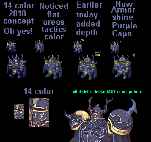
Edit: Placed in a monster sheet and I saw a lot of space so I made one with more room for his neck area
Title: Re: Seushiro's Sprites... Redoing some sprites
Post by: Kagebunji on March 25, 2014, 10:43:30 am
Post by: Kagebunji on March 25, 2014, 10:43:30 am
Golbez, huh. You might be interested in Smash's concept too, might work as a reference.
That Horse looks fun, heh. We never had Horser in FFT, so that's fun to see :P
That Horse looks fun, heh. We never had Horser in FFT, so that's fun to see :P
Title: Re: Seushiro's Sprites... Redoing some sprites
Post by: Seushiro on March 25, 2014, 10:48:27 am
Post by: Seushiro on March 25, 2014, 10:48:27 am
Smash concept would be good for a human version :) I will take Smash's Cecil concept thou and finish that ahaha
Title: Re: Seushiro's Sprites... Redoing some sprites
Post by: Luiakyn on March 25, 2014, 03:37:03 pm
Post by: Luiakyn on March 25, 2014, 03:37:03 pm
I really like the Golbez. The Right hand plays tricks on the mind and makes the whole sprite look as through they're facing the viewer. I think it should at least be higher.
A terrible edit, but:
(The cloak isn't edited right, I realize :( )

A terrible edit, but:
(The cloak isn't edited right, I realize :( )
Title: Re: Seushiro's Sprites... Redoing some sprites
Post by: Seushiro on March 25, 2014, 10:11:54 pm
Post by: Seushiro on March 25, 2014, 10:11:54 pm
Well you are right with the hands. I will go with your edit :) at least doing the shoulder animations wont be a pain anymore since left and right have the same style now.
Title: Re: Seushiro's Sprites... Redoing some sprites
Post by: Seushiro on March 27, 2014, 10:12:23 am
Post by: Seushiro on March 27, 2014, 10:12:23 am
Still long ways to go on the Squall sprite. I have some progress and need to do tweaks. Can anyone help me animate Squall's hair in the front and rear walking animations?
I also had nothing much to do at down time during work so I made Concept for Full Metal Alchemist using the main frames in tactics. I plan on taking on the 4 heroes of light that just have portraits and the main 4 cast of Bravely Default since the Artist (Akihiko Yoshida) is the same as Final Fantasy Tactics and FF XII, which as you know have simple designs and can be translated to FFT sprites.


I also had nothing much to do at down time during work so I made Concept for Full Metal Alchemist using the main frames in tactics. I plan on taking on the 4 heroes of light that just have portraits and the main 4 cast of Bravely Default since the Artist (Akihiko Yoshida) is the same as Final Fantasy Tactics and FF XII, which as you know have simple designs and can be translated to FFT sprites.
Title: Re: Seushiro's Sprites... Redoing some sprites
Post by: Kagebunji on March 27, 2014, 10:24:10 am
Post by: Kagebunji on March 27, 2014, 10:24:10 am
Haha, Full Metal Alchemist. I recently watched the Brotherhood remake, it is such a fuckin good anime.
For Squall, you should see Twinees' version of him. It looks really great. It's his work though, so I cannot post it unless he approves. You can PM him about it if you want, it really would help you :)
For Squall, you should see Twinees' version of him. It looks really great. It's his work though, so I cannot post it unless he approves. You can PM him about it if you want, it really would help you :)
Title: Re: Seushiro's Sprites... Redoing some sprites
Post by: Celdia on March 27, 2014, 01:13:47 pm
Post by: Celdia on March 27, 2014, 01:13:47 pm
Quote from: Seushiro on March 27, 2014, 10:12:23 am
I plan on taking on the 4 heroes of light that just have portraits and the main 4 cast of Bravely Default
OMG yes please
...start with Edea? Maybe please? Yes?
*adds another picture and candle to her Edea shrine* ...mrgrgr...
Title: Re: Seushiro's Sprites... Redoing some sprites
Post by: Dante on March 27, 2014, 05:41:06 pm
Post by: Dante on March 27, 2014, 05:41:06 pm
Really cool Seu!!! Hope u make some sprites from suikoden or naruto :)
Title: Re: Seushiro's Sprites... Redoing some sprites
Post by: Lijj on March 27, 2014, 05:42:42 pm
Post by: Lijj on March 27, 2014, 05:42:42 pm
Yeah, those Full-Metal Alchemist costumes really work well in FFT style!
Title: Re: Seushiro's Sprites... Redoing some sprites
Post by: Seushiro on March 28, 2014, 06:00:43 am
Post by: Seushiro on March 28, 2014, 06:00:43 am
Quote from: Dante on March 27, 2014, 05:41:06 pm
Really cool Seu!!! Hope u make some sprites from suikoden or naruto :)
We actually made concepts and one full sprite which was Kakashi (somewhere out there). I still have most of the concept arts
Title: Re: Seushiro's Sprites... Redoing some sprites
Post by: 3lric on March 28, 2014, 07:47:50 am
Post by: 3lric on March 28, 2014, 07:47:50 am
Believe it!
Title: Re: Seushiro's Sprites... Redoing some sprites
Post by: Seushiro on March 28, 2014, 08:10:13 am
Post by: Seushiro on March 28, 2014, 08:10:13 am
Quote from: Elric on March 28, 2014, 07:47:50 am
Believe it!
LoLs that comment was also part of the ban before ahaha
Title: Re: Seushiro's Sprites... Redoing some sprites
Post by: Angel on March 28, 2014, 09:12:16 am
Post by: Angel on March 28, 2014, 09:12:16 am
Oh wow, I'm loving that Gaara concept with the blue/black eyes! Is that Rock Lee I see?
But, no Sakura? Sadface.
I just woke up, and am completely incoherent, but I'd pay to see Elric event Rock Lee vs Gaara.
But, no Sakura? Sadface.
I just woke up, and am completely incoherent, but I'd pay to see Elric event Rock Lee vs Gaara.
Title: Re: Seushiro's Sprites... Redoing some sprites
Post by: kyozo22 on March 28, 2014, 02:58:15 pm
Post by: kyozo22 on March 28, 2014, 02:58:15 pm
Wow! I've gone off Naruto massively over the last few years, but seeing those concepts has made me go very giddy! ;)
Looking awesome!
Looking awesome!
Title: Re: Seushiro's Sprites... Redoing some sprites
Post by: Dante on March 28, 2014, 04:22:02 pm
Post by: Dante on March 28, 2014, 04:22:02 pm
Really good Seu! That concepts so awesome !!! Hope u finish them :)
Title: Re: Seushiro's Sprites... Redoing some sprites
Post by: Kagebunji on March 29, 2014, 01:05:42 pm
Post by: Kagebunji on March 29, 2014, 01:05:42 pm
Heh, thse Naruto sprites were really fun in the past. Had a hidden section and all that. They lack some quality, but overall it's fun to see them again :P
Title: Re: Seushiro's Sprites... Redoing some sprites
Post by: 3lric on March 29, 2014, 02:09:48 pm
Post by: 3lric on March 29, 2014, 02:09:48 pm
That section still exists in Archives.
Title: Re: Seushiro's Sprites... Redoing some sprites
Post by: Seushiro on March 30, 2014, 11:07:47 am
Post by: Seushiro on March 30, 2014, 11:07:47 am
Coming up with parts for the 4 heroes and Bravely Default just got harder my mind just can't give me the combinations I want to make it happen. Not even just as a concept.
Finished up my Squall sprite. I got the head for the front frames from Twinees Squall concept, Missing pieces from Cronos Aragami's unfinished work, and a lot of fixing as the colors and flesh they had in those were broken up. Lastly Jimmy's Portrait since I cannot find my own Squall Portrait from way way back. Just need to make the bangs move in the back facing walks.

Finished up my Squall sprite. I got the head for the front frames from Twinees Squall concept, Missing pieces from Cronos Aragami's unfinished work, and a lot of fixing as the colors and flesh they had in those were broken up. Lastly Jimmy's Portrait since I cannot find my own Squall Portrait from way way back. Just need to make the bangs move in the back facing walks.
Title: Re: Seushiro's Sprites... Redoing some sprites
Post by: Lijj on March 30, 2014, 10:49:43 pm
Post by: Lijj on March 30, 2014, 10:49:43 pm
That looks great. The black is very black though.
Title: Re: Seushiro's Sprites... Redoing some sprites
Post by: Seushiro on March 31, 2014, 02:02:33 am
Post by: Seushiro on March 31, 2014, 02:02:33 am
Thanks for pointing that out Lijj. I think that is why when I play the sprite and he goes to a darker area like under the castle wall his darker colors look bad. I have a better graphics card here in the office so I fixed things up with graphics Gale. Also noticed some arms not looking right so changed it from the squire set of hands.
Edit: updated Squall Sprite again saw some excess pixels in-game

Edit: updated Squall Sprite again saw some excess pixels in-game
Title: Re: Seushiro's Sprites... Redoing some sprites
Post by: Seushiro on March 31, 2014, 11:12:56 am
Post by: Seushiro on March 31, 2014, 11:12:56 am
The blue shades for Squall was not fun in game so I switched the shade to brown again and re uploaded.
I looked back at jap_tac's Rinoa and reduced it to 16 colors I think with a thief's body it can be done.
Sprites I did before that I should redo and finish:
1. Genesis
2. Ryu BOF
3. Golbez
4. Exodus
5. Fei Fong Wong
6. Strider
7. Chun-Li
But my priority is still the 4 heroes of light and Bravely Default. If only I can get a good concept through inspiration.
Title: Re: Seushiro's Sprites... Redoing some sprites
Post by: Dante on April 01, 2014, 01:51:57 am
Post by: Dante on April 01, 2014, 01:51:57 am
Gj Seu!!! Really good concept !!! :P Goku Gohan Goten so awesome. Pls finish them !! Haha :twisted:
Title: Re: Seushiro's Sprites... Redoing some sprites
Post by: Seushiro on April 01, 2014, 08:35:57 am
Post by: Seushiro on April 01, 2014, 08:35:57 am
While conceptualizing for Genesis I had a look at the existing Zach Fair sprites and tried to come up with my own.
Which head resembles mature Zack the best?

Which head resembles mature Zack the best?
Title: Re: Seushiro's Sprites... Redoing some sprites
Post by: Kagebunji on April 01, 2014, 03:37:17 pm
Post by: Kagebunji on April 01, 2014, 03:37:17 pm
Personally, I like Genesis quite a bit. Did a few tweaks to the hair, cause it really deserves it.
Also, I have a new Zack sprite in my files, it's a portrait and concept so far, but I will finish it eventually. Twinees did the port and helped me on the concept stage. Take a look.


Also, I have a new Zack sprite in my files, it's a portrait and concept so far, but I will finish it eventually. Twinees did the port and helped me on the concept stage. Take a look.
Title: Re: Seushiro's Sprites... Redoing some sprites
Post by: Seushiro on April 01, 2014, 10:20:14 pm
Post by: Seushiro on April 01, 2014, 10:20:14 pm
I like the sprite concept it is very well done but with huge changes to belt straps and gloves that will be a very long edit from the cloud base unlike what I would be doing and already did. Hope you do finish it (you must please!). For the portrait it is way better than the Aliste mod but I feel some thing can still be done. I'm taking that Genesis head you edited and will try it on the JOT5 Sephiroth as a start to get me going
Edit: 2 tone the ear in the concept
Edit: 2 tone the ear in the concept
Title: Re: Seushiro's Sprites... Redoing some sprites
Post by: Kagebunji on April 02, 2014, 05:12:52 am
Post by: Kagebunji on April 02, 2014, 05:12:52 am
Haha, good catch on the ear, I forgot to change it. I will finish him for sure eventually, but right now I have a couple of other sprites that need to be done, so he is on a hold.
Good luck with Genesis, I always liked his character, heh.
Good luck with Genesis, I always liked his character, heh.
Title: Re: Seushiro's Sprites... Redoing some sprites
Post by: Seushiro on April 02, 2014, 11:20:50 am
Post by: Seushiro on April 02, 2014, 11:20:50 am
The overall Sephiroth sprite has minimal distance of colors so modding it to Genesis is a total failure.... Any other good open coat characters? I would try Agrias but that is still a major overhaul effort.
Since I already started my Zack concept before knowing of Kagebunji's project I went ahead and did a head swap :) I think I will still finish my Zack Sprite just so I have another head base in the fodder. My concept does resemble hair for Brave Fencer Musashi Anyway.


Since I already started my Zack concept before knowing of Kagebunji's project I went ahead and did a head swap :) I think I will still finish my Zack Sprite just so I have another head base in the fodder. My concept does resemble hair for Brave Fencer Musashi Anyway.
Title: Re: Seushiro's Sprites... Redoing some sprites
Post by: Luiakyn on April 02, 2014, 05:51:58 pm
Post by: Luiakyn on April 02, 2014, 05:51:58 pm
I reworked a bit of Golbez to prepare him for animation, but I went more off of the FFwiki:
Yes, it needs polishing and tweaking.
Edit: some more tweaks

Yes, it needs polishing and tweaking.
Edit: some more tweaks
Title: Re: Seushiro's Sprites... Redoing some sprites
Post by: Seushiro on April 02, 2014, 09:03:02 pm
Post by: Seushiro on April 02, 2014, 09:03:02 pm
Very refined :) He looks more slick and awesome now fit for a boss. I'll take a closer look at it to see what else to tweak.
Title: Re: Seushiro's Sprites... Redoing some sprites
Post by: jimmyjw88 on April 03, 2014, 12:14:20 am
Post by: jimmyjw88 on April 03, 2014, 12:14:20 am
Welcome back Seushiro! Great job reviving the sprite section! Keep'em up!!
Title: Re: Seushiro's Sprites... Redoing some sprites
Post by: Seushiro on April 03, 2014, 10:19:41 am
Post by: Seushiro on April 03, 2014, 10:19:41 am
Hey Luiakyn you made it 15 colors so I got room to fix the cape :) Well the original goal was to make him bull demon size so I buffed the arms and made it look like it can grab a head and crush it. I also used Anti-Aliasing on the rough edged pixels.

Title: Re: Seushiro's Sprites... Redoing some sprites
Post by: Lijj on April 03, 2014, 04:20:02 pm
Post by: Lijj on April 03, 2014, 04:20:02 pm
Golbez is looking really nice.
Title: Re: Seushiro's Sprites... Redoing some sprites
Post by: Kagebunji on April 03, 2014, 04:31:12 pm
Post by: Kagebunji on April 03, 2014, 04:31:12 pm
True, he does. It's kinda disproportional though. His head is as big as his chest, and it gives off a weird feeling.
For future, could you please post it on black background? It's easier to judge it then, heh.
For future, could you please post it on black background? It's easier to judge it then, heh.
Title: Re: Seushiro's Sprites... Redoing some sprites
Post by: Seushiro on April 04, 2014, 01:53:13 am
Post by: Seushiro on April 04, 2014, 01:53:13 am
The disproportion is good news cause it needs to be huge as a Lucavi which have barely no chest and huge heads and arms... so I need to beef up the arms more like Hashmalum, Adramelk, and Velius
Edit: Although it would be awesome to continue it in Lucavi size as planned. Someone with higher spriting skill should refine this idea further.

Edit: Although it would be awesome to continue it in Lucavi size as planned. Someone with higher spriting skill should refine this idea further.
Title: Re: Seushiro's Sprites... Redoing some sprites
Post by: Seushiro on April 04, 2014, 07:38:43 am
Post by: Seushiro on April 04, 2014, 07:38:43 am
I was messing with Shishi and passed by Rudvich.... seeing the half of the sheet green and white I thought I'll try fixing... To my surprise there is a 3rd palette that matches the lower half colors with his main frames thus completion is possible. The tested head on young Rudvich is a concept of MikeMitchi
I tested and the lower half is a fit version of Rudvich... but nonetheless reverse engineering is possible so reassembled the third frame and can finish the entire sheet.
Edit: Same with Draclau


I tested and the lower half is a fit version of Rudvich... but nonetheless reverse engineering is possible so reassembled the third frame and can finish the entire sheet.
Edit: Same with Draclau
Title: Re: Seushiro's Sprites... Redoing some sprites
Post by: Luiakyn on April 04, 2014, 03:27:11 pm
Post by: Luiakyn on April 04, 2014, 03:27:11 pm
Quote from: Seushiro on April 04, 2014, 01:53:13 am
The disproportion is good news cause it needs to be huge as a Lucavi which have barely no chest and huge heads and arms... so I need to beef up the arms more like Hashmalum, Adramelk, and Velius
Edit: Although it would be awesome to continue it in Lucavi size as planned. Someone with higher spriting skill should refine this idea further.
I'll see what I can do :P Many we'll just ping pong it between the two of us XD
Title: Re: Seushiro's Sprites... Redoing some sprites
Post by: CONMAN on April 04, 2014, 06:29:29 pm
Post by: CONMAN on April 04, 2014, 06:29:29 pm
Ah damn dude I have been working on both of these (at least a little!) Let me show you what I have. Largely finished draclua - and started to reset the arms on rudvich.


Title: Re: Seushiro's Sprites... Redoing some sprites
Post by: Seushiro on April 04, 2014, 11:14:57 pm
Post by: Seushiro on April 04, 2014, 11:14:57 pm
Luiakyn sure let us Ping Pong the sprite with our combined thoughts it is bound to make us complete that Lucavi Golbez.
Very nice CONMAN I will finish of the slim version and if you want I'll help you on the regular version. Since it will look weird if they both slim down during attacks.
Very nice CONMAN I will finish of the slim version and if you want I'll help you on the regular version. Since it will look weird if they both slim down during attacks.
Title: Re: Seushiro's Sprites... Redoing some sprites
Post by: Luiakyn on April 05, 2014, 01:28:46 am
Post by: Luiakyn on April 05, 2014, 01:28:46 am
I'm also doing some concepts on what I'd think the original 6 Lucavi (http://finalfantasy.wikia.com/wiki/Lucavi) would have looked like :3
Title: Re: Seushiro's Sprites... Redoing some sprites
Post by: Seushiro on April 05, 2014, 03:03:33 am
Post by: Seushiro on April 05, 2014, 03:03:33 am
Let us in on those Concepts :) Let us make it happen!
:more: :more: :more: :more:
:more: :more: :more: :more:
Title: Re: Seushiro's Sprites... Redoing some sprites
Post by: Seushiro on April 06, 2014, 09:21:51 am
Post by: Seushiro on April 06, 2014, 09:21:51 am
Not much spriting done since it is the weekend but did fix up the young Rudvich and Rudvich Jr. bases.
I think the Rudvich Jr. Has a lot of potential in looking good, but I need your edits to help give it a better outcome so feel free to edit the Front and Back walking Frames if you want :)
Right now I have some time so I am also working on making the Ryu sprite more like his BOF 3 appearance and building a big lucavi standing dragon base which I plan to convert to Bahamut once finalized in the attack and walking animations (Right Now it is just Charizard :P).
Edit: Before I just had the mindset that it was fine as long as it is completed and was playable... Good thing I now take a long look and try to fix the shadings and give proper lighting and depth... So with that I redid my very first completed sprite Reno... It is not perfect but at least it is way better than before.
Title: Re: Seushiro's Sprites... Redoing some sprites
Post by: Kagebunji on April 06, 2014, 01:30:28 pm
Post by: Kagebunji on April 06, 2014, 01:30:28 pm
Rudvich body could work for a Mage of some sort, I kinda like it. Just make sure to make the inside of his collar on the portrait black.
Elric was doing once a lot of monsters the way you did with Charizard. When transfering other monster into FFT, you usually need to fill out the walking cycle, since most game uses 3, while FFt uses 5, and give it proper FFT palette, this really makes it seem more like FFT work. Other thing is the shading of course, but that's a longer topic, heh.
And nicely done on Reno, it's fun to see reworks of old pieces.
About Ryu, I dunno, I get the feeling like something is still off about it, it's the concept I tihnk. Still, it looks better when FFT-fied a little.
Title: Re: Seushiro's Sprites... Redoing some sprites
Post by: Angel on April 06, 2014, 06:29:17 pm
Post by: Angel on April 06, 2014, 06:29:17 pm
Ryu has a bit too much hair, imo. Especially in the portrait. The rest of his sprite really isn't that bad, though.
Title: Re: Seushiro's Sprites... Redoing some sprites
Post by: azavier on April 06, 2014, 07:24:53 pm
Post by: azavier on April 06, 2014, 07:24:53 pm
Is there any way you can finish that Ritz sprite you started in 2009? (:
Title: Re: Seushiro's Sprites... Redoing some sprites
Post by: Jumza on April 06, 2014, 08:13:49 pm
Post by: Jumza on April 06, 2014, 08:13:49 pm
Uhm, I may be wrong about this but I think Rudvich Belt has his hair going the wrong way on the back frames.
Title: Re: Seushiro's Sprites... Redoing some sprites
Post by: 3lric on April 07, 2014, 12:00:45 am
Post by: 3lric on April 07, 2014, 12:00:45 am
I wish you still had the old Ryu you worked on, I seem to remember that one looking a lot more like the Adult Ryu from Bof3.
Either way, nice job :P
Either way, nice job :P
Title: Re: Seushiro's Sprites... Redoing some sprites
Post by: Seushiro on April 07, 2014, 12:07:19 am
Post by: Seushiro on April 07, 2014, 12:07:19 am
@Kagebunji and Toshiko: thanks I really need more references for hair and the back facing frames. I guess I'll take a day or two into lurking the spriting section in search of precious pieces of reference and build my work bench
@ azavier: well since you brought that up I will see what I can do to complete Ritz. I think there is now a complete Aeris out there that I can use as reference.
@ Jumza: you are entirely right I did 10 combinations but got stuck. So I left it at that while I get more references to use in completing him.
@ Elric: I did find it in my thread but... see for yourself it is made almost from a BOF3 Ryu sprite and looks weird and chibi. Also I think it is because I changed references... Should I just merge em both?
Title: Re: Seushiro's Sprites... Redoing some sprites
Post by: Angel on April 07, 2014, 08:42:29 am
Post by: Angel on April 07, 2014, 08:42:29 am
To give an example, Cloud's hair in FFT is far more understated than his hair in FFVII. It's about conforming to a style rather than shoehorning a square peg into a round hole.
Most of the frames are looking really good now, though there are a couple here and there that are still a tiny bit more exaggerated than would really fit - a matter of opinion that may only be my own. Everything really is looking better and better, though, no doubt!
Most of the frames are looking really good now, though there are a couple here and there that are still a tiny bit more exaggerated than would really fit - a matter of opinion that may only be my own. Everything really is looking better and better, though, no doubt!
Title: Re: Seushiro's Sprites... Redoing some sprites
Post by: Kagebunji on April 07, 2014, 09:30:44 am
Post by: Kagebunji on April 07, 2014, 09:30:44 am
Here is a further FFT-fied hair for Ryu.

Title: Re: Seushiro's Sprites... Redoing some sprites
Post by: Seushiro on April 07, 2014, 01:05:26 pm
Post by: Seushiro on April 07, 2014, 01:05:26 pm
I agree with your render of the upper part of the hair Kage but, the hair on the side of the ears (Faux Side Burn/ not the facial hair) now looks like bangs and he is nerdy :roll:
I will work on the sprite from there then.
Also dumping this Reno WIP here. I fixed majority of the face to match references and have his sunglasses/ goggles be in proportion to his eyes as they should be unless you are a fun of small spectacles/frames. So can anyone do his hair? If not it is fine I can do it much later. Just gonna get loads of sleep for reports day at work later.
Title: Re: Seushiro's Sprites... Redoing some sprites
Post by: Twinees on April 08, 2014, 09:32:21 am
Post by: Twinees on April 08, 2014, 09:32:21 am
You kind of lost the spikeyness and in turn he looks like he has a small head of hair with your new edit of Reno (the sprite). But the goggles look pretty good. I made an edit for you, so do whatever you want with it :P

Title: Re: Seushiro's Sprites... Redoing some sprites
Post by: Seushiro on April 08, 2014, 09:48:52 am
Post by: Seushiro on April 08, 2014, 09:48:52 am
Nice Twin!!!! with that I need minimal changes to the backward facing concept I have. A real life saver :)
Title: Re: Seushiro's Sprites... Redoing some sprites
Post by: Luiakyn on April 08, 2014, 06:47:25 pm
Post by: Luiakyn on April 08, 2014, 06:47:25 pm
I apologize for not doing much, lately :< I'll be trying to work on Golbez before Thursday.
Title: Re: Seushiro's Sprites... Redoing some sprites
Post by: Seushiro on April 08, 2014, 10:09:02 pm
Post by: Seushiro on April 08, 2014, 10:09:02 pm
Quote from: Luiakyn on April 08, 2014, 06:47:25 pm
I apologize for not doing much, lately :< I'll be trying to work on Golbez before Thursday.
Don't worry about it :) We know spriting takes 50% time and skill while the other 50% is pure inspiration. Unless we feel it then it is hard to push for the finish. Especially since we are still at the concept stages. Also you have really good WIPs sprites.
Edit: Got some updates for Reno Sprite Makeover:
*Fixed more frames for front walking
*Back facing walking tuxedo cut has been removed. Apparently The Turks don't have the cut at the back so bye to the penguin tail
*Portrait work in Progress I would say at 70% still need more layers of hair
For Genesis: still 0% progress argh! Shoulder pads look like crap
Also I think it is possible to have just 3 walking frames with Monsters since the Cockatrice 1st and 5th frame are wing flap repeats while only the 2nd-4th frames are walking anims and the is 3 frames. I will try Charizard over again on the weekend.
Title: Re: Seushiro's Sprites... Redoing some sprites
Post by: Kagebunji on April 10, 2014, 07:40:16 am
Post by: Kagebunji on April 10, 2014, 07:40:16 am
Great work on the Reno sprite. He si really shaping up now. Much better than the first version.
As to the portrait, you might want to erase the two bangs at the top left part of the portrait, they just ain't fitting.
Genesis body is gettin good, but the shouders are weird indeed, kinda as if they were too low or something. I assume you used Dante from JoT5 sprite as a base? It has the coat you are looking for pretty much.
Edit: I looked closely on the Reno portrait. Few things worth mentioning, is that you need to get proper palette first. You are way over 16 colors, yet have only 5 skin shades, which makes it hard to work with. The trick to save up some colors when doing red head portraits, is that darkest reds and browns can be shared, since they look pretty similiar. Try looking at my Succubus portrait for example. Make sure you use existing palettes of course. Smash started doing a portrait tutorial once, where he had great skin palettes all ready. It's somewhere in the spriting section though. I also included a small edit to the face and hair, but I cannot do much without a proper palette. Still, you will get the idea of how a face should look with all the fixes.(small size only)
Title: Re: Seushiro's Sprites... Redoing some sprites
Post by: Seushiro on April 10, 2014, 08:04:50 am
Post by: Seushiro on April 10, 2014, 08:04:50 am
Noted. Also yep you are correct with the base for Genesis :) My lurking did not fail.
Title: Re: Seushiro's Sprites... Redoing some sprites
Post by: jimmyjw88 on April 11, 2014, 01:52:15 am
Post by: jimmyjw88 on April 11, 2014, 01:52:15 am
Took a rough try on Reno. Been so long. Got rusty.

Title: Re: Seushiro's Sprites... Redoing some sprites
Post by: Seushiro on April 11, 2014, 10:30:54 am
Post by: Seushiro on April 11, 2014, 10:30:54 am
Even for a rough draft you still got your fundamentals stuck into you still good even as a WIP. I will kidnap that hair and fix my Natsu Portrait with it cause it is perfect for it.
I already reduced the colors to 16 and made some hair layer adjustments but I'm still not done. I wanna keep on working on this to practice more. I also read Smash's advice just like the Alucard portrait to take note of where the hair starts to change in the face. So I made this matching those areas (the Chin itself, the Sideburns past the chin line, the major bangs above the shades, start of eyebrows) other stuff I may find too.


I already reduced the colors to 16 and made some hair layer adjustments but I'm still not done. I wanna keep on working on this to practice more. I also read Smash's advice just like the Alucard portrait to take note of where the hair starts to change in the face. So I made this matching those areas (the Chin itself, the Sideburns past the chin line, the major bangs above the shades, start of eyebrows) other stuff I may find too.
Title: Re: Seushiro's Sprites... Redoing some sprites
Post by: Seushiro on April 13, 2014, 12:37:59 pm
Post by: Seushiro on April 13, 2014, 12:37:59 pm
Having such a hard time with the Reno (attached update) and Genesis sprite so I took a break to relax a bit and wait for the vibes to come to me. SO right now I am basically messing with the Tiamat sprite and mashed it with Charizard to make a Bahamut sprite with only 3 walking animations except all those sprites in game have no hands :mad: .... it will be tough


Title: Re: Seushiro's Sprites... Redoing some sprites
Post by: jimmyjw88 on April 14, 2014, 12:17:05 pm
Post by: jimmyjw88 on April 14, 2014, 12:17:05 pm
Those lines don't match bahamut's angle. (Well, if the arms are blocking then I guess it wouldn't matter.)
Try to take another crack on port, unfortunately looks nothing like Genesis. Lol.

Try to take another crack on port, unfortunately looks nothing like Genesis. Lol.
Title: Re: Seushiro's Sprites... Redoing some sprites
Post by: Kagebunji on April 14, 2014, 01:32:03 pm
Post by: Kagebunji on April 14, 2014, 01:32:03 pm
Jimmy's right about Bahamut's arms, just put right arm to the right a few pixels and it will look better.
I tried doing some tweaks on Genesis jair, but this bitch is definitly making it hard, haha. Try tweaking Jimmy's portrait more, it's a nice start.
I tried doing some tweaks on Genesis jair, but this bitch is definitly making it hard, haha. Try tweaking Jimmy's portrait more, it's a nice start.
Title: Re: Seushiro's Sprites... Redoing some sprites
Post by: Seushiro on April 15, 2014, 10:10:16 am
Post by: Seushiro on April 15, 2014, 10:10:16 am
Quote from: Kagebunji on April 14, 2014, 01:32:03 pm
I tried doing some tweaks on Genesis hair, but this bitch is definitly making it hard, haha.
Yep exactly :) For the portrait nah I'll just get more references to fix mine but I will steal Jimmy's collar there on Genesis. It looks like someone else as he said ahaha. Still it goes to my portrait workbench I love Jimmy's style in doing ports.
Well I cant access sprites at the office so out of boredom I did the Bravely default guys concepts by sheer knowledge of doing sprites which is from scratch. A lot of bad proportions are expected in this one but I will post it.
Also anybody still have the Firion Sprite but a fixed one??? I kinda wanna complete it as I had begun my Hero of Light Sprite and want to finish them both. I already have the Front walking animations for the hero of light done but the cloth under his armor on the legs need to sway while walking.... or not :)
Title: Re: Seushiro's Sprites... Redoing some sprites
Post by: azavier on April 15, 2014, 11:22:43 am
Post by: azavier on April 15, 2014, 11:22:43 am
The yuna one is the one i want so bad ! Please finish that one lol
Title: Re: Seushiro's Sprites... Redoing some sprites
Post by: Seushiro on April 15, 2014, 12:00:10 pm
Post by: Seushiro on April 15, 2014, 12:00:10 pm
Which Yuna are you looking forward to? The gunner or Summoner? If it is the Summoner that one is possible to do cause of colors (and the lame excuse since it has an existing portrait in the MegaRef by Lijj).
EDIT: Did an Armored Chocobo cause I promised myself so many times I would. Only Helmet and Chest piece so far need to do Wing Pads. This was also inspired from the JOT5 Ramza thus his colors for the Blue Materias embedded and 3 of the 5 shades of Armor Metal.


EDIT: Did an Armored Chocobo cause I promised myself so many times I would. Only Helmet and Chest piece so far need to do Wing Pads. This was also inspired from the JOT5 Ramza thus his colors for the Blue Materias embedded and 3 of the 5 shades of Armor Metal.
Title: Re: Seushiro's Sprites... Redoing some sprites
Post by: 3lric on April 15, 2014, 01:07:39 pm
Post by: 3lric on April 15, 2014, 01:07:39 pm
Holy fuck, I've wanted a armored chocobo FOREVER. Glad to see someone finally take up the task, good luck!
Title: Re: Seushiro's Sprites... Redoing some sprites
Post by: jimmyjw88 on April 15, 2014, 11:19:52 pm
Post by: jimmyjw88 on April 15, 2014, 11:19:52 pm
Cool! Always wanted to try that.
Title: Re: Seushiro's Sprites... Redoing some sprites
Post by: Seushiro on April 16, 2014, 04:14:48 am
Post by: Seushiro on April 16, 2014, 04:14:48 am
I think I over did it and went a bit gothic/ dark style on it that only Gaffy would be proud... suggestions?

Title: Re: Seushiro's Sprites... Redoing some sprites
Post by: Kagebunji on April 16, 2014, 06:40:42 am
Post by: Kagebunji on April 16, 2014, 06:40:42 am
Make it's face back to the first version, looked better. It's pretty dark, yeah, but it doesn't bother me at all. From the two chocobos presented above, I would choose the one on the left.
Bravely Default characters are clearly made from scratch as you mentioned, and there would be a lot of fixes required. It's funny you did those the moment I started watching an LP of the game, haha.
That Warrior of Light is from some japaneese concept? It could use some simplifying, since it's hard to tell what is what in the small view.
Genesis...well his back hair is an annoying cunt, but what to do, ey.
Yuna is really thin, kinda dsproportional. There was once a Yuna concept floating around which could help you out. I would ditch the white details on dress for now, small detail which isn't working at the moment.
Title: Re: Seushiro's Sprites... Redoing some sprites
Post by: jimmyjw88 on April 16, 2014, 07:26:30 am
Post by: jimmyjw88 on April 16, 2014, 07:26:30 am
In my personal opinion, I feel that's way too much armor. Feels like chocobo is completely covered.
Title: Re: Seushiro's Sprites... Redoing some sprites
Post by: Twinees on April 16, 2014, 11:44:20 am
Post by: Twinees on April 16, 2014, 11:44:20 am
It's great to see you come up with so many new things to look at. I'm really liking your Goku sprite the most out of all of these so far.
If you are struggling with Genesis's hair, just start all over from scratch and begin his hair anew. Its sometimes best to try again using a different base. You've got the Dante sheet right there, why not use his hair as base? :)
Bravely Default characters: Watch out with some of your placement of feet, hand and head positions. Its quite important to make sure that each has the right proportion to each other and such. This is most noticeable on Edea, she looks quite hunched over (this is the same for Yuna)!
Chocobo: It looks rather... robotic. Considering the only real piece of robot technology in FFT is Worker 8, maybe look at some knights armour from medieval ages and try to base the armour on that instead. And keep an eye on your shading particularly for this, if you compare the original chocobo to your current, the lighting on the armour should be very different.
Great start with all of them though, interested to see more :)
Title: Re: Seushiro's Sprites... Redoing some sprites
Post by: Seushiro on April 20, 2014, 10:34:01 am
Post by: Seushiro on April 20, 2014, 10:34:01 am
I decided to rework the Armored Chocobo from scratch the best is to make it look like Delita's Plated Chocobo but I will need more references for that.
2nd update:
I was able to complete my Reno sprite but instead of doing the head swaps for Olan (Tseng) and the Warjilis sailor (Rude) I figured I would have tons to fix so I'll do it in the coming week.
3rd Update: Using Zalbaag and Cavalier (Smash) I made my own rendition of the Warrior of Light and impressed myself with the Walking animations. I am 1/4 done with the attack animations so this will take time. Only when I finish this will I further dive in to doing Firion... So right now one Final Fantasy at a Time
4th Update: Snooping with in game palettes I decided to fix Squall again and not just recolor but update the portrait done by Jimmy to have less bushy brows, normal level of scar depth and length, a hair cut, and his Smug face.
EDIT: Thanks for finishing the Squall Port Jimmy now updated
Title: Re: Seushiro's Sprites... Redoing some sprites
Post by: jimmyjw88 on April 20, 2014, 11:56:03 am
Post by: jimmyjw88 on April 20, 2014, 11:56:03 am
1-The armor chocobo looks much clean and better than previous attempt. I like it, though I would like to see them in lighter & shiny armour shades.
2-In my opinion, that red on Reno's portrait is bit saturated. Try use Kage's Succubus red. Also, what happened to his brows??
3-For Squall's portrait, try not to use all the shades on his forehead. It's giving the blurry effect. Use only necessary shades to make it look sharp and detailed. Also, there shouldn't be a straight dark line under his chin to his neck.
4-In my opinion, Hero of Light portrait (from Dissidia) need quite some refining to do. I'll leave it to the pros.
Title: Re: Seushiro's Sprites... Redoing some sprites
Post by: Seushiro on April 20, 2014, 01:04:50 pm
Post by: Seushiro on April 20, 2014, 01:04:50 pm
Thanks for the feedback Jimmy I will work from scratch with the Chocobo and would appreciate your crits again when it happens. I want to try something more of leather straps first and no metal plating for it.
For the Reno portrait I just followed the brows on the advent children references and got to that. His eyes reach out more than the brows so I did the same, but yeah I could shape it more. I will give the hair recolor a try thou since that is quick and easy and edit the posted sheet.
For the Squall Portrait can you fix it up please? It is originally your's Jimmy so you know its needs and fixes more than I do. Looking at it much closer I saw the forehead blur you mentioned and I admit I am lazy to fix that one ahaha.
I don't think I will be touching it up again for now. I must keep focused and finish FFI-FFVI main guys sheets before my inspiration to finish em dies :) Thus I'm leaving that to the Pros too!
Title: Re: Seushiro's Sprites... Redoing some sprites
Post by: jimmyjw88 on April 21, 2014, 07:18:37 am
Post by: jimmyjw88 on April 21, 2014, 07:18:37 am
Yea, leather strap is good too. I like to see that as well.
I may try give another whoop on Reno's port when I'm free.
Here's some minor fixes for Squall.
EDIT: Add x1 size

I may try give another whoop on Reno's port when I'm free.
Here's some minor fixes for Squall.
EDIT: Add x1 size
Title: Re: Seushiro's Sprites... Redoing some sprites
Post by: Twinees on April 21, 2014, 08:39:36 am
Post by: Twinees on April 21, 2014, 08:39:36 am
I will make some edits to the Hero of Light shortly and edit this post to show you some places that could do with some clean up :).
I much prefer Jimmy's original colours for Squall, the current are a bit too saturated in my opinion.
Haha, got to it before you could Jimmy :P. Hopefully this is some help for the Reno portrait.

I much prefer Jimmy's original colours for Squall, the current are a bit too saturated in my opinion.
Haha, got to it before you could Jimmy :P. Hopefully this is some help for the Reno portrait.
Title: Re: Seushiro's Sprites... Redoing some sprites
Post by: jimmyjw88 on April 21, 2014, 09:01:35 am
Post by: jimmyjw88 on April 21, 2014, 09:01:35 am
Damn! That's way better than what I had in mind! Hah. Definitely help a lot, Twin. :)
I'm looking forward to learn from the pro on Hero of Light edits. :P
I'm looking forward to learn from the pro on Hero of Light edits. :P
Title: Re: Seushiro's Sprites... Redoing some sprites
Post by: Seushiro on April 21, 2014, 09:11:58 am
Post by: Seushiro on April 21, 2014, 09:11:58 am
"Leave it to the pros" I love you guys for your skills. Now I'm excited for the Hero of light!
edit: Jimmy would you mind sharing to me the small size version so I could update Squall?
I would like to give a big thanks to Twinees as he made the revised look and an awesome portrait. Also cause of that I noticed I did not update the Attack Water animations front/back so here it is.

edit: Jimmy would you mind sharing to me the small size version so I could update Squall?
I would like to give a big thanks to Twinees as he made the revised look and an awesome portrait. Also cause of that I noticed I did not update the Attack Water animations front/back so here it is.
Title: Re: Seushiro's Sprites... Redoing some sprites
Post by: Kagebunji on April 21, 2014, 09:56:01 am
Post by: Kagebunji on April 21, 2014, 09:56:01 am
Well, everything was already said, what can I add is that Genesis new hair isn't working really, you should rather keep the old one over this. I can see Cloud pretty easily there.
Title: Re: Seushiro's Sprites... Redoing some sprites
Post by: Seushiro on April 21, 2014, 10:28:09 am
Post by: Seushiro on April 21, 2014, 10:28:09 am
Actually I took it from here ahaha just to try...
http://ffhacktics.com/smf/index.php?topic=9859.0 (http://ffhacktics.com/smf/index.php?topic=9859.0)
The heroes below are all FFT size and with a little recoloring and proper shading it will be good. I like how they executed characters with bangs in the middle. the purple haired looks like Misato Katsuragi O__O
But yeah I also like the older one you fixed and kept a version of it :)
Title: Re: Seushiro's Sprites... Redoing some sprites
Post by: Seushiro on April 23, 2014, 01:44:37 pm
Post by: Seushiro on April 23, 2014, 01:44:37 pm
Hi all! I need a little help in two of the sprites I'm working on... I made a Judge Magister Class (yes I know there a lot of Gabranths concepts floating there but I want my own to replace a job class) and Garland's first draft Concept.
To be a little Straight forward the main problem I have with the Judge Magister is his right hand (left hand in our view) The large shoulder pauldrons are just hard to transfer to the other arm. I need help in shaping that up.
for Garland if you can help me give it a better look then I would appreciate the inputs.
Title: Re: Seushiro's Sprites... Redoing some sprites
Post by: Kagebunji on April 24, 2014, 06:50:34 am
Post by: Kagebunji on April 24, 2014, 06:50:34 am
Gabranth needs way more colors, right now he is all gray, which makes him look booring. Another thing is that he is disproportional, giant shoulders, small chest, even bigger helm. Fact that he is small doesn't help either, small and bulky doesn't look well.
Garland on the other hand isn't that bad, cause the purple cape breaks the monotonous look.
This Gabranth here is a good example of how to make it more colorful
http://ffhacktics.com/smf/index.php?topic=6182.140
Garland on the other hand isn't that bad, cause the purple cape breaks the monotonous look.
This Gabranth here is a good example of how to make it more colorful
http://ffhacktics.com/smf/index.php?topic=6182.140
Title: Re: Seushiro's Sprites... Redoing some sprites
Post by: Seushiro on April 24, 2014, 08:25:10 am
Post by: Seushiro on April 24, 2014, 08:25:10 am
Thanks Kage his has even less colors for the armor. I think I could get some palette suggestions from it and fix mine. About disproportion I would probably uncover areas i shaded with black and go for delita ch 2 arm swaps
O another note I did'nt know you modded that paladin Ramza I have been looking for it for days after I saw a semi finishes post! Finally got my hands on it
O another note I did'nt know you modded that paladin Ramza I have been looking for it for days after I saw a semi finishes post! Finally got my hands on it
Title: Re: Seushiro's Sprites... Redoing some sprites
Post by: Lijj on April 25, 2014, 05:42:31 pm
Post by: Lijj on April 25, 2014, 05:42:31 pm
I think the Gabranth sprite looks pretty cool myself. but maybe smaller horns and as Kage said bigger chest.
Title: Re: Seushiro's Sprites... Redoing some sprites
Post by: Seushiro on April 27, 2014, 12:51:19 pm
Post by: Seushiro on April 27, 2014, 12:51:19 pm
Wew been awhile since I posted but I have some good news.
Let us start with the good news. First of I would like to thank Twinees for not giving up on helping me with my goal of having Bravely Default Heroes possible in FFH. Below you would see the comparison (and big difference in skill) with the attached photo. The one above is his rendition of the 4 (obviously) while the 4 mutations below are mine since I made em from scratch and was a bad idea to begin with.
Unfortunately I do not have his skill to craft out of thin air and i still stick to minor edits and a lot of copy pasting. SO PLEASE I NEED SUGGESTIONS FOR THE BASE BODY TO BE USED. Meanwhile I just made animations of some as I was excited for them :)
Second bit of news: As you have all heard in E3 FFXV is just FFXIII: Versus getting a rename and a few fashion changes.... I swear the only reason they really did no release it because Noctis had Emo Hair (Sasuke Hair), Red Eyes (Sharingan Like), and a SHort sleeved Jacked with a Zipper up to the neck (Yes Sasuke in the Avenger/ Hawk era).. That aside now I based the sprite of the new look and was just glad it can fit into FFT well the long shorts part not quite...
The rest are just updates of the things I have decided to work on.
Title: Re: Seushiro's Sprites... Redoing some sprites
Post by: Choto on April 27, 2014, 08:38:37 pm
Post by: Choto on April 27, 2014, 08:38:37 pm
Don't fret, spriting from scratch for me is terrible. As for a base, I'm not sure. i guess look at which vanilla sprites clothing, hair, etc. are most close to what you want in the end.
Hero of light looks good, albeit busy like Kage said. I like him though. Check the movement of his left shoulder and how it disconnects from the cape part, I think it should all move together. The right arm disappears quite abruptly, you could add just a tiny bit of it before it hits the turn around frame to make it more smooth.
Cool concepts though, keep flexing the creative muscle!
Title: Re: Seushiro's Sprites... Redoing some sprites
Post by: Kagebunji on April 28, 2014, 04:46:01 am
Post by: Kagebunji on April 28, 2014, 04:46:01 am
Haha, Rin from Blue Exorcist! Liked that anime a lot. You could add some shape to his hair though, and make his flames move a little bit more.
Those Bravely Default characters are hot, perhaps go along with finishing one. Tiz seems like most friendly, pixel-wise.
Who's the guy next to Firion? With the crown on his head. And also the Samurai guy, don't think I recall him from anywhere.
The Chocbo's new helmet looks nice. I am not a fan of his wing armor, and the chest plate though, kinda looks like a big plate, nothing more. Some shaping might help. Are you using some Armored Chocobos reference?
Genesis is my favorite, pretty much :P
Title: Re: Seushiro's Sprites... Redoing some sprites
Post by: jimmyjw88 on April 28, 2014, 08:29:00 am
Post by: jimmyjw88 on April 28, 2014, 08:29:00 am
Overall, nice sprites! Chocobo helmet is okay but not the wing and chest. What Kage said.
Title: Re: Seushiro's Sprites... Redoing some sprites
Post by: Seushiro on April 28, 2014, 10:08:54 am
Post by: Seushiro on April 28, 2014, 10:08:54 am
Quote from: Choto on April 27, 2014, 08:38:37 pm
Check the movement of his left shoulder and how it disconnects from the cape part, I think it should all move together. The right arm disappears quite abruptly, you could add just a tiny bit of it before it hits the turn around frame to make it more smooth.
Thanks Choto I'm glad you spotted those. Will do your suggestions
Quote from: Kagebunji on April 28, 2014, 04:46:01 am
Who's the guy next to Firion? With the crown on his head. And also the Samurai guy, don't think I recall him from anywhere.
That is a Delita King concept I need him to be in his highest as Orinas will grow up and kill him as the Bastard/Fugitive turned Hero of the people. While for the Samurai he is Chiba from Rhapsody gave him FFT colors and will make him a Yojimbo that will slay a party for Gil.
Quote from: Kagebunji on April 28, 2014, 04:46:01 am
The Chocbo's new helmet looks nice. I am not a fan of his wing armor, and the chest plate though, kinda looks like a big plate, nothing more. Some shaping might help. Are you using some Armored Chocobos reference?
I pretty much followed what Twin said to look up medieval armor. All the Armored chocobos in google search are heavily covered and all of em lost their wings for a place to put the saddle... Poor Creatures :'(
Title: Re: Seushiro's Sprites... Redoing some sprites
Post by: Angel on April 28, 2014, 12:55:30 pm
Post by: Angel on April 28, 2014, 12:55:30 pm
Rinoa's chest looks too big. Otherwise, nice form.
(that was the only thing I could comment on that others haven't)
(that was the only thing I could comment on that others haven't)
Title: Re: Seushiro's Sprites... Redoing some sprites
Post by: Celdia on April 28, 2014, 02:04:57 pm
Post by: Celdia on April 28, 2014, 02:04:57 pm
I love how the newer concepts for the Bravely Default characters came out. Only thing that comes to mind is that Edea's outfit and hair look way too stiff when she walks. I'd expect a little bit of motion in there somewhere.
Title: Re: Seushiro's Sprites... Redoing some sprites
Post by: LastingDawn on April 29, 2014, 12:48:19 pm
Post by: LastingDawn on April 29, 2014, 12:48:19 pm
I am always glad to see some love for Bravely Default, that was an incredible game and how fitting that Yoshida's characters would be turned into classic Sprite forms, hehe. Keep up the great work, I found Bravely Default to be a breath of fresh air from a company that has mostly stagnated.
Title: Re: Seushiro's Sprites... Redoing some sprites
Post by: azavier on April 29, 2014, 02:40:51 pm
Post by: azavier on April 29, 2014, 02:40:51 pm
do u still have the old rits u worked on a while back?
the summoner one yes ! i have been playin ff x/x2 and fell in love with summoner yuna again. im gonna use her in my patch and give her summoner and white mage skills .
EDIT: Merged posts -Elric
Quote from: Seushiro on April 15, 2014, 12:00:10 pm
Which Yuna are you looking forward to? The gunner or Summoner? If it is the Summoner that one is possible to do cause of colors (and the lame excuse since it has an existing portrait in the MegaRef by Lijj).
the summoner one yes ! i have been playin ff x/x2 and fell in love with summoner yuna again. im gonna use her in my patch and give her summoner and white mage skills .
EDIT: Merged posts -Elric
Title: Re: Seushiro's Sprites... Redoing some sprites
Post by: 3lric on April 29, 2014, 07:20:06 pm
Post by: 3lric on April 29, 2014, 07:20:06 pm
Dude, freakin edit button, that was barely 5 minutes apart
Title: Re: Seushiro's Sprites... Redoing some sprites
Post by: Grond on May 02, 2014, 11:51:27 am
Post by: Grond on May 02, 2014, 11:51:27 am
Nice work on these sprites :)
I tweaked your Rudvich sprite a bit, since I think I will use it in my mod. I'm not a spriting expert, so it won't be 100% perfect or anything, but I suppose it's "good enough" if no one else wants to work on it. I also reverted the eyes on the portrait to the original's, which you may not like, but you can change them back I suppose.

I tweaked your Rudvich sprite a bit, since I think I will use it in my mod. I'm not a spriting expert, so it won't be 100% perfect or anything, but I suppose it's "good enough" if no one else wants to work on it. I also reverted the eyes on the portrait to the original's, which you may not like, but you can change them back I suppose.
Title: Re: Seushiro's Sprites... Redoing some sprites
Post by: Seushiro on May 03, 2014, 01:49:44 am
Post by: Seushiro on May 03, 2014, 01:49:44 am
Nice go ahead :) As mentioned by Kage before.... you might want to make the inner collar black. I did it and it looks way better.
Finished up the Hero/ Warrior of Light and am currently working on Tiz right now and getting the Noctis Concept finalized (Damn shorts).
Also need more shadings done to on a new Judge concept.


Finished up the Hero/ Warrior of Light and am currently working on Tiz right now and getting the Noctis Concept finalized (Damn shorts).
Also need more shadings done to on a new Judge concept.
Title: Re: Seushiro's Sprites... Redoing some sprites
Post by: Kagebunji on May 03, 2014, 05:45:15 am
Post by: Kagebunji on May 03, 2014, 05:45:15 am
Daaaamn, where to start :P
New Judge is lookin real nice. Gold, blues and silver go along well. Only thing is that his chest is smaller than head once again, perhaps try fixing that. And that Chocobo? Real fucking nice, go for that one.
Tiz is great, just remember to add some grey on his shoes on the back frames, just like it is on forward frames.
For Noctis, move hjis head one pixel to the right on back frames. Other than that he's good.
Good work on Hero of Light! I fel he could use an quality update, but it's not that bad. And the sheet is done, so it will be easier to update it now. Just remember to paste the attack frames into the water ones.
Hah, you seem to watch anime just like I do. Alfonse could use a brighter armor, since this one is kinda dark. His chest and back also don't quite sit with me, but let's leave that for later.
Awesome work Seushiro, keep this up :D
Title: Re: Seushiro's Sprites... Redoing some sprites
Post by: Seushiro on May 03, 2014, 07:46:26 am
Post by: Seushiro on May 03, 2014, 07:46:26 am
Quote from: Kagebunji on May 03, 2014, 05:45:15 am
Only thing is that his chest is smaller than head once again, perhaps try fixing that.
But but but I drew that over a Ramza head and took out the hair T__T. I will see what I can do but the Ramza Paladin does have a really small chest to begin with.
Quote from: Kagebunji on May 03, 2014, 05:45:15 am
1. Tiz is great, just remember to add some grey on his shoes on the back frames, just like it is on forward frames.
2. For Noctis, move hjis head one pixel to the right on back frames. Other than that he's good.
3. His chest and back also don't quite sit with me, but let's leave that for later
Noted and thanks for pointing the Pixel move on Noctis... Finally took a look at Alfonse after what you said and the metallic boobs are what I see like you said :'(
EDIT: Fixed Hero of light water animations since I forgot. Also a Concept stage for Garland... Below the belt and Cape needs lots of work
Title: Re: Seushiro's Sprites... Redoing some sprites
Post by: jimmyjw88 on May 03, 2014, 12:26:04 pm
Post by: jimmyjw88 on May 03, 2014, 12:26:04 pm
Those are some nice updates! The new judge now has more colours. I'm not really a fan of the chocobo but its cool. And yes, Alphonse has boobs. Also, as Kage said, brighter and shiny armour would be nice.
Title: Re: Seushiro's Sprites... Redoing some sprites
Post by: Jumza on May 03, 2014, 01:04:07 pm
Post by: Jumza on May 03, 2014, 01:04:07 pm
Loving all this stuff Seu :o Especially Tiz and the Judge
Title: Re: Seushiro's Sprites... Redoing some sprites
Post by: Kagebunji on May 03, 2014, 01:47:42 pm
Post by: Kagebunji on May 03, 2014, 01:47:42 pm
Here's bigger armor for the Judge, and something you might be interested in too.


Title: Re: Seushiro's Sprites... Redoing some sprites
Post by: jimmyjw88 on May 03, 2014, 04:22:48 pm
Post by: jimmyjw88 on May 03, 2014, 04:22:48 pm
Why isn't the cape moving on Garland?
Title: Re: Seushiro's Sprites... Redoing some sprites
Post by: Seushiro on May 03, 2014, 09:30:04 pm
Post by: Seushiro on May 03, 2014, 09:30:04 pm
Quote from: Kagebunji on May 03, 2014, 01:47:42 pm
Here's bigger armor for the Judge, and something you might be interested in too.
NICE!!!!!! With these I could complete the sprite.
Quote from: jimmyjw88 on May 03, 2014, 04:22:48 pm
Why isn't the cape moving on Garland?
Because it is a new concept and I have much to learn in monster sprites :)
EDIT: Thanks to Kages edits. WIP Judge Sprite Sheet
Title: Re: Seushiro's Sprites... Redoing some sprites
Post by: Kagebunji on May 04, 2014, 11:06:04 am
Post by: Kagebunji on May 04, 2014, 11:06:04 am
Seushiro, what the hell happened to the colors on the portrait on the Judge? It's all messed up. Armor on the sprite changes on each walking frame, fix it up, also look at the helm, I made some small edits to it, apply them to every forward helm.
Cid's head is too small too. His hair needs to get bigger. FFTA heads don't fit into FFT perfectly. Also the oranges and skin color is weird, try 20yo Man sprite skin and hair color, it might work better. Or go for the brown hair, since FFT allows more colors than FFTA and it is actually possible here.
Cid's head is too small too. His hair needs to get bigger. FFTA heads don't fit into FFT perfectly. Also the oranges and skin color is weird, try 20yo Man sprite skin and hair color, it might work better. Or go for the brown hair, since FFT allows more colors than FFTA and it is actually possible here.
Title: Re: Seushiro's Sprites... Redoing some sprites
Post by: Seushiro on May 04, 2014, 11:24:11 am
Post by: Seushiro on May 04, 2014, 11:24:11 am
Chill man it is a WIP... I fixed the helmets I did not notice the minor edits you made ahaha. For the shoulder pads I'm shifting it to Agrias' since I will do 3 Judges for a patch.
For the portrait it has Zero pixel colors and uses the current 16 pixels. I am not done editing so I want only 16 colors to edit this properly in MS paint with no problems in pasting stuff.
EDIT: Finished it to Version 1

For the portrait it has Zero pixel colors and uses the current 16 pixels. I am not done editing so I want only 16 colors to edit this properly in MS paint with no problems in pasting stuff.
EDIT: Finished it to Version 1
Title: Re: Seushiro's Sprites... Redoing some sprites
Post by: azavier on May 04, 2014, 11:11:48 pm
Post by: azavier on May 04, 2014, 11:11:48 pm
No summoner yuna?
Title: Re: Seushiro's Sprites... Redoing some sprites
Post by: Kagebunji on May 05, 2014, 12:13:48 am
Post by: Kagebunji on May 05, 2014, 12:13:48 am
There are two pixels different on armor on the last two forward walking frames. The brightest shade. Also, you got the portrait set already? Cause the colors aren't right yet. Grats on finishing it nonetheles.
Title: Re: Seushiro's Sprites... Redoing some sprites
Post by: Jumza on May 05, 2014, 06:54:32 pm
Post by: Jumza on May 05, 2014, 06:54:32 pm
Aaahh! Seu this is fantastic :D Great Job!
Title: Re: Seushiro's Sprites... Redoing some sprites
Post by: Twinees on May 06, 2014, 10:35:01 am
Post by: Twinees on May 06, 2014, 10:35:01 am
Great job seushiro, keep it up. Just do those things Kage has suggested and you should be golden.
(Oh by the way, the Edea sprite concept I made uses the female squire legs)
(Oh by the way, the Edea sprite concept I made uses the female squire legs)
Title: Re: Seushiro's Sprites... Redoing some sprites
Post by: Seushiro on May 06, 2014, 12:20:59 pm
Post by: Seushiro on May 06, 2014, 12:20:59 pm
Quote from: Twinees on May 06, 2014, 10:35:01 am
(Oh by the way, the Edea sprite concept I made uses the female squire legs)
Lol I would have never guessed that thanks that will make things easier :)
EDIT: Updated to v2 with Kages points and yes the portrait is updated it has little colors thus you thought it was not changed. Other WIPs posted
Title: Re: Seushiro's Sprites... Redoing some sprites
Post by: LastingDawn on May 06, 2014, 08:35:30 pm
Post by: LastingDawn on May 06, 2014, 08:35:30 pm
That Cecil is amazing! Also I am always glad to see some support for Bravely Default and that Tiz Sprite looks fantastic so far! And that Judge...! You've been doing some incredible work lately, keep it up Seushiro!
Title: Re: Seushiro's Sprites... Redoing some sprites
Post by: Seushiro on May 07, 2014, 12:02:06 am
Post by: Seushiro on May 07, 2014, 12:02:06 am
Quote from: LastingDawn on May 06, 2014, 08:35:30 pm
That Cecil is amazing! ....Tiz Sprite looks fantastic so far! And that Judge...!
Just want to give credit to the real heroes. Cecil is Smash/Mobius concept :) Twinees gave birth to the concept of Bravely Default and a lot of sprites I finished. Kage who has been the best active critique and also a concept director in his own right. I am really more of an assembler.
I just wanna make sure if I am thanked that they also get the proper high five! :more:
Title: Re: Seushiro's Sprites... Redoing some sprites
Post by: Kagebunji on May 07, 2014, 12:20:18 am
Post by: Kagebunji on May 07, 2014, 12:20:18 am
Judge portrait uses some really dark blacks though, they stand out a lot. Here is a cropped down version of the portrait, just copy the palette and paste it over, should be fine.
Garland is definitly looking great, liking his concept a lot.
And good job on starting Cecil, I remember a lot fo people trying to start it up in the past, but no one really did, heh.

Garland is definitly looking great, liking his concept a lot.
And good job on starting Cecil, I remember a lot fo people trying to start it up in the past, but no one really did, heh.
Title: Re: Seushiro's Sprites... Redoing some sprites
Post by: Lijj on May 07, 2014, 06:41:02 am
Post by: Lijj on May 07, 2014, 06:41:02 am
Wow I like em all!
Title: Re: Seushiro's Sprites... Redoing some sprites
Post by: jimmyjw88 on May 07, 2014, 08:28:58 am
Post by: jimmyjw88 on May 07, 2014, 08:28:58 am
Great to see someone working on Cecil! That sprite needs to be finish. Great job Seushiro, for picking that up.
That Judge walking now looks more realistic and normal than that previous "steel" cape. Lol.
That Judge walking now looks more realistic and normal than that previous "steel" cape. Lol.
Title: Re: Seushiro's Sprites... Redoing some sprites
Post by: Argy on May 07, 2014, 08:39:20 am
Post by: Argy on May 07, 2014, 08:39:20 am
Seushiro, wow you are a trojan. The Judge is immense and im looking forward to the Garland one as well....brilliant!
Title: Re: Seushiro's Sprites... Redoing some sprites
Post by: Seushiro on May 17, 2014, 11:13:47 am
Post by: Seushiro on May 17, 2014, 11:13:47 am
Updated Warrior of light to his Yellow Cape design which covers up the neck. Releasing a partial version of Cecil. I settled for him having a similar cape to Ovelia since he is royalty (King Cecil of Baron). Also his portrait needs color fixes. I switched the palettes in the sprite to other FFT purples and whites since the original colors by Smash make some darker shades pop out.


Title: Re: Seushiro's Sprites... Redoing some sprites
Post by: Kagebunji on May 17, 2014, 11:41:25 am
Post by: Kagebunji on May 17, 2014, 11:41:25 am
Cecil seems to look good, I would need to check it in-game and see there. You've made some damn good progress on him.
Title: Re: Seushiro's Sprites... Redoing some sprites
Post by: LastingDawn on May 17, 2014, 03:08:38 pm
Post by: LastingDawn on May 17, 2014, 03:08:38 pm
Those are looking pretty good! We've had the Dark Knight Cecil for some time now, it's about time we get the Paladin as well, hehe.
Title: Re: Seushiro's Sprites... Redoing some sprites
Post by: thechancellor on May 18, 2014, 07:44:37 am
Post by: thechancellor on May 18, 2014, 07:44:37 am
Dude, that Garland is SERIOUS! I absolutely LOVE how the shoulder moves beneath the cloak. Beautiful. Can't wait to see the completed versions.
Title: Re: Seushiro's Sprites... Redoing some sprites
Post by: Jumza on May 18, 2014, 02:51:57 pm
Post by: Jumza on May 18, 2014, 02:51:57 pm
Great work Seu :) You've improved so much!
Title: Re: Seushiro's Sprites... Redoing some sprites
Post by: Seushiro on May 22, 2014, 01:07:35 pm
Post by: Seushiro on May 22, 2014, 01:07:35 pm
Gonna take longer than my usual edits on Garland especially since I am not used to TYPE 2 editing. The base is a real pain as I need to do a lot of calculations and frame by frame editing cause of the cape.
Here are some updates on WIP sprites:


Here are some updates on WIP sprites:
Title: Re: Seushiro's Sprites... Redoing some sprites
Post by: Kagebunji on May 22, 2014, 03:15:45 pm
Post by: Kagebunji on May 22, 2014, 03:15:45 pm
Garland is looking real nice there, only thing that bugs me a lot is the portrait. It's hard to tell what it is. I assume you used Dissidia art as a starter and went from there, yeah? It didn't work out well, sadly.
Firion is cool, got nothing on him.
Good progress on Cid too. Only thing you need to change is his armor, since currently it looks shapeless, just a white blob. Try adding some shape and definition to it. Other thing is the white thing below his head on back frames. It's way too big and doesn't click. Try either making it smaller, or turn it back to blue, like the Judge has.
For concepts, I don't even know where the first caracter is from, and have no reference to him, perhaps tell something about him first.
Jecht's head is nice, but his body isn't quite right. Use Berserker as a base for arms, as for chest, there are plenty muscled ones around, just ditch the tattoo.
For female Judge, I would pick the one on the right, since bra looks much better.
Title: Re: Seushiro's Sprites... Redoing some sprites
Post by: Valkirst on May 22, 2014, 04:00:27 pm
Post by: Valkirst on May 22, 2014, 04:00:27 pm
Wow, great stuff. Garland looks amazing. I just wanted to remark on the Female Judge, does she need to be in a skimpy outfit? I agree that the one on the right looks better but the chest plate is a little off, but a badass fully armored chick I think would serve the purpose of the Judges and their role a lot better.
Title: Re: Seushiro's Sprites... Redoing some sprites
Post by: Jumza on May 22, 2014, 05:50:28 pm
Post by: Jumza on May 22, 2014, 05:50:28 pm
Quote from: Valkirst on May 22, 2014, 04:00:27 pm
I just wanted to remark on the Female Judge, does she need to be in a skimpy outfit? I agree that the one on the right looks better but the chest plate is a little off, but a badass fully armored chick I think would serve the purpose of the Judges and their role a lot better.
I agree with this 100%, I think the female should be fully covered up, though maybe different (somehow? :P) from the male armor. I like the head / hat though :)
Everything else is looking good :)
Title: Re: Seushiro's Sprites... Redoing some sprites
Post by: jimmyjw88 on May 22, 2014, 06:59:14 pm
Post by: jimmyjw88 on May 22, 2014, 06:59:14 pm
I may take a crack on Garland portrait as a challenge to myself. Everything else are good like what they said.
Title: Re: Seushiro's Sprites... Redoing some sprites
Post by: Choto on May 22, 2014, 07:09:58 pm
Post by: Choto on May 22, 2014, 07:09:58 pm
Just a note on perspective, try to be consistent with the height of shoulders, hips, arms, legs, etc. For example the sprite on the right of the 4 concepts, their right hip is lower than it should be to maintain the SouthWest facing direction. I think a good rule of thumb for the angle is two over then one down as mentioned here: http://ffhacktics.com/smf/index.php?topic=10334.msg197231#msg197231
Otherwise, nice progress and concepts!
Otherwise, nice progress and concepts!
Title: Re: Seushiro's Sprites... Redoing some sprites
Post by: Seushiro on June 03, 2014, 11:01:03 am
Post by: Seushiro on June 03, 2014, 11:01:03 am
Can anyone fix the cape at the back facing frames of Garland? I have done a couple of edits but none to my liking so yeah I'm stuck with it for a while now.


Title: Re: Seushiro's Sprites... Redoing some sprites
Post by: Kagebunji on June 04, 2014, 06:02:12 am
Post by: Kagebunji on June 04, 2014, 06:02:12 am
Hah, Elsa. I prefer the firsat one the most, with leg exposed.
As to Garland, what exactly you want to fix on his back cape? Hand movement?
As to Garland, what exactly you want to fix on his back cape? Hand movement?
Title: Re: Seushiro's Sprites... Redoing some sprites
Post by: Seushiro on June 04, 2014, 07:45:55 am
Post by: Seushiro on June 04, 2014, 07:45:55 am
Well the cape just looks plain....... it is not flat but just not flowing in the upper parts. Kinda cardboard like is the best way I can explain it when I see it in shi shi
Title: Re: Seushiro's Sprites... Redoing some sprites
Post by: Seushiro on June 05, 2014, 12:51:35 pm
Post by: Seushiro on June 05, 2014, 12:51:35 pm
Another thing to add to my already big list list of spriting weaknesses.... Damn Capes..... :evil:

Title: Re: Seushiro's Sprites... Redoing some sprites
Post by: azavier on June 07, 2014, 12:12:03 am
Post by: azavier on June 07, 2014, 12:12:03 am
Finish elsa !!! I love it & wheres aummoner yuna! Sorry just amazed at ur work !
Title: Re: Seushiro's Sprites... Redoing some sprites
Post by: Luiakyn on July 17, 2014, 04:41:14 pm
Post by: Luiakyn on July 17, 2014, 04:41:14 pm
Quote from: Seushiro on June 03, 2014, 11:01:03 am
Can anyone fix the cape at the back facing frames of Garland? I have done a couple of edits but none to my liking so yeah I'm stuck with it for a while now.
Awesome, awesome stuff.
I'll keep looking at it and see if there are edits I can make that make sense.
To the cloak or arms?
Title: Re: Seushiro's Sprites... Redoing some sprites
Post by: Seushiro on July 18, 2014, 06:56:31 pm
Post by: Seushiro on July 18, 2014, 06:56:31 pm
Cloak and arms... So it would look less cardboard back cape
Title: Re: Seushiro's Sprites... Redoing some sprites
Post by: megef2010 on November 02, 2014, 12:25:15 pm
Post by: megef2010 on November 02, 2014, 12:25:15 pm
Quote from: Kagebunji on May 22, 2014, 03:15:45 pm
For concepts, I don't even know where the first caracter is from, and have no reference to him, perhaps tell something about him first.
That first character is from an anime called Gintama :D
Title: Re: Seushiro's Sprites... Redoing some sprites
Post by: Erosennin36 on November 08, 2014, 11:19:03 pm
Post by: Erosennin36 on November 08, 2014, 11:19:03 pm
hey guys fiz JUDGE CID PLEASE i whant to play it this Sprite xD :roll:
**Hey guys, please finish Judge Cid, I want to use this Sprite xD :roll:**
Please go back to using google translate, I believe it was more accurate.
Thank You,
-Elric
kkk sorry i back xD ......
**Hey guys, please finish Judge Cid, I want to use this Sprite xD :roll:**
Please go back to using google translate, I believe it was more accurate.
Thank You,
-Elric
kkk sorry i back xD ......
Title: Re: Seushiro's Sprites... Redoing some sprites
Post by: wyat_erp on December 16, 2014, 10:02:13 am
Post by: wyat_erp on December 16, 2014, 10:02:13 am
@Seushiro, do you take requests? I wanted something to be made, but I don't know how to sprite. Maybe you could take a look at my request while i'm still trying to learn how to sprite? :D
Title: Re: Seushiro's Sprites... Redoing some sprites
Post by: PedroMarz on April 07, 2016, 09:20:37 pm
Post by: PedroMarz on April 07, 2016, 09:20:37 pm
Hello glentlement (from now sorry my bad english i try really hard), i wonder if someone could make a UNIT image for Formation of a Judgev2 Whitout helmet and whit ramza's head, i use the judge sprite for ramza as a "Judgement Knight" and i know the last post was in 2014 but i dont know maybe someone whit skills (that i dont have) could read this, or a ramza holding his helmet in hands, i want to do (im really in this, i mean i allways love FFT back in te 1998 when my brother start playing this fantastic game i was 6 years old and here in argentina the psx was da real shit, da real thing awesome games) later i play it again whit psp version and really broken it whit lvl 99 ch3 dark knight the game lost every dificulty and now im playing "1.3 FFHACKTICKS EASYTYPE" AND ITS FLAWLESS in deep dungeon its true hardcore and this gameplay iam doing it right (lvl 76 final to orbonne)sorry for the nonsense talk, i was mean its this game i play it whit a mistic air, see ramza throw a stasis sword its awesome, back to the thread: i was trying to make a different UNIT formation image for ramza and delita, ramza a "Judge" whit the helm in his hand, and a delita ch4 (i have delita in my party) whit the helm in his hand whit the sprite of DelitaKing, but i cant do it myself because i dont have any program right, when i paste the "head" it changes its color, due to different color palet i think, well i hope someone read this and have a reply, regards from argentina gentlements, good bye. Pedro Marzano
Title: Re: Seushiro's Sprites... Redoing some sprites
Post by: PedroMarz on April 08, 2016, 12:53:06 am
Post by: PedroMarz on April 08, 2016, 12:53:06 am
i was refering to this two


Title: Re: Seushiro's Sprites... Redoing some sprites
Post by: PedroMarz on May 31, 2016, 09:02:20 pm
Post by: PedroMarz on May 31, 2016, 09:02:20 pm
hi everyone, instead of be a lazy ass noob, im gonna do it by myself, sorry fot thats stupids requesting, and many thanks to all ffh, sorry again :)
Title: Re: Seushiro's Sprites... Redoing some sprites
Post by: Andre Pratama on April 17, 2017, 06:01:34 am
Post by: Andre Pratama on April 17, 2017, 06:01:34 am
I am new and I want to make a sprite but I am confused as to what his tools
Title: Re: Seushiro's Sprites... Redoing some sprites
Post by: Nyzer on April 17, 2017, 09:19:25 pm
Post by: Nyzer on April 17, 2017, 09:19:25 pm
Well, necroing an old topic isn't the best way to go about asking.
Title: Re: Seushiro's Sprites... Redoing some sprites
Post by: Andre Pratama on April 18, 2017, 02:37:36 am
Post by: Andre Pratama on April 18, 2017, 02:37:36 am
wew ... so I have to be on the topic of where to ask whatever I want, I do not know the tools that I want 😊
Title: Re: Seushiro's Sprites... Redoing some sprites
Post by: Guru on April 18, 2017, 01:08:05 pm
Post by: Guru on April 18, 2017, 01:08:05 pm
Well... It just helps if you actually look around a bit. Help yourself before asking others to help you kinda thing. You made it to the spriting section, which means at some point you were on the main section of the forum. You actually skipped past a help section in order to get to a spriting section.
So no, you do not need to know the exact tools you need in order to ask what exact tools you need, you just need to post in a relevant section. I'll be honest, I doubt anybody is going to answer this question, since it can easily be found if you look around. Try the tutorials section, there is a sticky post called "tutorial link index" and has plenty of tutorials, with step by step instructions on how to sprite. I would check out the FFT spriting video tutorial, and conman's frankensprite tutorial, they are a great place to start.
If you are really interested in learning, you have to do the research yourself and ask questions you have about the research. There is also a good chance your question has been asked and answered already, possibly 100s of times. So try looking around in the relevant sections, the help section, and use the search bar above too. It's the most useful way to find answers to questions on this site, and you don't have to wait for a reply! ;) Good luck, everyone on here is very helpful, but they only help those who help themselves.
Title: Re: Seushiro's Sprites... Redoing some sprites
Post by: Andre Pratama on April 18, 2017, 03:17:25 pm
Post by: Andre Pratama on April 18, 2017, 03:17:25 pm
I am very grateful for your reply was very helpful, next time I will focus on my actions ... I'm sorry to have to waste your time on this question may seem ridiculous to those who are experts in making sprites