Title: Nojgaard's Sprites
Post by: Nojgaard on July 31, 2011, 11:14:34 pm
Post by: Nojgaard on July 31, 2011, 11:14:34 pm
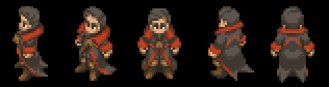
Hi all, first of all you guys have been a great inspiration and have added a lot of fun to may old FFT in psx.
This is my first sprite, or maybe frankensprite, i wold like to know you opinions and also it will be a honor if you guys help me to finishing it.

This is my first sprite, or maybe frankensprite, i wold like to know you opinions and also it will be a honor if you guys help me to finishing it.
Title: Re: First Sprite: Nojgaard
Post by: Durbs on July 31, 2011, 11:33:05 pm
Post by: Durbs on July 31, 2011, 11:33:05 pm
Not bad for a newbie. It has a great color scheme. What sprites did you rip it from?
Title: Re: First Sprite: Nojgaard
Post by: GeneralStrife on July 31, 2011, 11:39:56 pm
Post by: GeneralStrife on July 31, 2011, 11:39:56 pm
Welcome to FFH.
First thing, front frame I thought at first his head was cut in half, then I realized that was his beard blending in seamlessly. Looks weird.
First thing, front frame I thought at first his head was cut in half, then I realized that was his beard blending in seamlessly. Looks weird.
Title: Re: First Sprite: Nojgaard
Post by: Nojgaard on August 01, 2011, 02:21:00 am
Post by: Nojgaard on August 01, 2011, 02:21:00 am
@Durbs
For the portrait i used part of the "Old man" avatar and part of Elmdore avatar too.
For the sprites i used "old man" head (some times Algus), some parts of Elmdore clothing, and mostly male mediator outfit, i love their coats.
@GeneralStrife
Edited a little, how it looks now?

For the portrait i used part of the "Old man" avatar and part of Elmdore avatar too.
For the sprites i used "old man" head (some times Algus), some parts of Elmdore clothing, and mostly male mediator outfit, i love their coats.
@GeneralStrife
Edited a little, how it looks now?
Title: Re: First Sprite: Nojgaard
Post by: Pierce on August 01, 2011, 03:13:14 am
Post by: Pierce on August 01, 2011, 03:13:14 am
I'm no spriter, but what you've got going there looks awesome.
To add the "Show" option, you embed the picture in a spoiler tag.
[ spoiler=Show] Image [ /spoiler]
To add the "Show" option, you embed the picture in a spoiler tag.
[ spoiler=Show] Image [ /spoiler]
Image
Title: Re: First Sprite: Nojgaard
Post by: Cheetah on August 01, 2011, 10:35:19 am
Post by: Cheetah on August 01, 2011, 10:35:19 am
This is a very good first attempt. As mentioned before you might want to consider using different shades of black for the cloths and hair, just to add some differentiation and not make him so dark. Though the black you have chosen is a good one. The portrait needs a little work in the color department, can you post the portrait at 100?
Title: Re: First Sprite: Nojgaard
Post by: Nojgaard on August 01, 2011, 01:54:30 pm
Post by: Nojgaard on August 01, 2011, 01:54:30 pm
@Pierce
Thank you very much =D
@Cheetah
Thank you very much too, gived new colors to hair, how it looks now?
Also, here is the portrait at 100%

Thank you very much =D
@Cheetah
Thank you very much too, gived new colors to hair, how it looks now?
Also, here is the portrait at 100%
Title: Re: First Sprite: Nojgaard
Post by: Cheetah on August 01, 2011, 05:16:51 pm
Post by: Cheetah on August 01, 2011, 05:16:51 pm
That is looking a lot better, his eyebrows are still black (it works if that is what you meant to do). Do you want help with the hair color on the portrait?
Title: Re: First Sprite: Nojgaard
Post by: Nojgaard on August 01, 2011, 05:24:12 pm
Post by: Nojgaard on August 01, 2011, 05:24:12 pm
Yes, i let the eyebronws that way because if i used brown they clould get lost in the face, using blak for eyebrons solves that problem.
About the portrait, yes please, it will thank so much your help.
About the portrait, yes please, it will thank so much your help.
Title: Re: First Sprite: Nojgaard
Post by: Lijj on August 01, 2011, 05:42:03 pm
Post by: Lijj on August 01, 2011, 05:42:03 pm
I kinda liked the black hair but good job! The palettes being separate is better and more universal though.. palette one could be black haired while 2 could be brown. The sprite looks cool. I think the portrait needs more of a head.. it's like he has a small cranium the back of his head is missing some mass like 2 pixels worth of hair should do.
Title: Re: First Sprite: Nojgaard
Post by: Nojgaard on August 01, 2011, 11:38:13 pm
Post by: Nojgaard on August 01, 2011, 11:38:13 pm
Remaked the portrait and tried a more natural looking pose, also aded some shadows an colourd here and there, coments and help are welcome.

Did a minior recolour to the hair in the sprites. I like black hair too so i tried to do something in between black and dark brown, tell me pls how it worked =D

Did a minior recolour to the hair in the sprites. I like black hair too so i tried to do something in between black and dark brown, tell me pls how it worked =D
Title: Re: First Sprite: Nojgaard
Post by: RavenOfRazgriz on August 02, 2011, 01:13:49 pm
Post by: RavenOfRazgriz on August 02, 2011, 01:13:49 pm
Pretty good for a first sprite. My only critique would be that his beard in the sprite seems longer than the one in the portrait, but I don't know how much of that you can actually fix before it just looks weird.
Portrait-wise, the only issue I see right now is that the areas under his collar are a flat black, which looks kind of weird. Next time you post it, can you post a 200% or 300% portrait as well? It's easier to see the details and critiquing this I'm typing with my laptop held on its side to look at your blown up sprite sheet.
Portrait-wise, the only issue I see right now is that the areas under his collar are a flat black, which looks kind of weird. Next time you post it, can you post a 200% or 300% portrait as well? It's easier to see the details and critiquing this I'm typing with my laptop held on its side to look at your blown up sprite sheet.
Title: Re: First Sprite: Nojgaard
Post by: Nojgaard on August 03, 2011, 03:52:40 am
Post by: Nojgaard on August 03, 2011, 03:52:40 am
Did some little changes to the portrait, and today i bring you two portrait options, short and long beared (to match with the beard en the sprites). What do you think ppl, wich one looks best?

Title: Re: First Sprite: Nojgaard
Post by: Cheetah on August 03, 2011, 04:14:12 am
Post by: Cheetah on August 03, 2011, 04:14:12 am
Nice work extending the beard. I would recommend shifting the head one pixel to the right, he looks like he is pushing his head forward right now.
Title: Re: First Sprite: Nojgaard
Post by: GeneralStrife on August 03, 2011, 04:56:50 am
Post by: GeneralStrife on August 03, 2011, 04:56:50 am
Not bad, yeah move the head back just a bit, he looks like he's doing a quagmire right now.
Title: Re: First Sprite: Nojgaard
Post by: Nojgaard on August 04, 2011, 06:36:09 pm
Post by: Nojgaard on August 04, 2011, 06:36:09 pm
Moved the head 1 pixel and looks beter now, thank you very much guys.

So far this is what i got:

So far this is what i got:
Title: Re: First Sprite: Nojgaard
Post by: Kokojo on August 04, 2011, 06:38:22 pm
Post by: Kokojo on August 04, 2011, 06:38:22 pm
...This is great. Can I use it?
Title: Re: First Sprite: Nojgaard
Post by: Cheetah on August 04, 2011, 07:56:17 pm
Post by: Cheetah on August 04, 2011, 07:56:17 pm
There is still something a little funky with the hair color. Funky is a great word btw. The back of his head should have the darkest shades, not those lighter colors. It might be a straight palette swap of the colors wont work well or something.
Also, the head/neck looks better, but you need a couple more pixels of neck. Like the first line of the neck under the ear is too long. The next line of neck to the right of that should be 1 or 2 pixels higher.
This really is turning out to be a great first sprite.
Also, the head/neck looks better, but you need a couple more pixels of neck. Like the first line of the neck under the ear is too long. The next line of neck to the right of that should be 1 or 2 pixels higher.
This really is turning out to be a great first sprite.
Title: Re: First Sprite: Nojgaard
Post by: MagiusRerecros on August 04, 2011, 08:08:33 pm
Post by: MagiusRerecros on August 04, 2011, 08:08:33 pm
I do like the sprite, and the portrait, but to me it just looks like one of the sides of his face (on the portrait) is very very, almost unnaturally, straight. Personally, I feel that it could do with a bit more of a curve somewhere down that line, but that's just my opinion.
Title: Re: First Sprite: Nojgaard
Post by: GeneralStrife on August 04, 2011, 08:10:33 pm
Post by: GeneralStrife on August 04, 2011, 08:10:33 pm
It's based off of a vanilla portrait. like that though, so it's just a matter of taste. The original uses that.
Title: Re: First Sprite: Nojgaard
Post by: Reikn on August 04, 2011, 08:58:03 pm
Post by: Reikn on August 04, 2011, 08:58:03 pm
ooo gona totally use this. reminds me of a dragula theme for some reason... probably the cape. DIGGING THAT BEARD so smekxy hahaha gj man hope u keep it up :)
Title: Re: First Sprite: Nojgaard
Post by: Twinees on August 04, 2011, 11:14:13 pm
Post by: Twinees on August 04, 2011, 11:14:13 pm
Quote from: Cheetah on August 04, 2011, 07:56:17 pm
The back of his head should have the darkest shades, not those lighter colors.
This. Its making the back of his head seem really jagged because of it.
Also, i think you could either use a lighter skin colour at the top of his head where the hair meets his forehead, or the majority of the shading underneath the hair on the forehead could be removed entirely, e.g. Cheetah's avatar has very little to no shading at the front most bit of the forehead.
Title: Re: First Sprite: Nojgaard
Post by: Cheetah on August 05, 2011, 12:15:02 am
Post by: Cheetah on August 05, 2011, 12:15:02 am
I think part of the problem is that that color that you are referring to as a skin tone shadow is actually originally a dark hair shade, and that is why it shows up on the back of the hair as well.
Title: Re: First Sprite: Nojgaard
Post by: Nojgaard on August 05, 2011, 07:37:02 pm
Post by: Nojgaard on August 05, 2011, 07:37:02 pm
Did some changes on the portrait following your obervations, how it looks now?

PD: @Kokojo
Yes you can, have fun =D
PD: @Kokojo
Yes you can, have fun =D
Title: Re: First Sprite: Nojgaard
Post by: Kokojo on August 07, 2011, 12:04:20 am
Post by: Kokojo on August 07, 2011, 12:04:20 am
Would it be possible for you to make a .BMP or .SPR out of it, please?
Title: Re: First Sprite: Nojgaard
Post by: Kagebunji on August 07, 2011, 06:37:46 am
Post by: Kagebunji on August 07, 2011, 06:37:46 am
Yes, BMP or SPR format is neccesarry to put it in-game. And since it is finished, why don't you submit him, Nojgaard?
Title: Re: First Sprite: Nojgaard
Post by: Nojgaard on August 07, 2011, 12:52:28 pm
Post by: Nojgaard on August 07, 2011, 12:52:28 pm
Ok, submiting him today
Title: Re: First Sprite: Nojgaard
Post by: Cheetah on August 08, 2011, 12:11:15 am
Post by: Cheetah on August 08, 2011, 12:11:15 am
Congratulations on a successfully submitted sprite Nojgaard.
Title: Re: First Sprite: Nojgaard
Post by: GeneralStrife on August 08, 2011, 12:25:17 am
Post by: GeneralStrife on August 08, 2011, 12:25:17 am
Good first sprite bro.
Title: Re: First Sprite: Nojgaard
Post by: Lijj on August 08, 2011, 12:31:18 am
Post by: Lijj on August 08, 2011, 12:31:18 am
I'll add it to the front page later tonight. Good work and thanks for submitting.
I think I will submit that Meliadoul Unveiled sprite too.
I think I will submit that Meliadoul Unveiled sprite too.
Title: Re: First Sprite: Nojgaard
Post by: Kokojo on August 08, 2011, 02:00:38 am
Post by: Kokojo on August 08, 2011, 02:00:38 am
*thumbs up*
Title: Re: Nojgaard's Sprites
Post by: Kagebunji on August 23, 2011, 01:35:21 pm
Post by: Kagebunji on August 23, 2011, 01:35:21 pm
I see in your sig that ou are working on something new, could you show a frame or two?
Title: Re: Nojgaard's Sprites
Post by: Kagebunji on October 22, 2011, 12:37:46 pm
Post by: Kagebunji on October 22, 2011, 12:37:46 pm
Looks like that little Bard in Nojgaard's sig will remain hidden, huh.
Title: Re: Nojgaard's Sprites
Post by: Nojgaard on April 14, 2012, 02:53:14 pm
Post by: Nojgaard on April 14, 2012, 02:53:14 pm
Hi all, long time no see. This is my new project
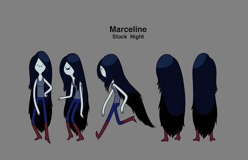
I already have some sprites but need to fix some things before posting them, by now i bring you the portrait.
What do you think guys? What needs to be fixed? Needs to look more like Marceline?

I already have some sprites but need to fix some things before posting them, by now i bring you the portrait.
What do you think guys? What needs to be fixed? Needs to look more like Marceline?
Title: Re: Nojgaard's Sprites
Post by: Pickle Girl Fanboy on April 14, 2012, 03:51:00 pm
Post by: Pickle Girl Fanboy on April 14, 2012, 03:51:00 pm
I think this the one case where you should stick to the original art style, instead of trying to port it to FFT style.
Keep the round face and the simplistic facial features. Make the hair much darker, like Lijj's Black Chocobo (ask Lijj for a link). And she's wearing a wife beater shirt, so you should only have two straps that circle down, and her bare shoulders should be visible beyond the straps.
Also, more hair.
The second image from the left is almost perfect for the FFT angle. Check out the Art Directives thread in Tethical for more info on FFT art style, so you can figure out what FFT art directives you should keep and which you should throw away.
Title: Re: Nojgaard's Sprites
Post by: Jon on April 15, 2012, 10:54:08 am
Post by: Jon on April 15, 2012, 10:54:08 am
Umm just get rid of the smile, in FFT everyone doesn't smile, and that looks awkward. You chose a pretty good portrait for the base. Keep it up! Also, I know the other sprite is probably done, good job on that, my first sprite had the same base too.
Title: Re: Nojgaard's Sprites
Post by: Nojgaard on April 15, 2012, 07:00:52 pm
Post by: Nojgaard on April 15, 2012, 07:00:52 pm
Followed your observations and i bring you 3 options today, one FFT stile, an the other two are something totally diferent, what do you think?

Title: Re: Nojgaard's Sprites
Post by: Durbs on April 15, 2012, 09:27:41 pm
Post by: Durbs on April 15, 2012, 09:27:41 pm
I dislike the 3rd... WAY to deviant from the FFT style. First is standard FFT, nothing terrible or great about it. But... I am in love with the second one. It's original and fits well with the sprite.
Title: Re: Nojgaard's Sprites
Post by: GeneralStrife on April 15, 2012, 09:56:42 pm
Post by: GeneralStrife on April 15, 2012, 09:56:42 pm
Two looks so awesome, even though it needs work.
Title: Re: Nojgaard's Sprites
Post by: Taichii on April 15, 2012, 11:08:21 pm
Post by: Taichii on April 15, 2012, 11:08:21 pm
2nd one please put fangs <3
Title: Re: Nojgaard's Sprites
Post by: Nojgaard on April 16, 2012, 03:12:55 am
Post by: Nojgaard on April 16, 2012, 03:12:55 am
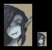
I liked the 2nd option too. Reworked it a little and fixed a few things. Do you like it? :D

Title: Re: Nojgaard's Sprites
Post by: Dome on April 16, 2012, 04:00:10 am
Post by: Dome on April 16, 2012, 04:00:10 am
Sexy
Title: Re: Nojgaard's Sprites
Post by: Jon on April 16, 2012, 07:20:00 am
Post by: Jon on April 16, 2012, 07:20:00 am
I like it at its original size, the fang to our right may be slightly too big (considering the one to our left is only 1 pixel long). This isn't FFT style at all, but looks pretty awesome and doesn't matter since you clearly are going for your own style. I really like how you did the eye (to our right). :mrgreen:
Title: Re: Nojgaard's Sprites
Post by: Kagebunji on April 16, 2012, 07:47:37 am
Post by: Kagebunji on April 16, 2012, 07:47:37 am
Given this is not FFT style, and is not supposed to be, I am not gonna tell anything other than you need to move the port itself more to right, look how much free spot there is, it makes it look weird. Make the face be in the center of the image in other words.
Title: Re: Nojgaard's Sprites
Post by: Cherrie on April 16, 2012, 08:10:21 am
Post by: Cherrie on April 16, 2012, 08:10:21 am
I'm just gonna say I love this~
Title: Re: Nojgaard's Sprites
Post by: Pickle Girl Fanboy on April 16, 2012, 01:51:39 pm
Post by: Pickle Girl Fanboy on April 16, 2012, 01:51:39 pm
Excellent work! Though I'm somewhat disappointed option 3 gets no love. Option 2 is, nevertheless, lovely, and by far the best. Same with your minor additions to the same.
Title: Re: Nojgaard's Sprites
Post by: Nojgaard on April 16, 2012, 07:59:54 pm
Post by: Nojgaard on April 16, 2012, 07:59:54 pm
Did some corrections following your observations and i bring you 4 options today (sorry for the spam), this options have larger or shorter fangs, also moved the image a few pixels to te right to center her face, but i kinda liked the left aligned option, it makes her look a little sneacky.
So, what do you think? What option likes you more? Coments and ovservations are very wellcome as always

Btw, im posting the images in a appropiate size? They are too big? Too small?
So, what do you think? What option likes you more? Coments and ovservations are very wellcome as always
Btw, im posting the images in a appropiate size? They are too big? Too small?
Title: Re: Nojgaard's Sprites
Post by: Lijj on April 16, 2012, 08:25:34 pm
Post by: Lijj on April 16, 2012, 08:25:34 pm
Is this something that's been scaled down? The AA on the outside looks like it has been blurred automatically.
Title: Re: Nojgaard's Sprites
Post by: Durbs on April 16, 2012, 08:35:45 pm
Post by: Durbs on April 16, 2012, 08:35:45 pm
My problem with the center-aligned one is that her hair continues past where it seems that it should. It seems like it should begin to level off and recede as the portrait is moved progressively further right, instead of continuing on at the same angle.
I also feel like the second fang (on the right) should be a little further right and up to fit with the mouth. Not much, but just a hair.
I also feel like the second fang (on the right) should be a little further right and up to fit with the mouth. Not much, but just a hair.
Title: Re: Nojgaard's Sprites
Post by: Pickle Girl Fanboy on April 17, 2012, 05:14:30 pm
Post by: Pickle Girl Fanboy on April 17, 2012, 05:14:30 pm
Requesting one where her ear is at the edge, yet not cut off. With long fangs.
And are you a fan of Star Ocean 2? Because I bet you could do a wonderful Rena.
@Durbs: Some women have that much hair. So soft.
And are you a fan of Star Ocean 2? Because I bet you could do a wonderful Rena.
@Durbs: Some women have that much hair. So soft.
Title: Re: Nojgaard's Sprites
Post by: Durbs on April 17, 2012, 05:34:04 pm
Post by: Durbs on April 17, 2012, 05:34:04 pm
Quote from: Pickle Girl Fanboy on April 17, 2012, 05:14:30 pm
@Durbs: Some women have that much hair. So soft.
But most women's hair don't defy gravity. ;)
Title: Re: Nojgaard's Sprites
Post by: Nojgaard on April 17, 2012, 08:37:18 pm
Post by: Nojgaard on April 17, 2012, 08:37:18 pm
Thank you very much to all for yor observations
Did some changes to the portrait, moved her left fang one pixel to the right and maded it at the same size of the other. Also moved the portrait to the right until it reached the very edge of the portrait (but not cutting her ear), so far this is waht i got
Portrait scale 300% and 100%
Btw, i dont own the original "portrair image" actullay its based on this piece fom deviant art http://laur-.deviantart.com/art/AT-Marceline-253301225?q=boost%3Apopular%20marceline&qo=3 all i did with it was selecting pallete, sacaling it and stuff.
Also, now i can show you the sprite set =D

The head and the hair are fom Zozma's Deis (Breath of Fire 3), jut removed the top spiky point of the hair
The arms are from Kagebunji's Generic Female Ninja
The shirt, "pants" and boots are fom Squire F
So, what do you think guys? what needs to be done?
Did some changes to the portrait, moved her left fang one pixel to the right and maded it at the same size of the other. Also moved the portrait to the right until it reached the very edge of the portrait (but not cutting her ear), so far this is waht i got
Portrait scale 300% and 100%
Btw, i dont own the original "portrair image" actullay its based on this piece fom deviant art http://laur-.deviantart.com/art/AT-Marceline-253301225?q=boost%3Apopular%20marceline&qo=3 all i did with it was selecting pallete, sacaling it and stuff.
Also, now i can show you the sprite set =D
The head and the hair are fom Zozma's Deis (Breath of Fire 3), jut removed the top spiky point of the hair
The arms are from Kagebunji's Generic Female Ninja
The shirt, "pants" and boots are fom Squire F
So, what do you think guys? what needs to be done?
Title: Re: Nojgaard's Sprites
Post by: Durbs on April 17, 2012, 10:17:11 pm
Post by: Durbs on April 17, 2012, 10:17:11 pm
Yeah, hair is much better in my opinion, as is the fang placement. It's the small little things that make all the difference. :D
As for the sprite, well... I'll let the experts go after you on that. I'm not sure if some of the things that I don't like are entirely valid. The blue skin tone seems slightly off to me, for instance. It probably isn't.
The one thing that I do feel needs to be addressed is the boot color in conjunction with the blue. It doesn't seem to mesh well with it. Perhaps a fairly dark brown color would match it better; as it is now, the orange contrasts violently with the rest of he sprite.
I'm also not sure how easy it would be, but if you're trying to match the picture, it might be neat if you can make her shirt fall a little over her shoulder (like on the right in the example you gave). It might help it to look more unique, too.
Title: Re: Nojgaard's Sprites
Post by: Taichii on April 17, 2012, 11:09:40 pm
Post by: Taichii on April 17, 2012, 11:09:40 pm
for me i think it would be best to add a little more blue on her skin or hair? O.O
Title: Re: Nojgaard's Sprites
Post by: Jon on April 18, 2012, 12:07:29 pm
Post by: Jon on April 18, 2012, 12:07:29 pm
Are you using existing colors on the sprite? The boots are too light, like Durbs said, I agree, darker boots. Also the darkest purple is so close to the second darkest, you might wanna fix that by either making the darkest darker or the second darkest lighter, or both. I like Zozma's hair, good choice!
Title: Re: Nojgaard's Sprites
Post by: Nojgaard on April 28, 2012, 12:15:36 pm
Post by: Nojgaard on April 28, 2012, 12:15:36 pm
Did some changes to the palette, the hair is now more blueish, the skin is slightly more blue and pale, still matching with the reference i guess. The boots are darker now, something in between dark red and brown; and lastly the shirt stayed in the same color.
I used in game existing color for everything but the shirt, is because all the grays i finded are too dark or too light =/ and is needed something just in between that.

Also, opened just a little the shirts neck
I used in game existing color for everything but the shirt, is because all the grays i finded are too dark or too light =/ and is needed something just in between that.
Also, opened just a little the shirts neck
Title: Re: Nojgaard's Sprites
Post by: Taichii on April 28, 2012, 01:06:59 pm
Post by: Taichii on April 28, 2012, 01:06:59 pm
could you make her hips a little skinnier? :D
Title: Re: Nojgaard's Sprites
Post by: Jon on April 29, 2012, 09:20:02 am
Post by: Jon on April 29, 2012, 09:20:02 am
I honestly can say that the colors are now fine. The made up grays are good as well, when in doubt just make your own colors but try always to use if possible existing ones. There's not too much more I can say because I only see the front facing frame (which looks good, keep it up), but yeah keep these colors and see how it goes! :mrgreen:
Title: Re: Nojgaard's Sprites
Post by: GeneralStrife on April 29, 2012, 03:58:21 pm
Post by: GeneralStrife on April 29, 2012, 03:58:21 pm
Quote from: Taichii on April 28, 2012, 01:06:59 pm
could you make her hips a little skinnier? :D
They don't need to be. Lol.
Title: Re: Nojgaard's Sprites
Post by: Nojgaard on May 07, 2012, 01:08:27 am
Post by: Nojgaard on May 07, 2012, 01:08:27 am
Hi all, worked on some things lately.
Firt, this is the Marceline project, new color and corrections from the last time and stuff. Du you like her? Its ok if i upload her today?

Second, this is some kind of a gift for my gf, its based on her original character "Sakary".
The shirt and arms are from Kagebunji's Generic Female Ninja
For the hair i used some parts from Female Monk, also i used some parts from Shishi-Sensou Asura Male (the top part from the hair)
The pants are from Mustadio, this guy used to be a Steam Punk before it was mainstream XD

Reference
So what do you think ppl?
Firt, this is the Marceline project, new color and corrections from the last time and stuff. Du you like her? Its ok if i upload her today?
Second, this is some kind of a gift for my gf, its based on her original character "Sakary".
The shirt and arms are from Kagebunji's Generic Female Ninja
For the hair i used some parts from Female Monk, also i used some parts from Shishi-Sensou Asura Male (the top part from the hair)
The pants are from Mustadio, this guy used to be a Steam Punk before it was mainstream XD
Reference
So what do you think ppl?
Title: Re: Nojgaard's Sprites
Post by: 3lric on May 07, 2012, 01:09:51 am
Post by: 3lric on May 07, 2012, 01:09:51 am
Nice job on these, I really really like the second one :)
Title: Re: Nojgaard's Sprites
Post by: Celdia on May 07, 2012, 01:27:10 am
Post by: Celdia on May 07, 2012, 01:27:10 am
Looking at the Sakary sprite and the reference pic, I've only got two words: "Nailed it."
Title: Re: Nojgaard's Sprites
Post by: Taichii on May 07, 2012, 12:39:49 pm
Post by: Taichii on May 07, 2012, 12:39:49 pm
oohh~!!! ohhh~!!!
she can be edited slightly a bit and be turned into daenna from legend of mana :D
can i use her nojgard please? :D
she can be edited slightly a bit and be turned into daenna from legend of mana :D
can i use her nojgard please? :D
Title: Re: Nojgaard's Sprites
Post by: Nojgaard on May 10, 2012, 09:04:30 am
Post by: Nojgaard on May 10, 2012, 09:04:30 am
Thanks all for your coments.
@Taichii: Yes, you can use it :), im uploading her to this site after i finish it.
Btw, after testing Marceline i thinked my old Nojgaard sprite needed some rework, do you like the changes?

@Taichii: Yes, you can use it :), im uploading her to this site after i finish it.
Btw, after testing Marceline i thinked my old Nojgaard sprite needed some rework, do you like the changes?
Title: Re: Nojgaard's Sprites
Post by: CONMAN on May 10, 2012, 10:02:07 am
Post by: CONMAN on May 10, 2012, 10:02:07 am
It's pretty sweet lookin! I also really like your newest sprite as well. I wanted to make something with a tail too, but didn't think of a good design/ not sure I would make it look very good.
Title: Re: Nojgaard's Sprites
Post by: GeneralStrife on May 10, 2012, 03:01:04 pm
Post by: GeneralStrife on May 10, 2012, 03:01:04 pm
You've done a great job on the tail. That wasn't easy.
Title: Re: Nojgaard's Sprites
Post by: Nojgaard on May 13, 2012, 10:53:15 pm
Post by: Nojgaard on May 13, 2012, 10:53:15 pm
Hi, been working at the same sprite projects. First of all, here is a reworked vercion of the old Nojgaard portrait.

Second, here is the Sakary's sprite, fixed some problems with the tail animations, i think it works ok now, or maybe not, some advice would be highly welcome.
Third, i tried a lot of options making Sakary's portrait and i couldn't do anything that i liked. So i asking help to you guys, can someone make a portrait for me pls? here is a sketch or sorta
Title: Re: Nojgaard's Sprites
Post by: Lijj on May 14, 2012, 12:14:36 pm
Post by: Lijj on May 14, 2012, 12:14:36 pm
Great update on the portrait Nojgaard.
Title: Re: Nojgaard's Sprites
Post by: Kagebunji on May 14, 2012, 12:32:13 pm
Post by: Kagebunji on May 14, 2012, 12:32:13 pm
I suggest you post what you did on the portrait. I can fix it up for you if you wish.
Title: Re: Nojgaard's Sprites
Post by: Nojgaard on May 14, 2012, 08:01:52 pm
Post by: Nojgaard on May 14, 2012, 08:01:52 pm
@Kagebunji: tank you, some help will be wellcome in this mess =/

Title: Re: Nojgaard's Sprites
Post by: Nojgaard on June 01, 2012, 02:26:15 pm
Post by: Nojgaard on June 01, 2012, 02:26:15 pm
Hi all, been working here and there and stuff. Here is the Sakary's portrait with some changes, it looks a little more fft style, also fixed some things.

Title: Re: Nojgaard's Sprites
Post by: Nojgaard on June 01, 2012, 11:04:30 pm
Post by: Nojgaard on June 01, 2012, 11:04:30 pm
I think the old Nojgaard remake is finished, (or maybe not, i open to suggestions). I requesting today to remove the old one (of course in the proper section) and later uploading the new.
Btw, do you like the boots i puted on him?
Btw, do you like the boots i puted on him?
Title: Re: Nojgaard's Sprites
Post by: Jon on June 02, 2012, 06:30:25 am
Post by: Jon on June 02, 2012, 06:30:25 am
Looks very good and almost like a character I'd expect to see in FFT :D
Title: Re: Nojgaard's Sprites
Post by: Kagebunji on June 02, 2012, 06:38:29 am
Post by: Kagebunji on June 02, 2012, 06:38:29 am
I like the rework, looks much more clean. As to the Sakye portrait, it looks more FFT indeed, but I think the eyes are what will make it look most out of place, I understand it is her design and all, but it just stands out a lot. I will look closer when I get more time.
Title: Re: Nojgaard's Sprites
Post by: Nojgaard on June 02, 2012, 09:07:39 pm
Post by: Nojgaard on June 02, 2012, 09:07:39 pm
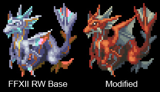
The other day, inspired by Kagebunji's FFXII RW Tiamat sprite i started messing arround with Leviathan sprite and this is what i have.
Title: Re: Nojgaard's Sprites
Post by: MiKeMiTchi on June 02, 2012, 09:50:24 pm
Post by: MiKeMiTchi on June 02, 2012, 09:50:24 pm
That modification looks very promising. I thought the color choice was smart, and it definitely looks awesome, Nojgaard! It even looks better than the original, mind you. I just wish it could be a bit bigger and can be mountable~ :D
Title: Re: Nojgaard's Sprites
Post by: Kagebunji on June 03, 2012, 03:11:55 am
Post by: Kagebunji on June 03, 2012, 03:11:55 am
It looks good! My only advice would be to change the arms to something more, I dunno, "visible", since currently they blend in and you cannot really tell where they are. Perhaps add some outline or copy/paste other monster arms(Byblos etc.). I like the color choice, heh.
Mike, making it bigger would be quite impossible, but it could be mountable, just need to set some things in FFTPatcher IIRC.
Mike, making it bigger would be quite impossible, but it could be mountable, just need to set some things in FFTPatcher IIRC.
Title: Re: Nojgaard's Sprites
Post by: Taichii on June 03, 2012, 01:21:37 pm
Post by: Taichii on June 03, 2012, 01:21:37 pm
gyarados and shiny gyarados! O_O
Title: Re: Nojgaard's Sprites
Post by: mav on June 09, 2012, 07:14:23 pm
Post by: mav on June 09, 2012, 07:14:23 pm
Quote from: MiKeMiTchi on June 02, 2012, 09:50:24 pmI just wish it could be a bit bigger and can be mountableThat's what she said.
Back on topic, that is such a gorgeous sprite, Nojgaard. Honestly, your palette and tweaks to the body are fantastic. If you can rip more RW sprites and make them look this good, you'll be doing a great service to the community.